






Sett

Sett replaces the guesswork in mobile game user acquisition with agentic AI that generates, tests, and refines high-performing ads faster than any in-house team can.

Built for enterprise and mid-market game studios, Sett entered a category still run on opinion-led decisions and slow, manual creative work. Entertainment can't be predicted, but the teams making it were still forced to bet big without any real clarity on what would work before launch.

Services Provided
Post Project

Mobile game studios have to bet big on creative before they know if it works. Sett needed a brand loud enough, and smart enough, to skip the bet entirely for a sure thing.

Brand Evaluation

Brand Evaluation

Focus Lab began by evaluating where Sett needed to stand apart from an industry's habits, not just its tools. The category was full of flat, corporate SaaS dashboards and generic gaming references that signaled ideas from outside the culture, not native to it.

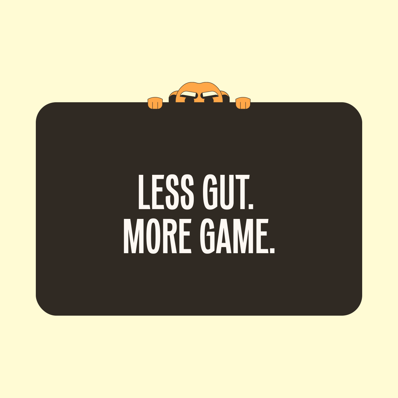
“Less Gut. More Game.” became Sett's guiding idea: creative decisions shouldn't feel like shots in the dark, and every part of the brand needed to replace instinct with insight.

Sett's brand attributes are Clever, Cutting-edge, and Audacious — a company that outsmarts guesswork with data-driven logic, builds what's next before competitors know to ask for it, and isn't afraid to crack a joke while doing it.

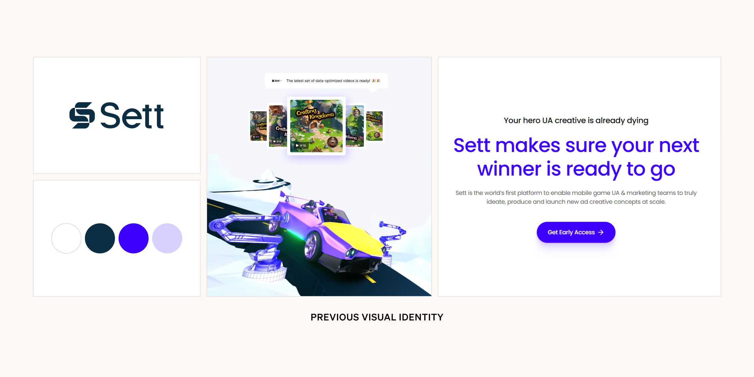
Collage showing previous visual identity with Vizard logo on blue background, Poppins font alphabet samples on red background, social media apps with video thumbnails, woman working on laptop, and website homepage with blue theme.
Text listing brand attributes: Effortless, Transformative, Essential on a purple background.
Less Gut. More Game.

Logo

Logo

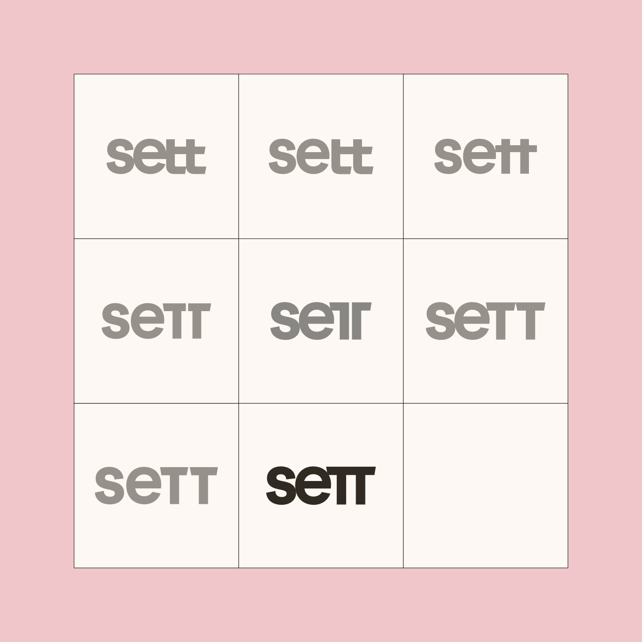
Sett's logotype leads with unapologetic confidence. Sharp details and mixed casing give the mark authority while keeping a sense of play — serious about performance, never precious about it.

Small variations of the Sett logo made while in progress
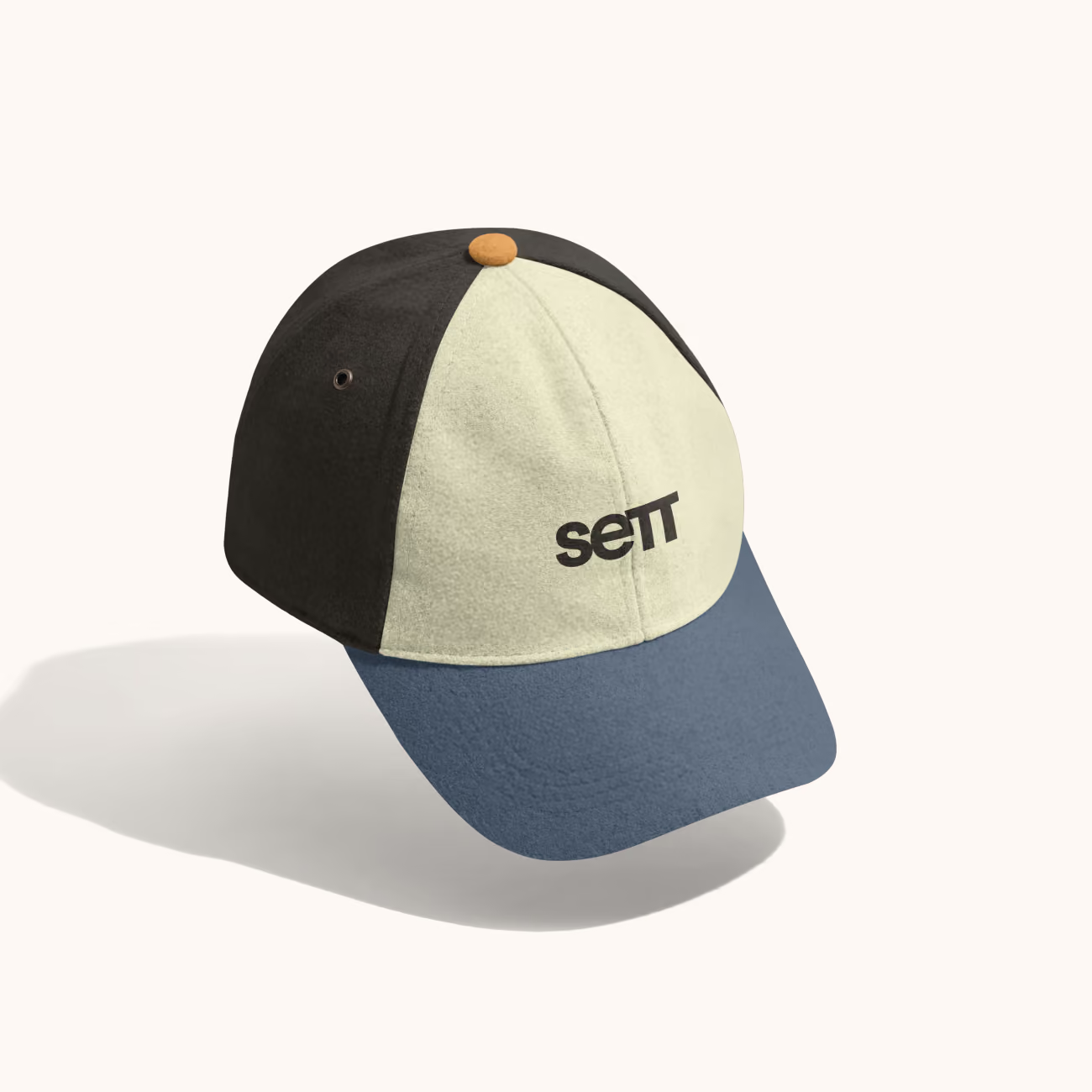
Color-blocked baseball cap with blue brim, cream front panel, black side panels, and text 'sett' on front.
Collage showing previous visual identity with Vizard logo on blue background, Poppins font alphabet samples on red background, social media apps with video thumbnails, woman working on laptop, and website homepage with blue theme.

Visual Language

Visual Language

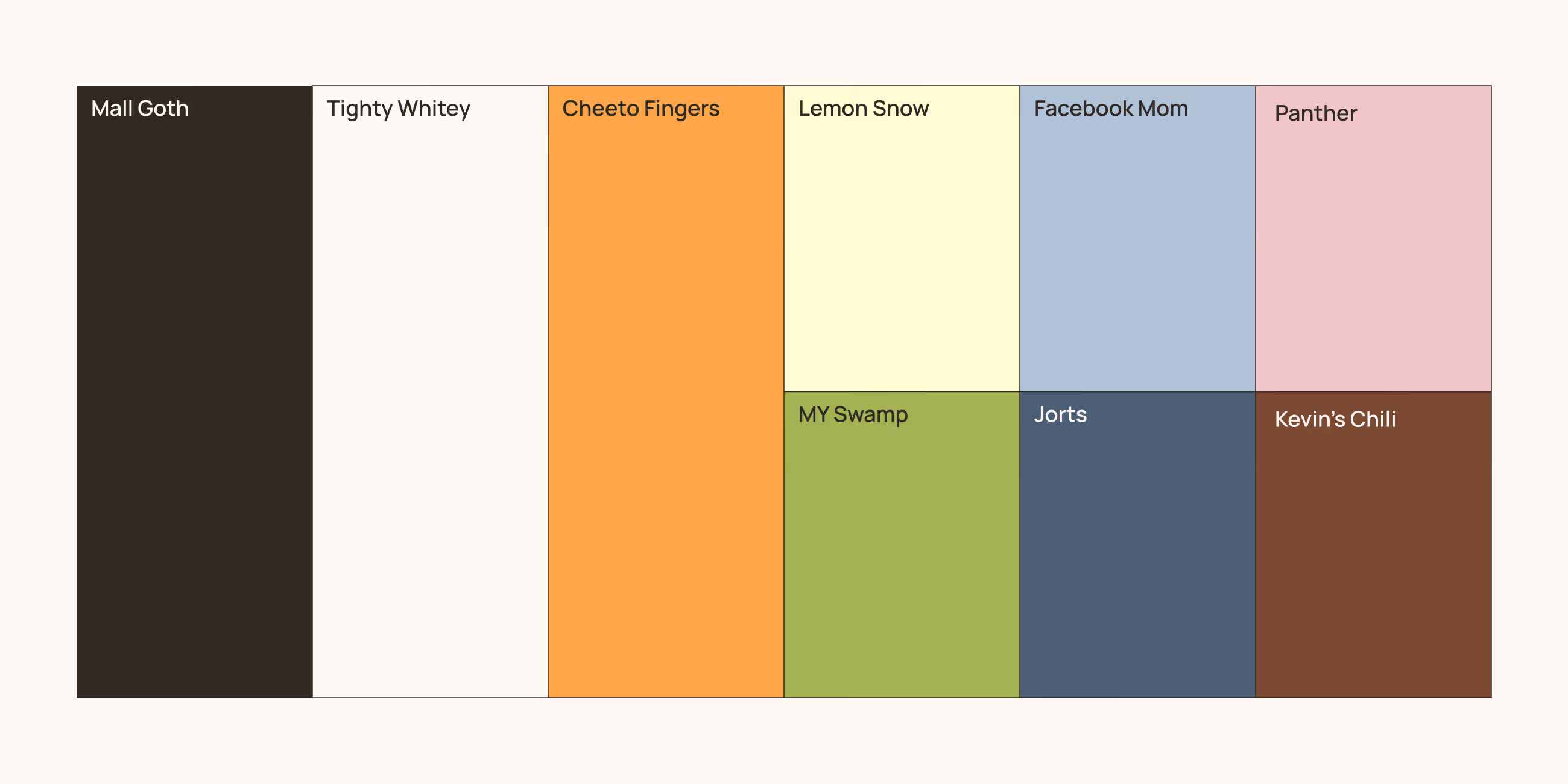
Color carries the weight of Sett's tone: smart enough to be trusted with enterprise budgets, funny enough to feel like it actually understands mobile gaming culture. A restrained palette of near-black, warm neutrals, and one sharp orange keeps that balance — authority first, personality close behind.

The names attached to each color are part of the story. Mall Goth, Tighty Whitey, and Cheeto Fingers headline the palette, joined by supporting tones named with the same irreverence. It's a small detail that signals Sett's Audacious streak internally.

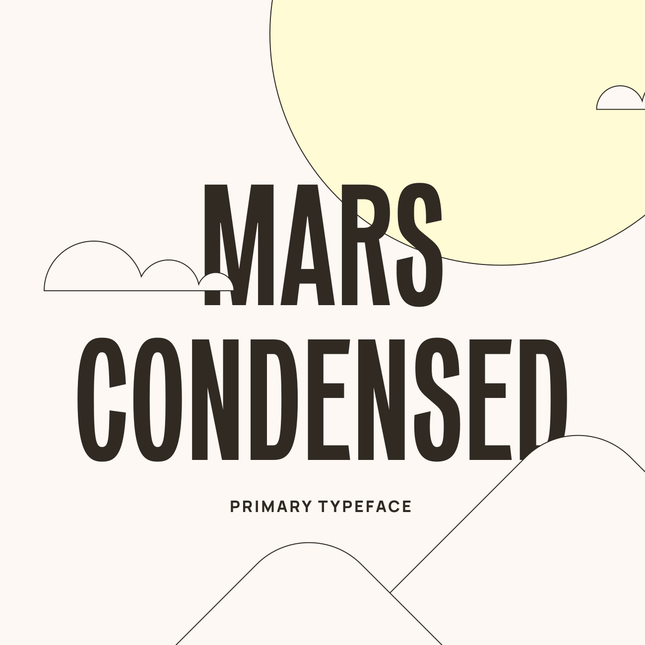
Type carries that same balance of authority and play. The primary typeface, a condensed sans-serif built with technical precision, has a few unexpected details in its letterforms that give it a personality no competitor can borrow. A rounder secondary typeface handles longer copy, keeping the system legible without losing its edge.

Layouts run on a flexible 12-column grid built around a signature technique: insetting and rounding blocks into circles, which gives every page an ownable rhythm. Grid, color, and illustration move together, structured enough to read as an authority on user acquisition, loose enough to still feel like Sett.

Grid of brand guideline slides showing Vizard's visual identity including logo, color palette, typography, and website interface.
Text listing brand attributes: Effortless, Transformative, Essential on a purple background.
Grid of brand guideline slides showing Vizard's visual identity including logo, color palette, typography, and website interface.

Mascot

Mascot

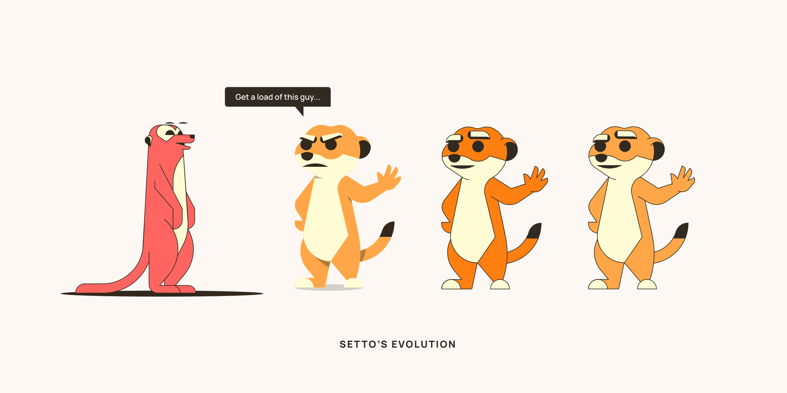
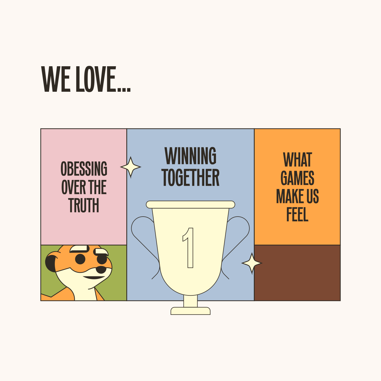
Setto, a meerkat built for the win, gives Sett a face without softening its edge. He's a strategist, a sidekick, and a little bit of a menace — sharp-eyed, cool-headed, and never afraid to crack a joke mid-metric.

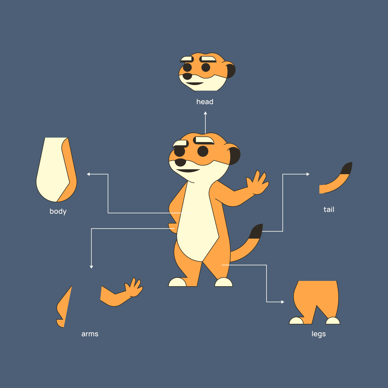
Built from bold geometric shapes, Setto is modular by design: swap an expression, a pose, or an accessory, and the system holds together like it was never any other way. That flexibility means Setto can grow alongside the product he represents, long after this first system ships.

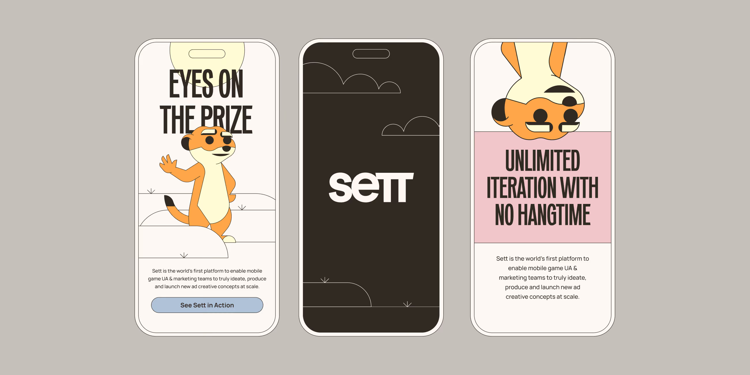
The worlds around him follow the same logic. Backgrounds stay minimal and geometric, built to frame Setto rather than compete with him, so a quick vignette can do as much work as a fully rendered scene. Full illustrations get saved for the moments that need them most: campaign heroes, landing pages, the places where Setto's story deserves room to breathe.

Speech bubbles give him a direct line to the audience: a nudge in onboarding, a quip in a product tour, a reaction to a metric worth celebrating. Minimal and punchy, they let Setto talk without getting in the way of the product he's helping explain.

Setto is the name of Sett's mascot
Sticker sheet with an orange meerket face and text sticker saying BEST IN THE GAME.
Grid of brand guideline slides showing Vizard's visual identity including logo, color palette, typography, and website interface.
The various elements that make up Sett's mascot, which allows them easy customization
Lineart drawings of environments: a beach, city skyline, fireworks
Text listing brand attributes: Effortless, Transformative, Essential on a purple background.
Grid of brand guideline slides showing Vizard's visual identity including logo, color palette, typography, and website interface.

Interactive

Interactive

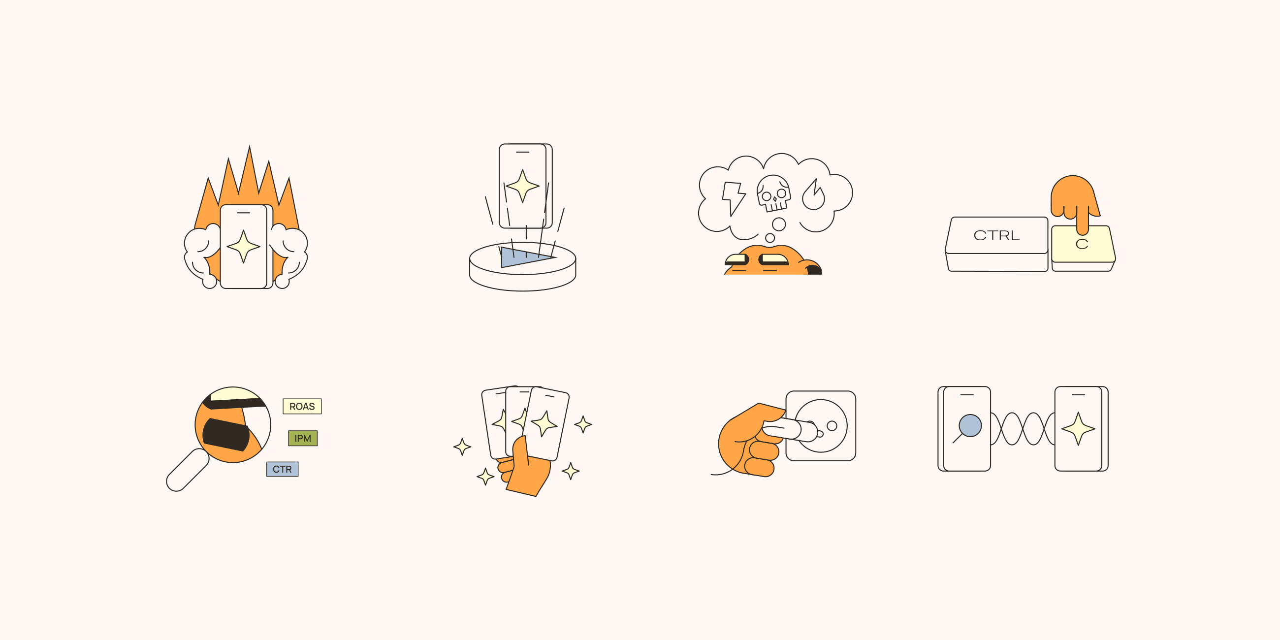
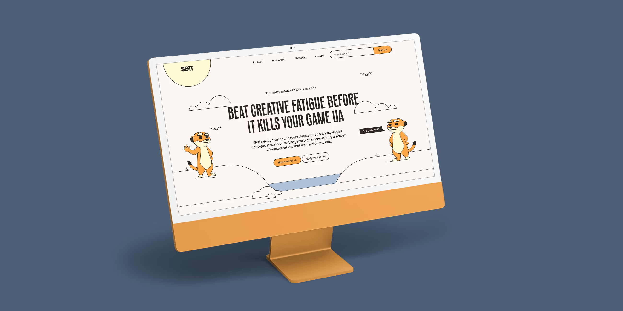
Sett's homepage, product page, and about page gave the illustration system room to stretch, and small character moments carry as much weight as any headline. Setto peeking out from behind the demo button, cobwebs settle over "the old way," and a pair of tighty-whiteys gets run up a flagpole in the fight against endless briefs — little gags that keep the site feeling like Sett, not a template with a mascot pasted on.

Four steps showing automated contact search: filter, name search, research progress, and contact results.
Text listing brand attributes: Effortless, Transformative, Essential on a purple background.

Brand Activation

Brand Activation

The brand had to show up everywhere at once, not just on the site. Sett's newsletter, The Unpredictable Hits, breaks up each section with a Setto joke, sharp enough to double as marketing copy on its own, and opens with a line that reads less like a tagline and more like Sett talking about itself in the third person: the only platform that doesn't treat manual work like a virtue.

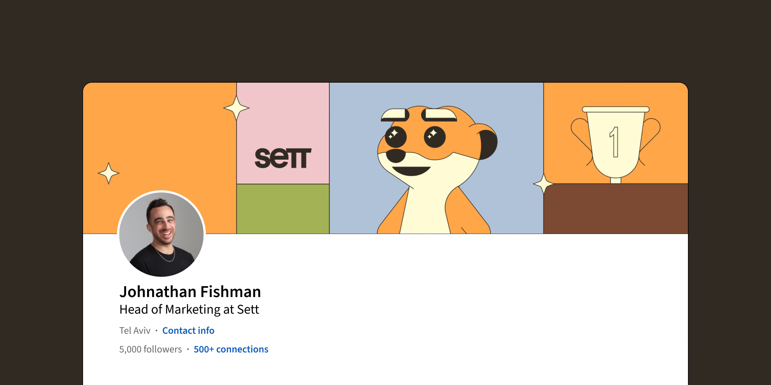
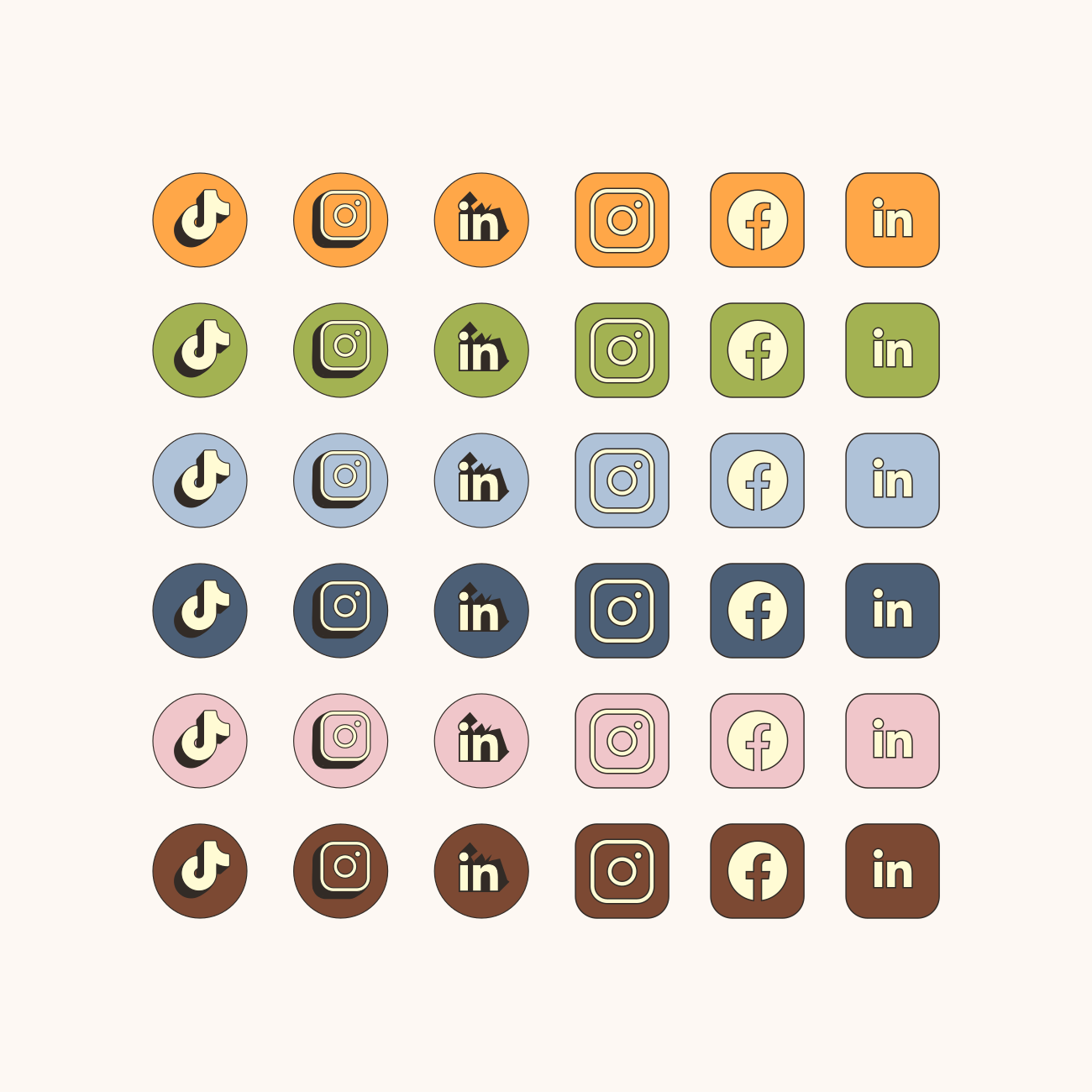
Podcast show art, social banners, and a slide deck template gave the team consistent ways to show up beyond the website, while lineart social icons and seasonal illustrations kept Setto flexible for whatever context came next. Even internal touches, like an employee's LinkedIn banner, use the same block-and-color system to make Sett recognizable before a single word gets read.

Seamless website showing demo booking form with fields for name, email, and phone number.
Text listing brand attributes: Effortless, Transformative, Essential on a purple background.
Read the next case study