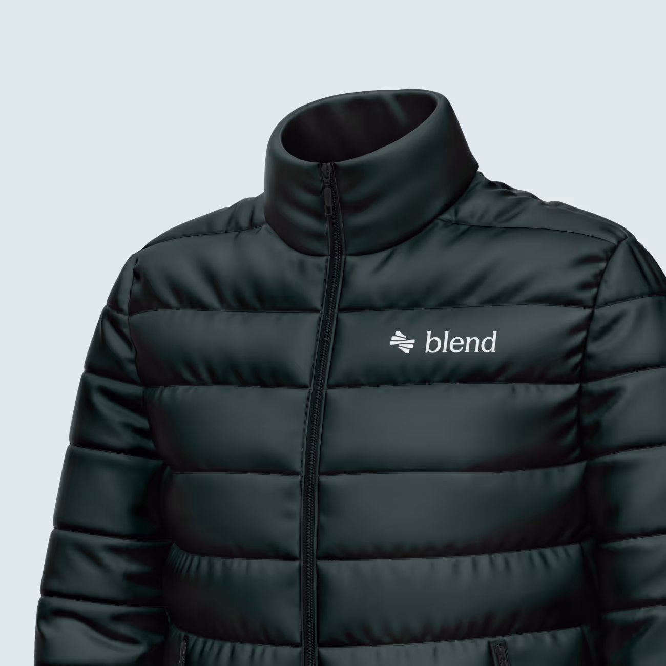
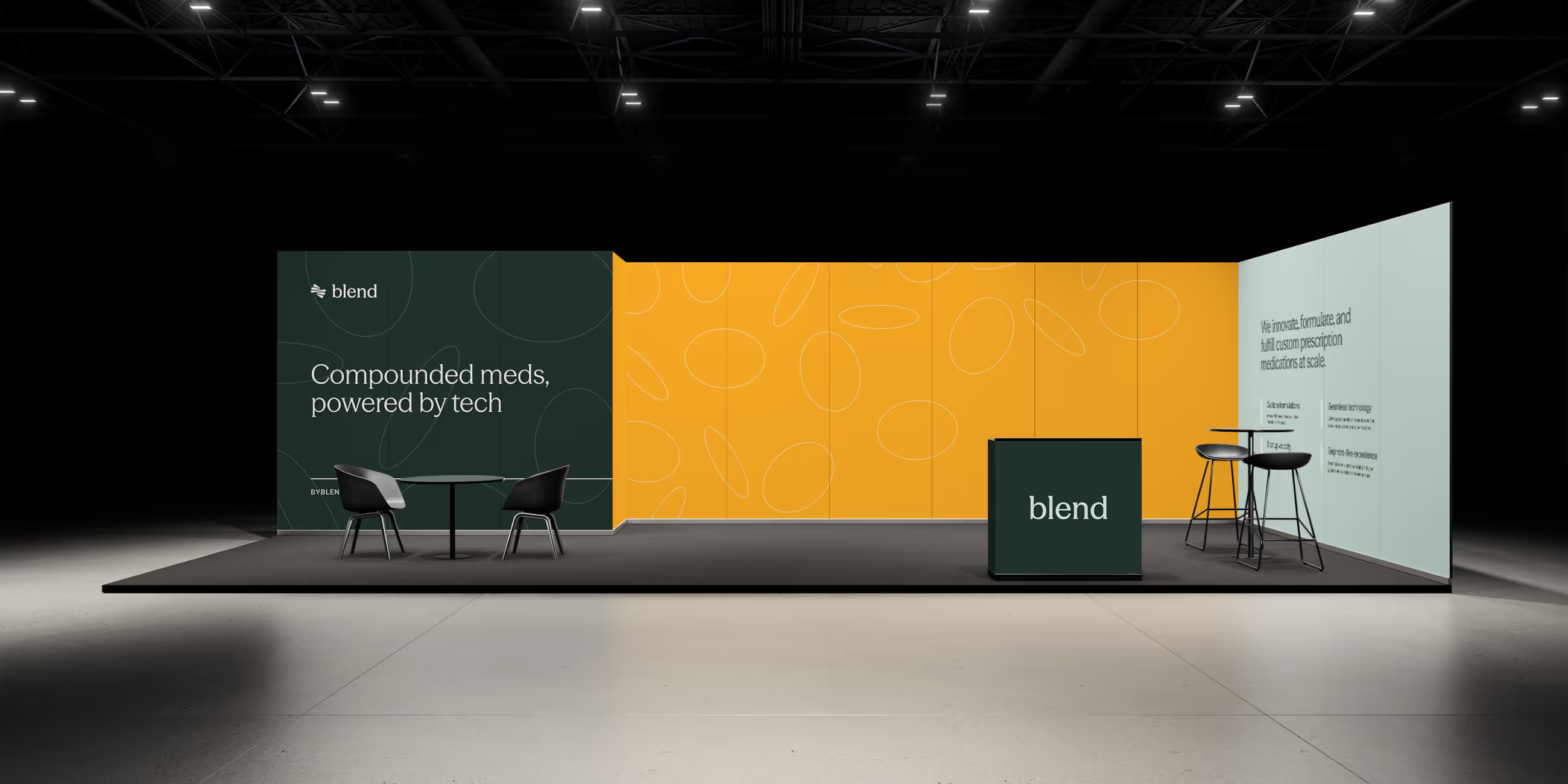
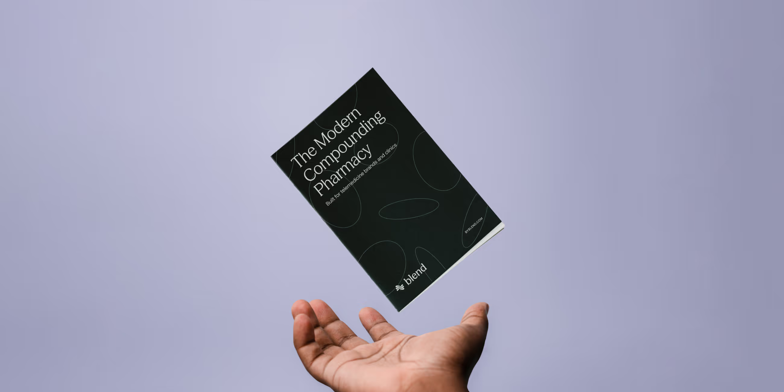
Blend’s visual language intentionally breaks from typical pharmaceutical conventions. The color palette establishes credibility through restraint while signaling a more sophisticated, modern point of view. Purples anchor the system with a sense of imagination and premium positioning, while oranges introduce vitality, innovation, and optimism. Together, they create clarity and confidence without drifting into cold or clinical territory.
Typography plays a key role in reinforcing that balance. Headlines use Displaay’s Season Mix, chosen for its distinctive letterforms and refined character. The typeface feels elevated and forward-thinking while remaining highly legible, giving the brand personality without sacrificing clarity.
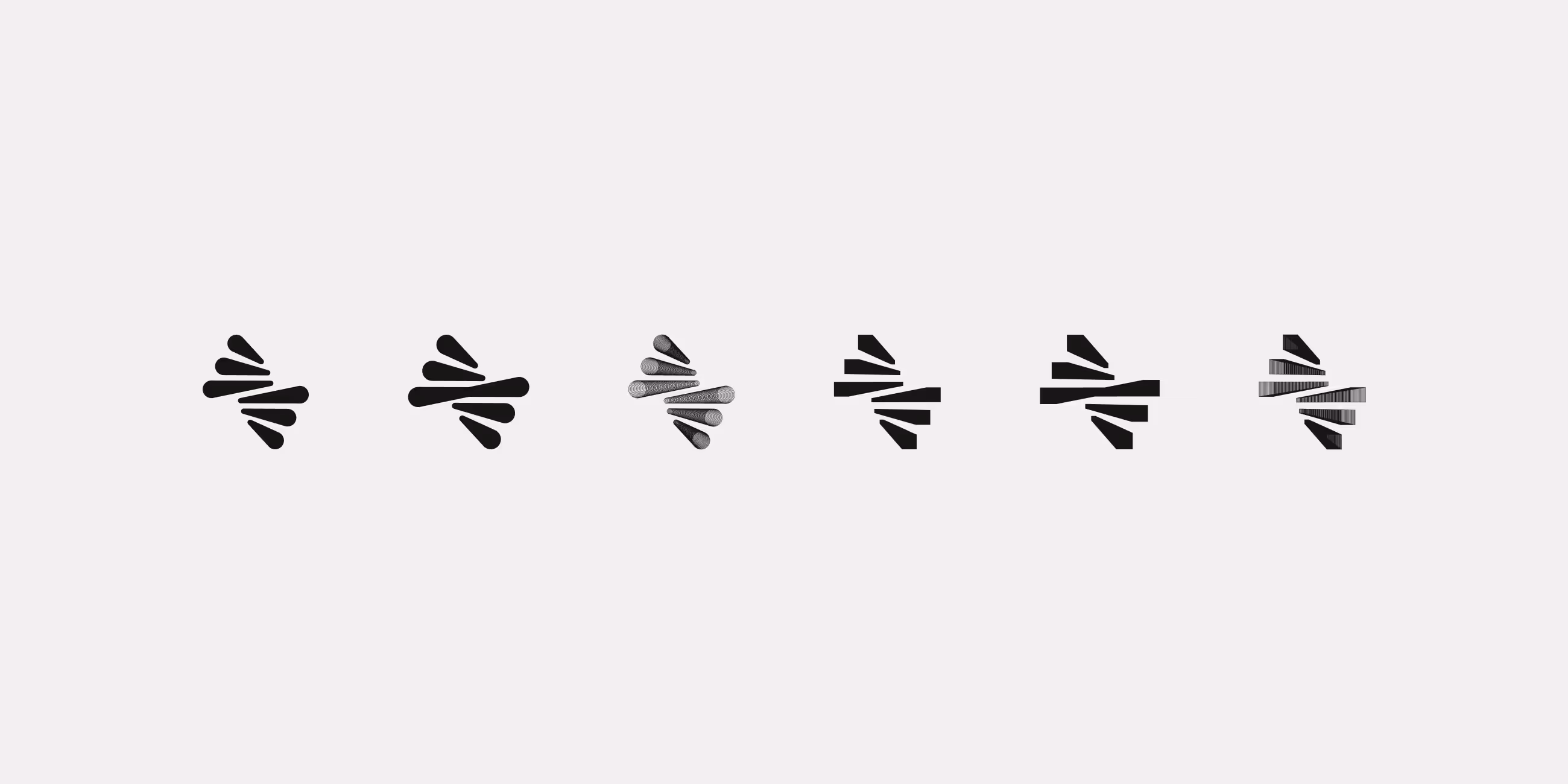
A custom brand pattern we call “Suspension” extends the concept of compounding into the visual system. Floating particles echo ingredients suspended in a solution. Used sparingly, the pattern adds atmosphere and depth without overpowering layouts.
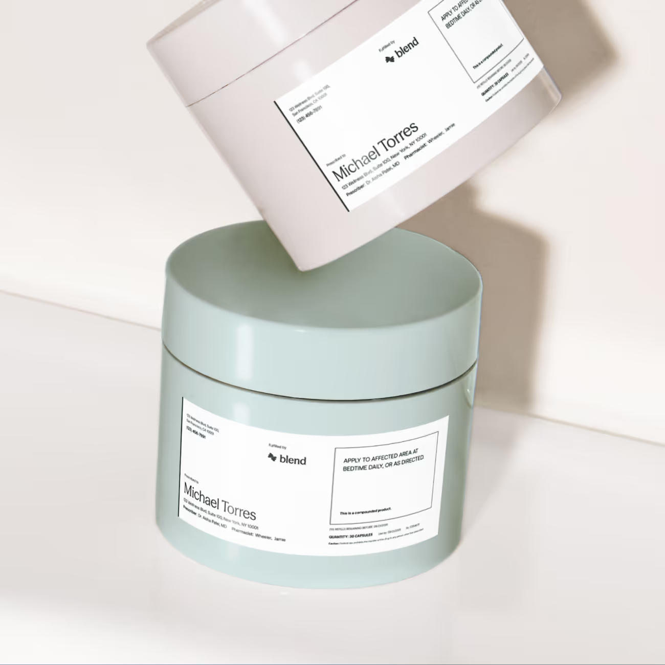
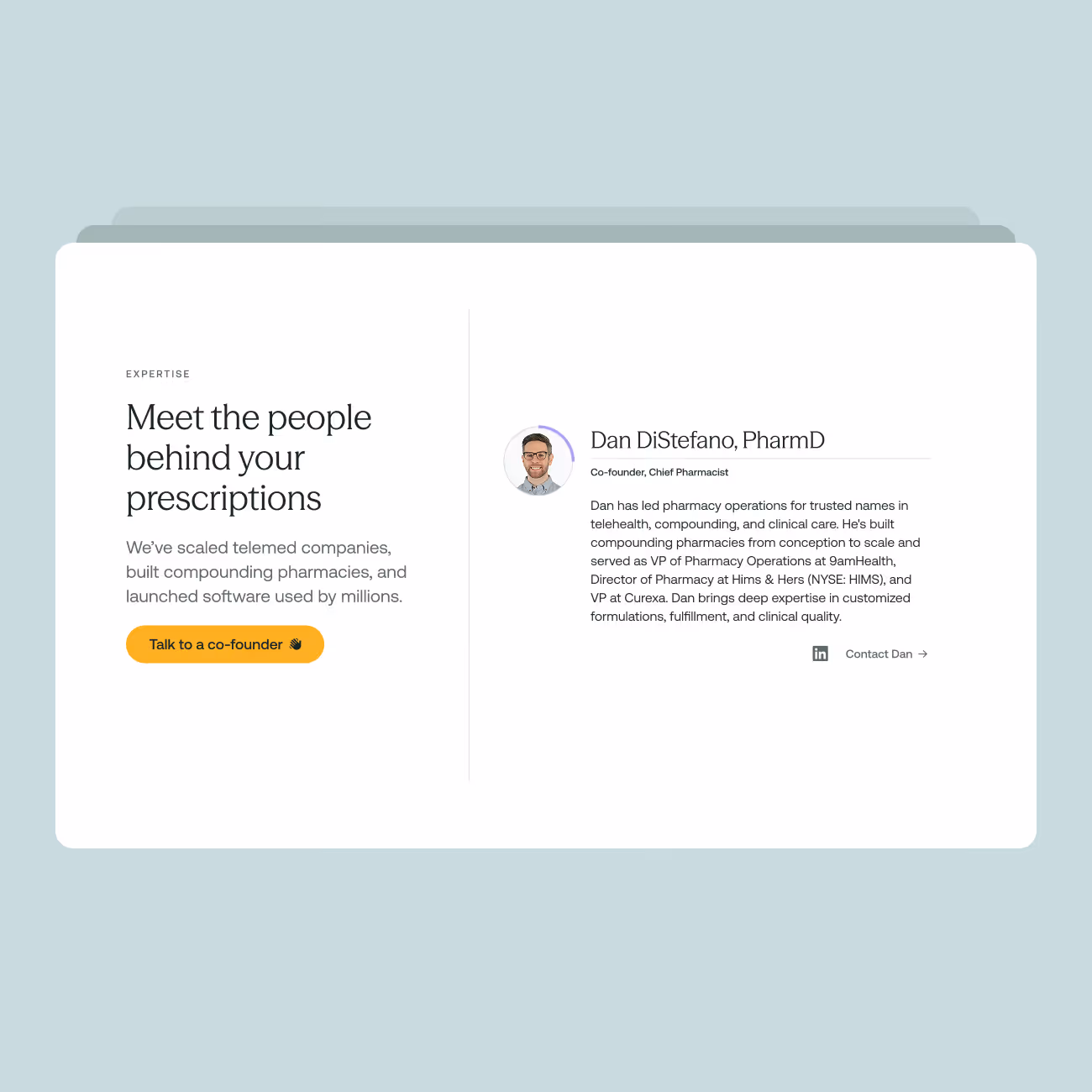
Product visualizations and interface design prioritize simplicity and usability. Layouts are clean, modular, and built for scanning, reinforcing Blend’s focus on clarity and efficiency. Secondary colors are used intentionally to orient users across the platform, with distinct hues assigned to different sections through sidebars, icons, and highlights. This creates intuitive wayfinding while reinforcing structure and cohesion.
Icons are drawn from Font Awesome Sharp, supporting a visual system that feels confident, consistent, and precise across digital touchpoints.