Seamless

Seamless helps go-to-market teams find, connect with, and close their ideal buyers.

The platform combines real-time, verified contact data with sales automation, AI-powered outreach, and revenue intelligence — everything a modern sales team needs to build pipeline and close deals, all in one place.

With over a million users and enterprise clients across the market, Seamless had scale. What it lacked was a brand that matched it. The platform had grown into a full GTM alternative, and the market still hadn't caught up.

Services Provided

Built for closers from day one, Seamless needed a brand as powerful as the platform behind it.

Brand Strategy

Brand Strategy

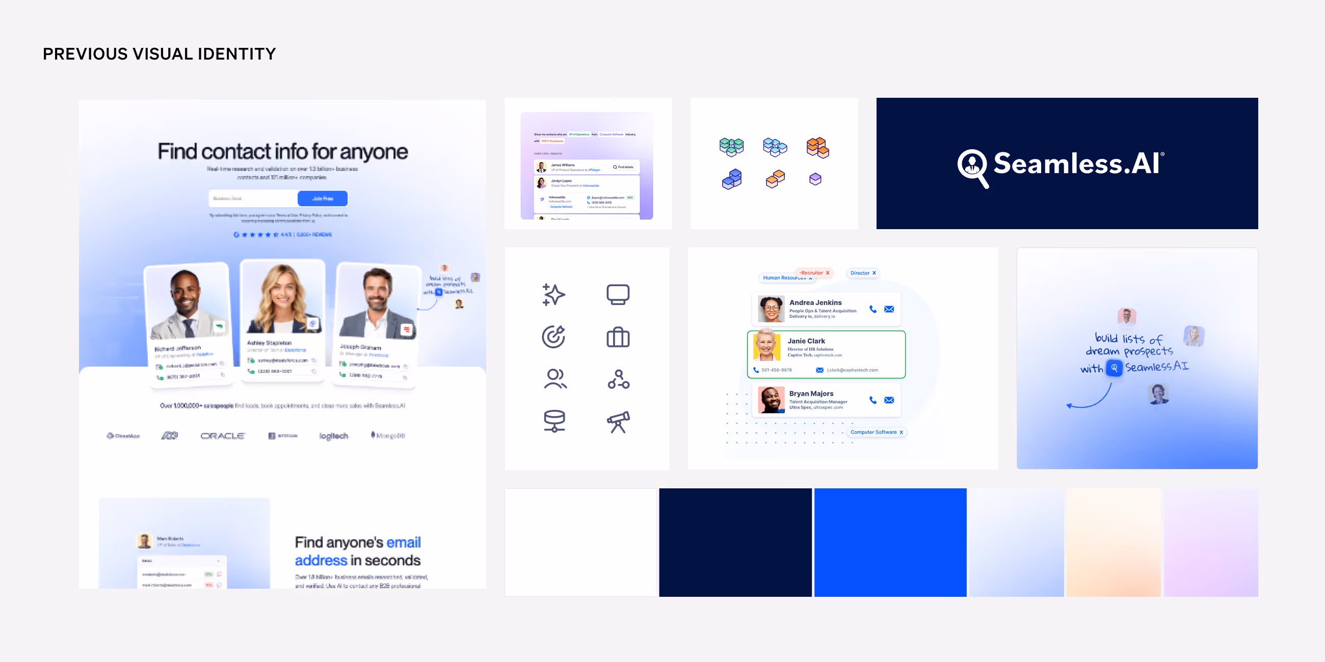
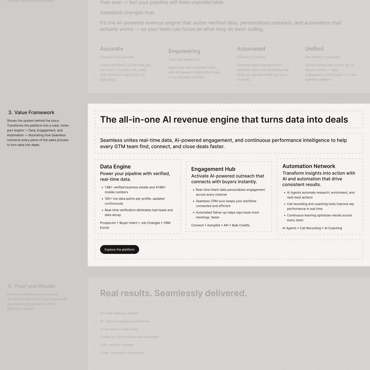
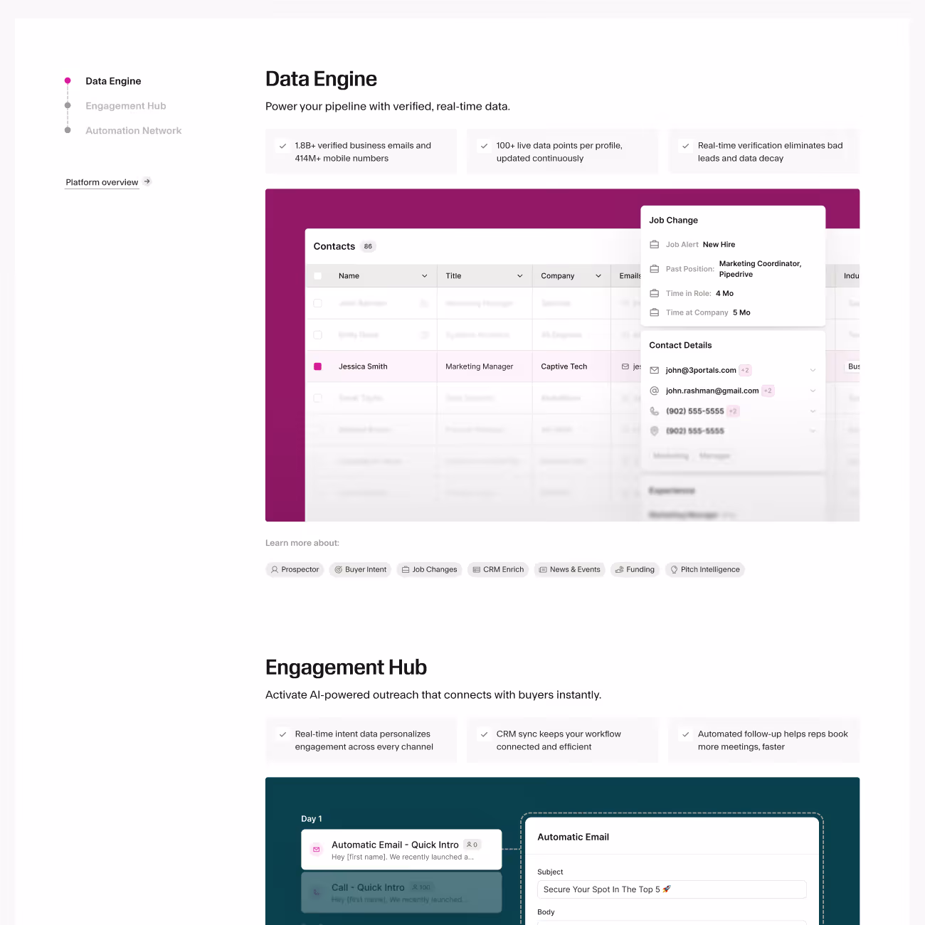
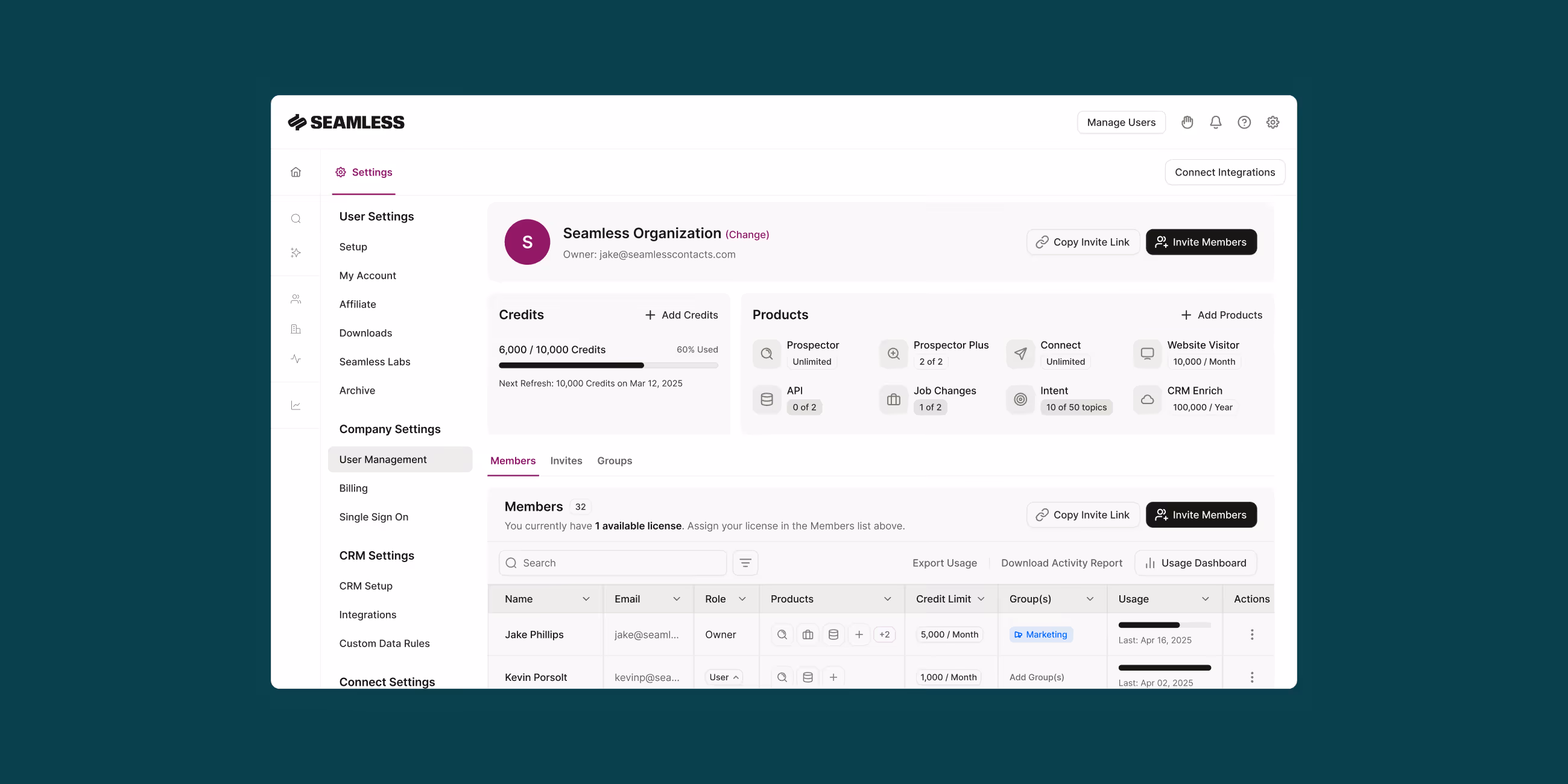
Early positioning leaned into speed and lead volume, and Seamless had long been categorized alongside static contact databases, when the platform had always been something more dynamic: a real-time, AI-powered engine that actively finds and enriches data. Then Seamless expanded into a full-stack GTM platform, combining prospecting, AI sales automation, outreach, coaching, and revenue intelligence into a single system. In a category where most teams stitch together four or five tools to cover that ground, Seamless had built the alternative.

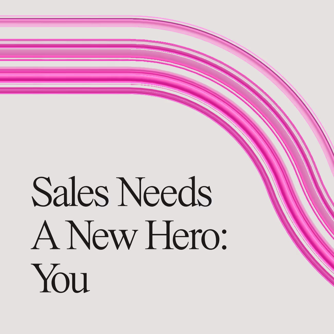
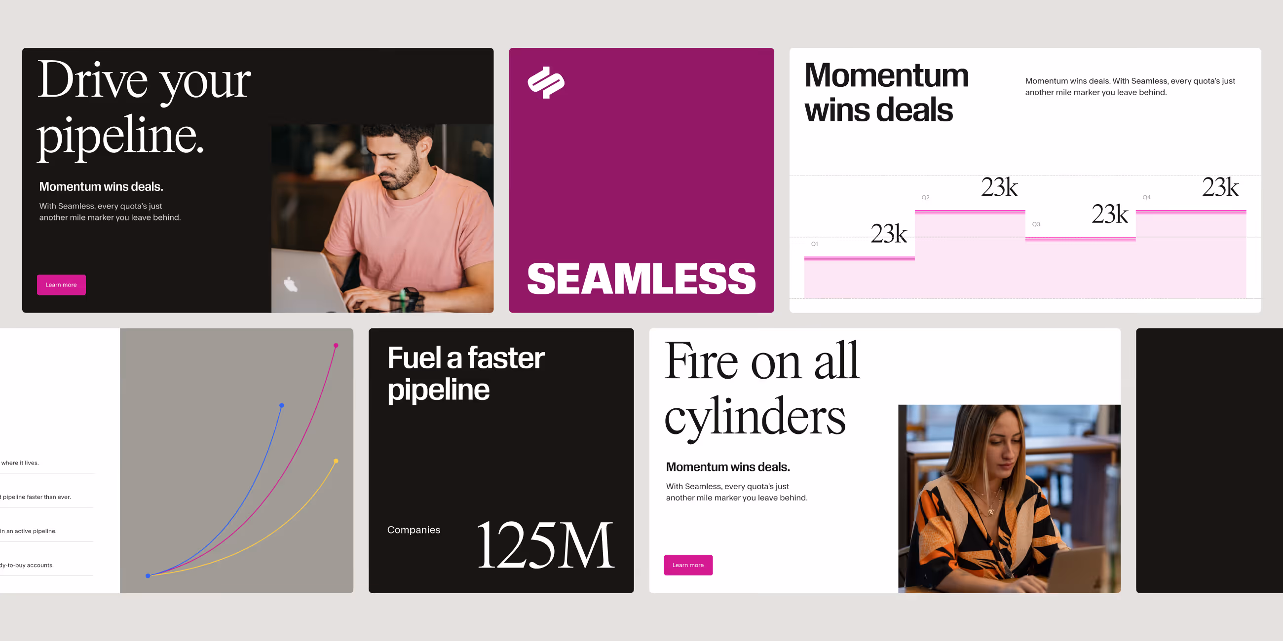
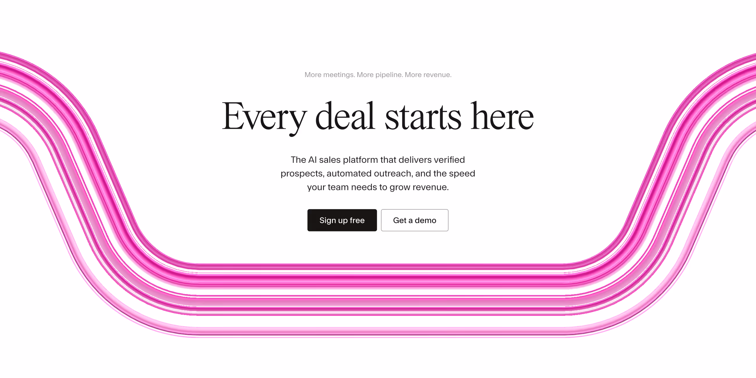
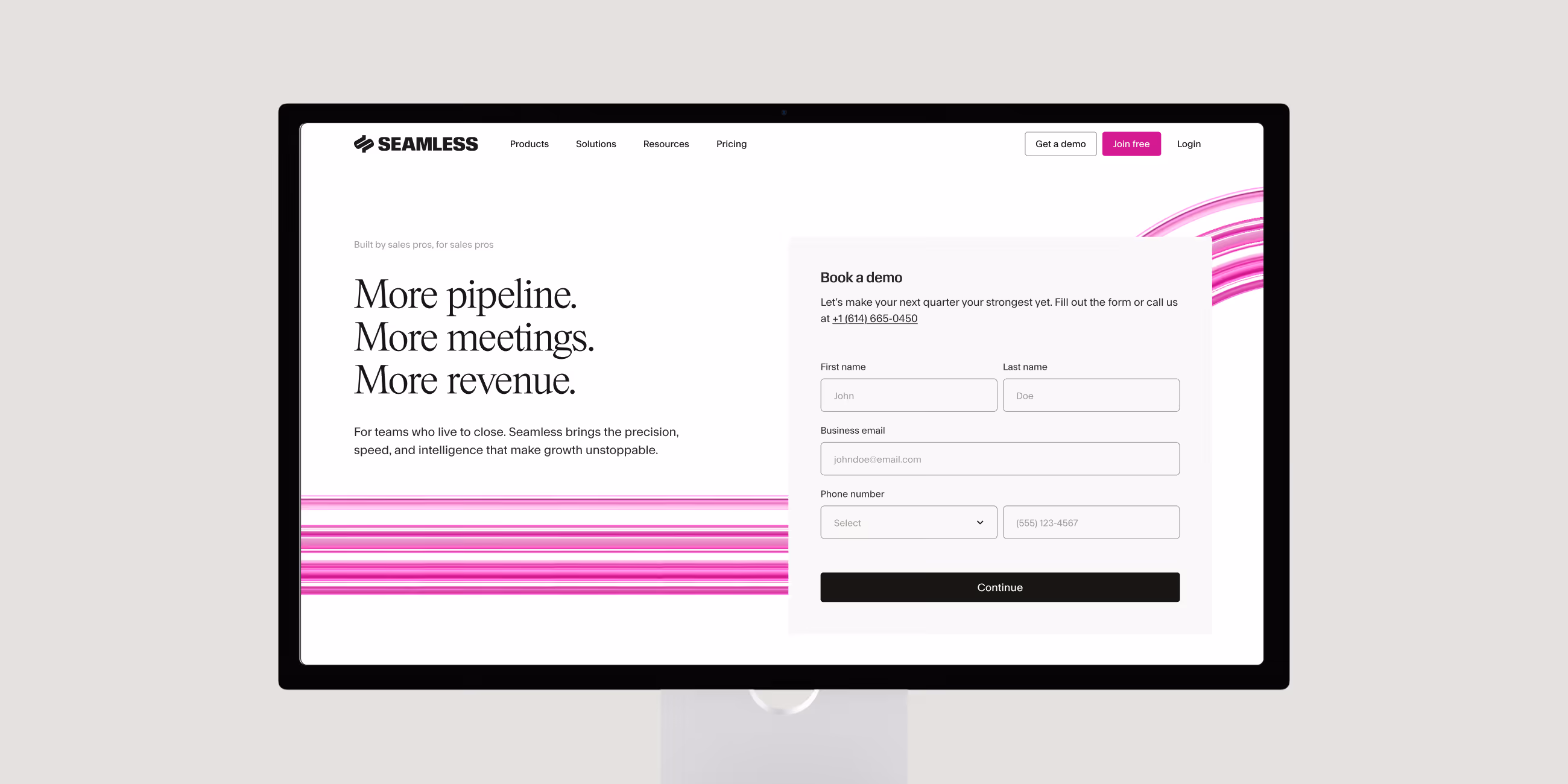
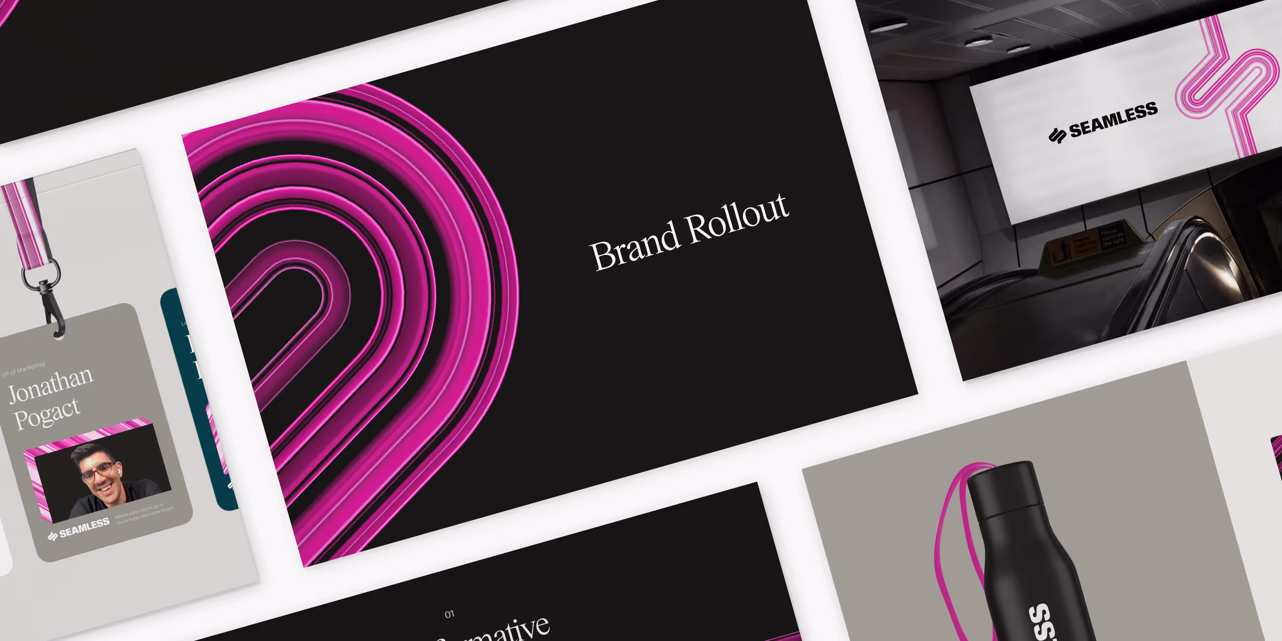
Focus Lab grounded the strategy in the Magician archetype: a brand that transforms outcomes through intelligence and mastery, not just speed. The brand concept, Force Multiplier, became the North Star. Where competitors promised more leads, Seamless promised more of everything that matters: more pipeline, more closed deals, more capability for every rep and leader on the team. Force Multiplier reframed the conversation from a feature to a force.

Seamless's brand attributes are Transformative, Revolutionary, and Upper Echelon, reflecting both that ambition and the audience it serves. Sales teams don't want adequate tools. They want the best ones.

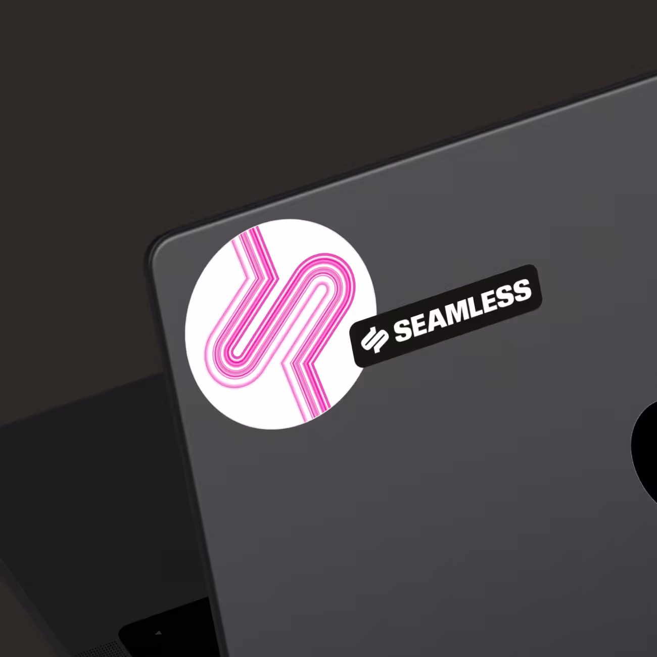
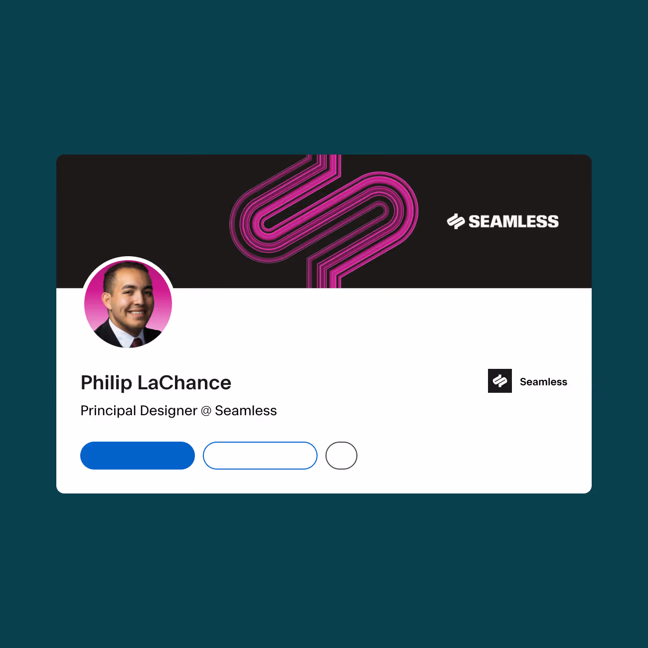
The rename from Seamless.AI to Seamless was a deliberate strategic decision. As AI became table stakes across the category, the suffix stopped functioning as a differentiator and started functioning as noise. Dropping it let the name do what it had always done best: promise clarity and frictionless motion for anyone trying to grow.

Collage showing previous visual identity with Vizard logo on blue background, Poppins font alphabet samples on red background, social media apps with video thumbnails, woman working on laptop, and website homepage with blue theme.
Text listing brand attributes: Effortless, Transformative, Essential on a purple background.

Verbal Identity

Verbal Identity

Seamless’ previous voice skewed toward individual reps, which had served Seamless well in its early growth phase but left strategic stakeholders without a clear signal that this platform was built for them too. The new Brand Messaging Framework we built together speaks to both without compromising either.

The brand voice is captured in S.E.A.M.: Straightforward, keeping communication succinct and clear; Empowering, bringing human expertise rather than technical distance; Ambitious, with the confidence to take bold, opinionated stances; and Mature, grounded in real experience and earned credibility.

That voice carries through a brand story centered on a single reframe: the hero of the sales story isn't the platform, it's the rep, the VP, the founder trying to hit their number. Seamless is the force multiplier behind them. The mission — giving revenue teams AI tools to find the right person, with the right message, at the right time — extends beyond sales to marketing, customer success, and RevOps, making the case that when revenue teams win, the whole business wins.

Collage showing previous visual identity with Vizard logo on blue background, Poppins font alphabet samples on red background, social media apps with video thumbnails, woman working on laptop, and website homepage with blue theme.
Text listing brand attributes: Effortless, Transformative, Essential on a purple background.

Logo

Logo

The logotype is set in a slightly modified version of Review, a typeface originally designed for a high-end editorial context and adapted here with sheared terminals and tightened curves that create dynamic horizontal tension. The result is heavy, direct, and built for impact, a wall of letters that holds its ground at any size.

The mark is where the brand's deeper logic lives. Distilled to its essence, it captures the idea of pipeline, the core of what Seamless delivers, while carrying two quieter references: a nod to seams tied to the name itself, and a hidden dollar sign.

Collage showing previous visual identity with Vizard logo on blue background, Poppins font alphabet samples on red background, social media apps with video thumbnails, woman working on laptop, and website homepage with blue theme.

Visual Language

Visual Language

Magenta is an unusual choice for a sales tech brand, which is exactly the point. In a category that defaults to safe blues and corporate grays, magenta is ownable, high-energy, and impossible to mistake for a competitor.

The display typeface, PS Times, is a sophisticated serif that keeps headlines warm and readable even at scale. Review pulls double duty as the logotype and secondary display face, used for subheads where structure and contrast are needed.

Gradient ribbons, dubbed Streamline, move with velocity and intent. Streamlines capture the motion at the center of the brand: flow, automation, reduced friction. The gradient runs in magenta and gray, magenta leading with momentum and gray grounding it, so every composition balances energy with control.

Diagrams carry real strategic weight in the Seamless system. Rather than generic SaaS explainers, they're built to simplify complex workflows into clear, legible sequences, with a visual language quietly drawn from the brand name itself. Dashed lines inspired by seams and stitching give the system a recurring motif that's felt before it's noticed, connecting every diagram back to the platform's core promise: making it seamless.

Grid of brand guideline slides showing Vizard's visual identity including logo, color palette, typography, and website interface.
Text listing brand attributes: Effortless, Transformative, Essential on a purple background.

Interactive

Interactive

The web work began with lo-fis and interactive writing across key pages, establishing narrative structure and integrating the new verbal identity. The brand story set the template for the homepage. "Sales needs a new hero: You" gave the page its structure, sequence, and stakes of every section.

The page follows a transformation arc from the first scroll. It opens on the customer's reality — disjointed tools, broken data, unpredictable pipeline — then positions Seamless as the guide who fixes it, and lands on empowerment and proof. 

The platform's scope is made legible through a three-part engine: Data, Engagement, and Automation. It shows how Seamless connects every piece of the sales process rather than asking visitors to connect the dots themselves. Testimonials and statistics are placed to validate momentum at the exact moments the story needs them, not grouped at the bottom as an afterthought.

Text listing brand attributes: Effortless, Transformative, Essential on a purple background.
Two side-by-side social media posts from Vizard with purple branding; left post announces team growth with a geometric pattern image, right post shows a woman smiling while talking on the phone.
Text listing brand attributes: Effortless, Transformative, Essential on a purple background.

Brand Activation

Brand Activation

A rebrand is only as strong as its rollout. Focus Lab's team worked alongside Seamless to apply the new identity across dozens of touchpoints, ensuring the brand showed up with consistency and intention from day one.

The work spanned the full range of what a team actually needs: presentation and slide templates, social media graphics, blog covers, email signatures, email templates, Zoom backgrounds, marketplace graphics, and a fully laid out 42-page employee handbook. Employee-facing materials brought the same brand energy inside the organization, so the people building Seamless experienced the brand the same way customers would.

A visual identity without implementation is a style guide that sits in a folder. Our brand implementation work is what closes the gap between guidelines and reality.

Text listing brand attributes: Effortless, Transformative, Essential on a purple background.
Two side-by-side social media posts from Vizard with purple branding; left post announces team growth with a geometric pattern image, right post shows a woman smiling while talking on the phone.
Seamless
Read the next case study