Huntress

Huntress was built for the defenders. Founded by three former NSA operators, the company set out to bring enterprise-grade cybersecurity to the businesses long neglected by the big vendors.

A fully managed platform backed by a 24/7 human-led Security Operations Center, Huntress hunts down threats, deploys solutions, and moves faster than anyone else in the field. 

A decade in, the business had grown well past its origins. The community loved Huntress — operators, MSP partners, and security professionals trusted the brand implicitly. But outside that community, something wasn't landing. 

The identity had drifted. A decade of small decisions — gaps in the guidelines filled in here, a workaround improvised there — had quietly pulled the brand into the same territory as everyone else in cybersecurity, leaving them indistinguishable from dozens of competitors. For a company that had always moved differently, the brand had stopped standing out.

The problem wasn't the foundation. The logo was right. The character was there. What was missing was a visual system expansive enough to carry Huntress beyond the community that already knew them, clear enough to rein in rogue elements, and built with the tools for a growing team to operate confidently inside it.

Services Provided

With a huntress as their logo and a community who loved them fiercely, cybersecurity's best-kept secret just needed a bigger world to fly in.

Expanding the Visual Language

Expanding the Visual Language

The brief was precise: evolve, don't replace. Huntress had real equity in a distinctive mark and a loyal following. The goal was to honor that foundation and build from it. Focus Lab sharpened the core palette and introduced a richer set of visual tools: new accent colors, an expanded tonal range, and an art direction system designed to give the brand genuine room to move.

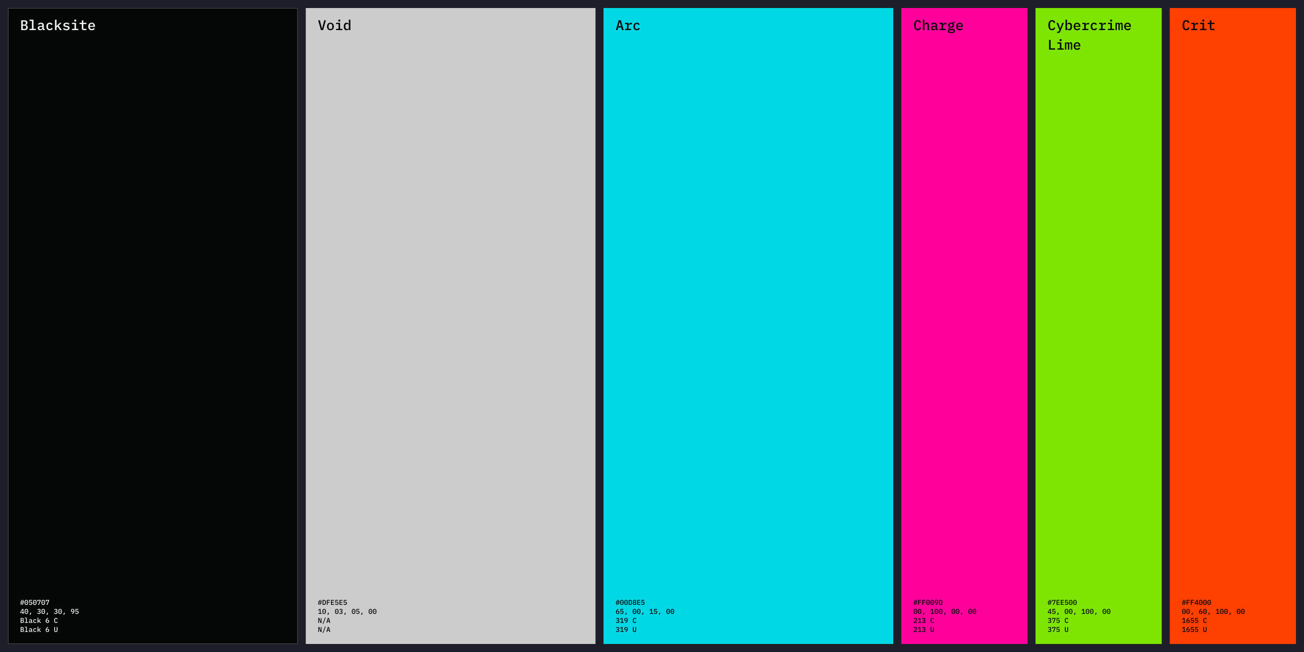
The previous palette centered on teal, now pushed to a brighter, bolder presence. Alongside it, the updated palette brings in a charged magenta, a high-contrast lime green, and a vivid orange. Together, they function less like a conventional brand palette and more like a field of energy — each color purposeful, each one capable of carrying the brand into new territory without losing what made it recognizable. The system supports both dark, high-contrast environments common in the industry and a “light mode” that feels fresh even in the cyberpunk world we’d built. The same identity, with more places to go.

Text listing brand attributes: Effortless, Transformative, Essential on a purple background.
Collage showing previous visual identity with Vizard logo on blue background, Poppins font alphabet samples on red background, social media apps with video thumbnails, woman working on laptop, and website homepage with blue theme.
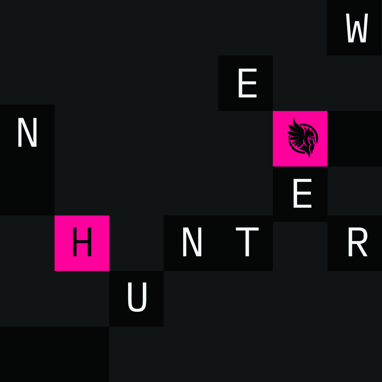
The Matrix is a grid of squares that adds depth, texture, and visual rhythm to a composition.
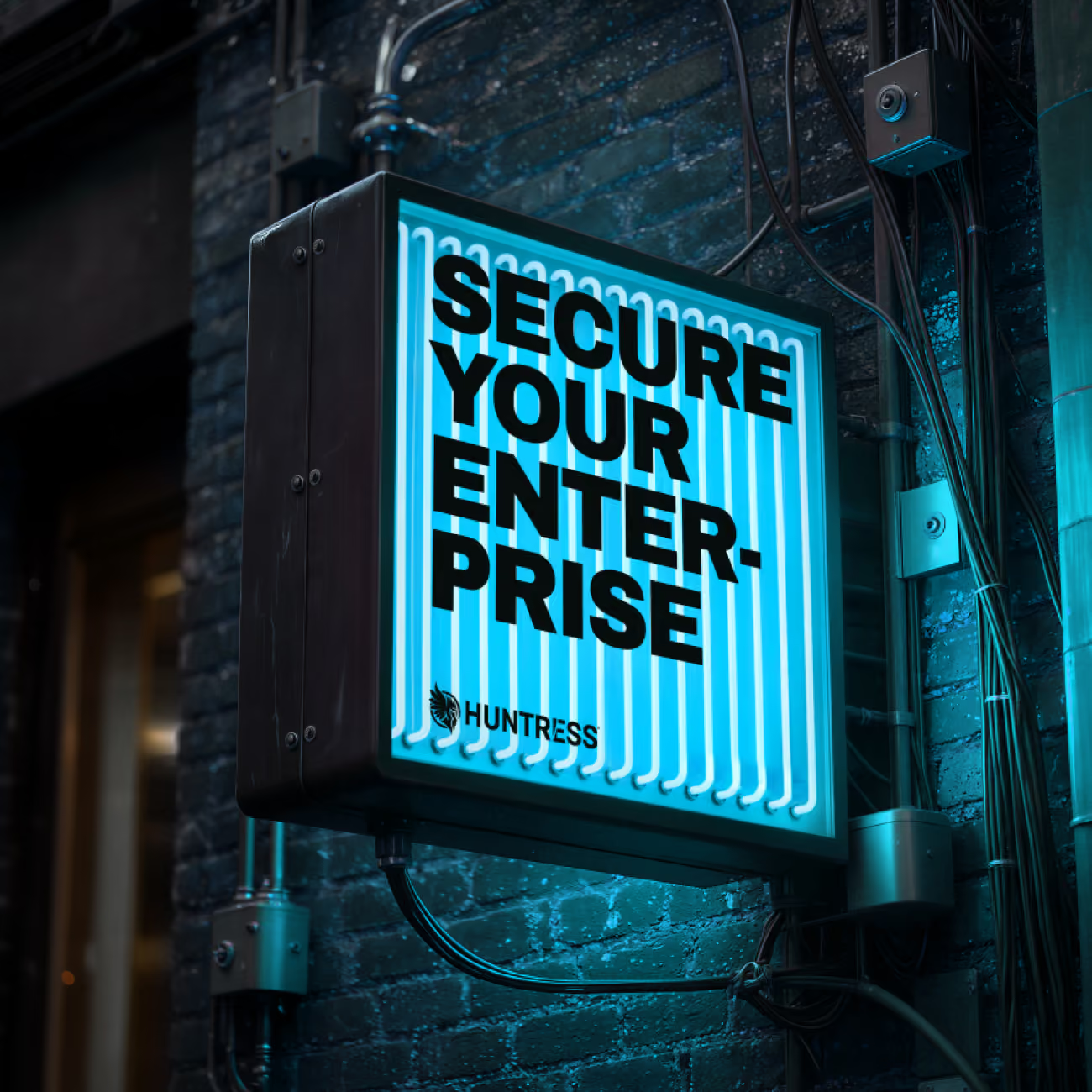
Glowing neon sign on brick wall reads 'SECURE YOUR ENTERPRISE' with Huntress logo below.

Building a Custom GPT for Brand Imagery

Building a Custom GPT for Brand Imagery

One of the persistent challenges at Huntress was imagery. The brand's subject matter — complex hacks, technical infrastructure, the invisible work of threat detection — doesn't translate easily to conventional visuals. The team was often left reaching for overused stock images that didn't quite fit, or skipping them altogether.

Focus Lab's answer was a system, built to think in the brand's own visual language.

Focus Lab developed a custom AI image generation tool: a purpose-built GPT trained on Huntress's full art direction, capable of producing on-brand imagery from a structured token prompt. The tool defines a complete visual world — a cyberpunk-inspired environment with its own lighting, surface textures, and compositional logic, built for Huntress. Any team member, regardless of design background, can call up a token combination and generate an image that belongs.

The token system works like a visual grammar. Scene setting, subject, lighting, composition, color behavior, and mood each have a defined vocabulary — and the defaults are already set to Huntress. A team member might specify an interior scene, a single operator, quiet tension as the mood, and receive an image that looks like it was art-directed from scratch. The system adapts across dark and light modes, giving the team flexibility without sacrificing cohesion.

This is what it means to build for scale. A brand is only as strong as the people executing it every day, and most teams don't have a designer at arm's reach every time they need an image. The AI generation tool closes that gap — not by automating creativity, but by encoding it. The art direction lives in the instructions. The judgment lives in the system. The Valkyrie flies wherever the team takes her.

Huntress's brand attributes — Audacious, Genuine, and Systematic — are embedded in how the tool works. The imagery it produces doesn't hedge. It doesn't blend in. It shows up with the same confidence the brand has always claimed, through a process that is measured, repeatable, and built to last.

Pick your tokens ↓

Composition
Environment
Lighting
Dark / Light
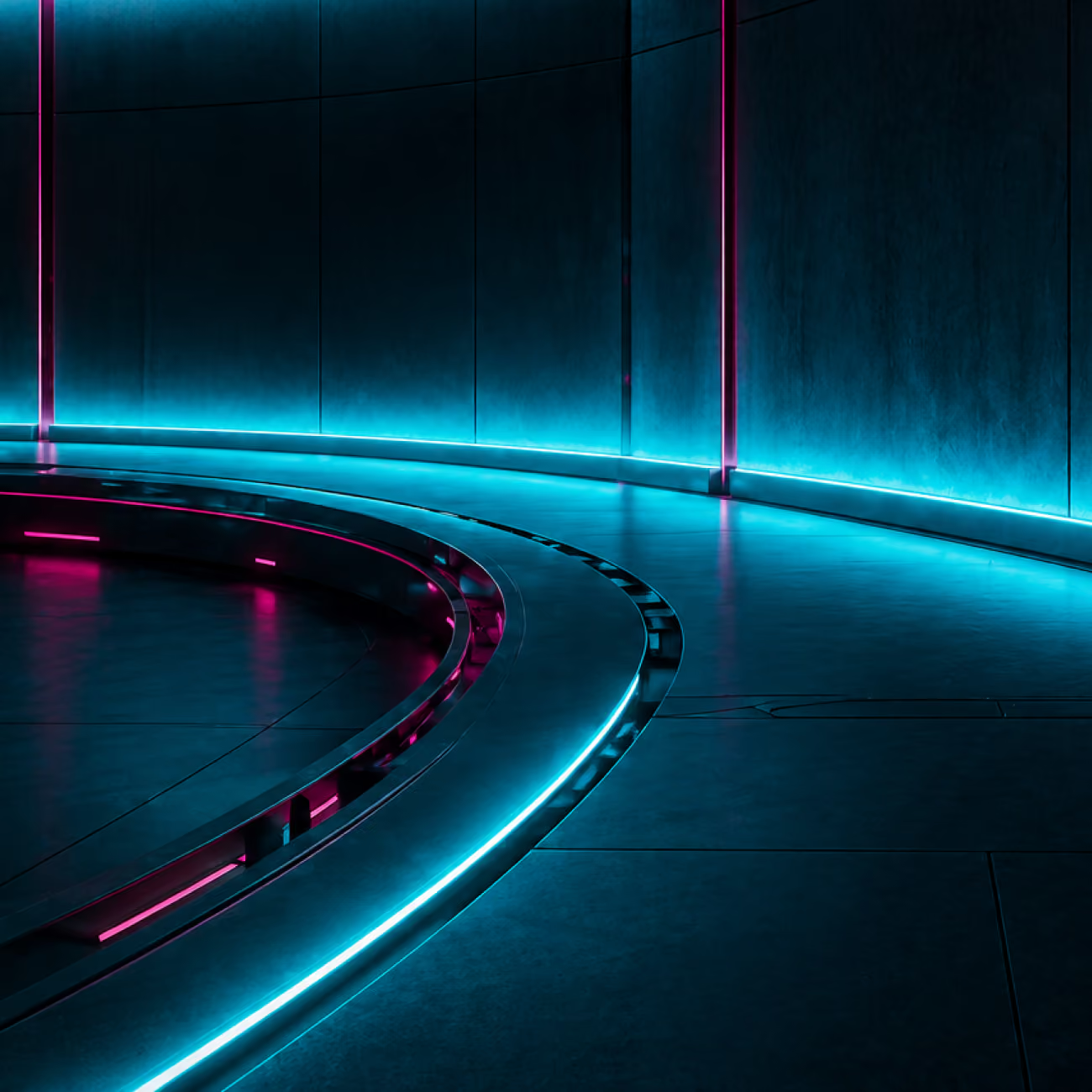
AI-generated on-brand image from the Huntress custom GPT

mid-scene · interior · perimeter · dark

Curved futuristic hallway with blue and pink neon lighting along walls and floor edges.
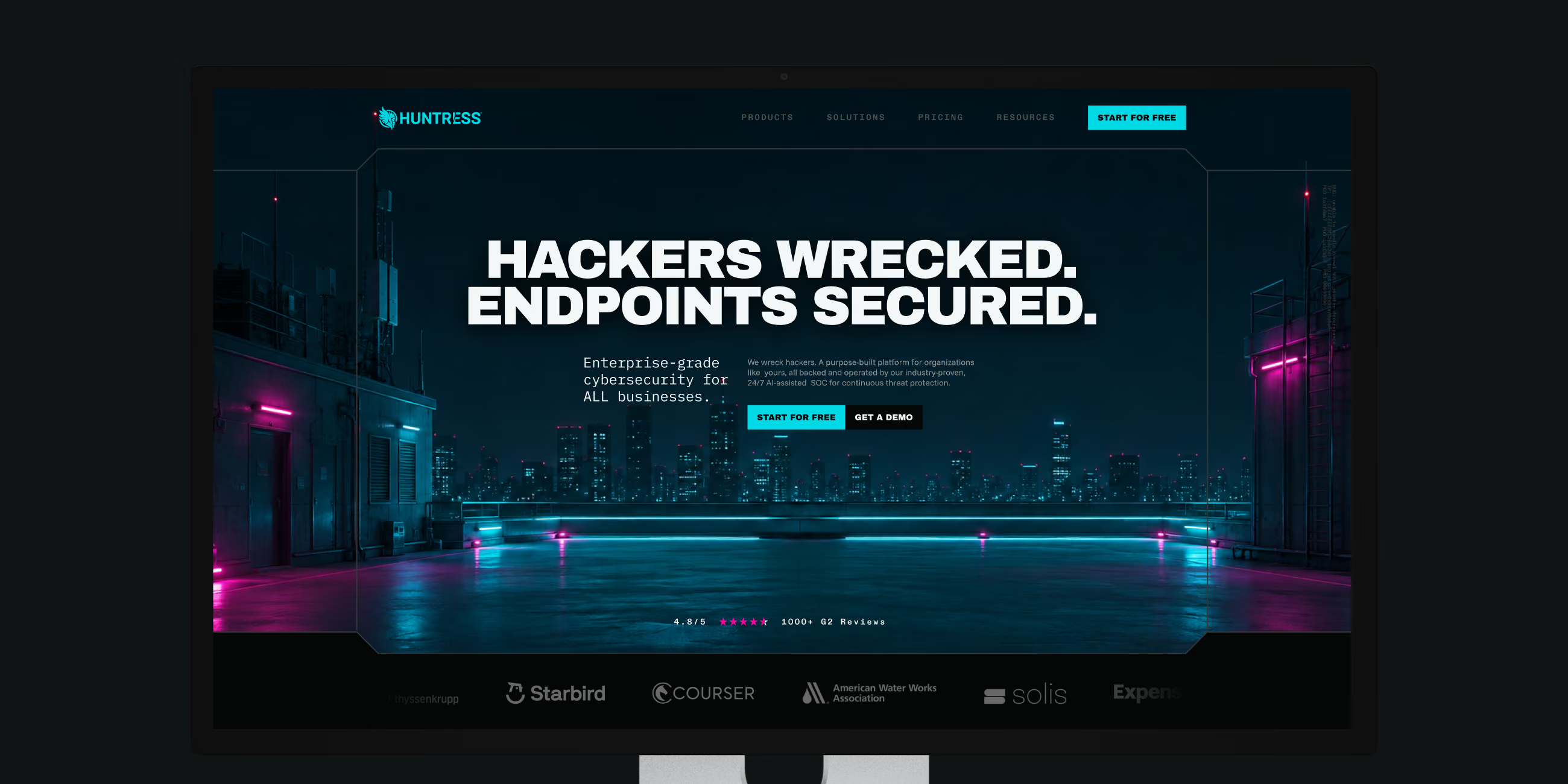
Cybersecurity website homepage with text 'Hackers wrecked. Endpoints secured.' and cityscape background.
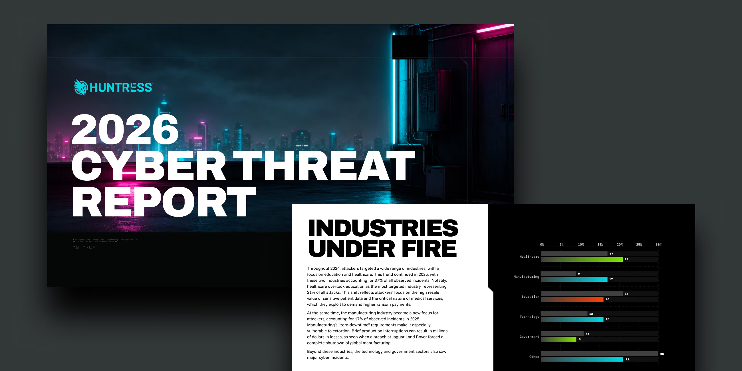
2026 Cyber Threat Report overview with text on industries targeted and a bar chart of cyber attack percentages.
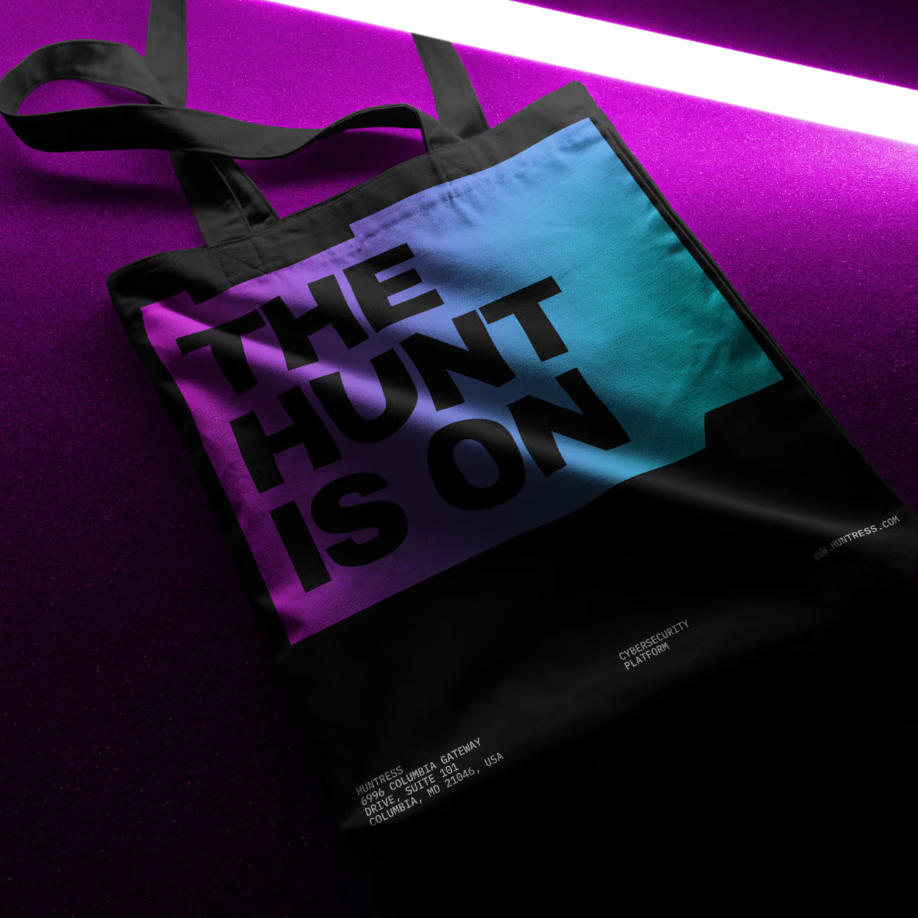
A tote bag with "The Hunt Is On"
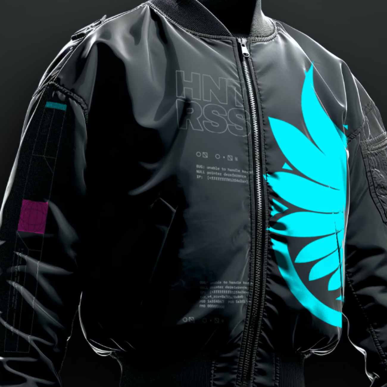
A bomber jacket with the Huntress logo
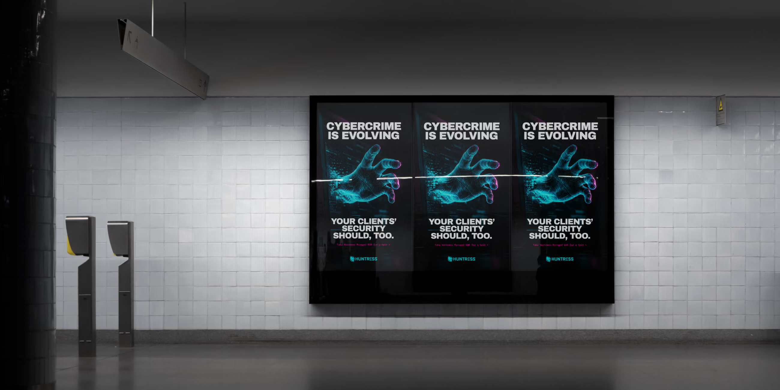
Three digital posters in a subway say 'Cybercrime is evolving. Your clients' security should, too.'
Read the next case study