CData

CData connects a company’s data to the tools that depend on it: reporting dashboards, custom applications, and, more and more, AI.

The company started in 2016 with a focus on solving one problem well. It has since built connectors for hundreds of systems, and thousands of organizations rely on them, including Microsoft and Palantir.

Then AI changed what connectivity means. Every AI tool a company deploys needs reliable access to its data. Almost overnight, the thing CData did best became the thing everyone building with AI needed. But its brand was still positioned as a traditional data integration company, which made it easy to overlook. CData’s story was bigger than the story its brand was telling.

Services Provided

AI made CData’s work essential. While others raced to bolt it on, CData had spent years building its foundation, and the brand had to show it.

Black uppercase text 'CDATA' on a bright yellow background.
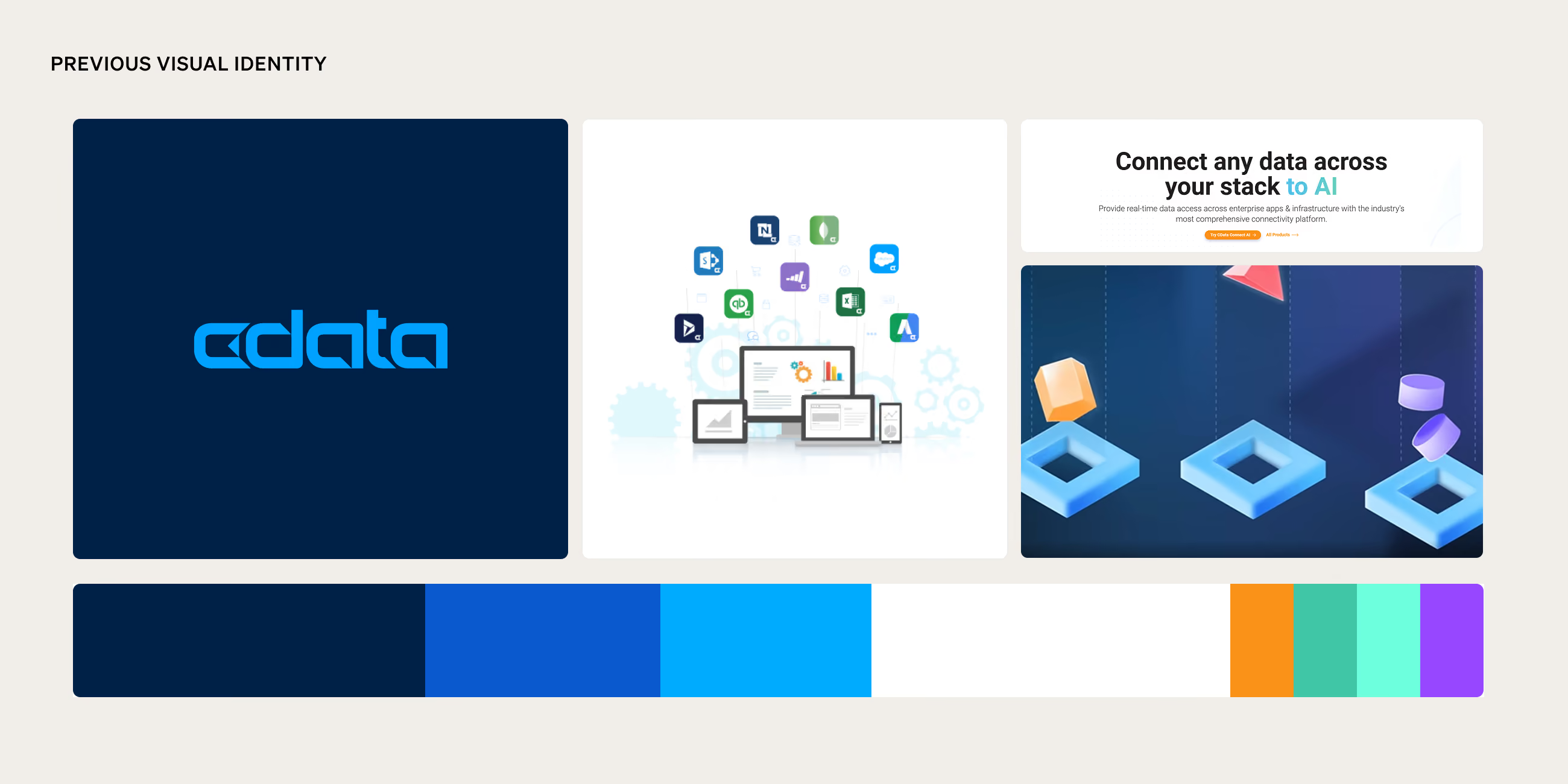
Collage showing previous visual identity of CData including the CData logo in blue on a navy background, a graphic of various data and software icons flowing into multiple devices on screens, a tagline reading 'Connect any data across your stack to AI', and a 3D abstract illustration of geometric shapes above blue squares, alongside a color palette bar featuring dark blue, royal blue, cyan, white, orange, teal, mint, and purple colors.

Brand Strategy

Brand Strategy

CData’s messaging led with integration and business intelligence. Its most AI-relevant work, like MCP servers, semantic layers, and live data access for agents, sat several layers down. But enterprise AI usually fails somewhere less visible: in the infrastructure that connects models to the data they need.

‍

That became the brand concept: Every layer beyond the surface. Other AI tools treat the surface. CData shows and solves every layer beneath it, and turns what’s usually hidden into the main event. The concept also reframed CData’s history. A decade of engineering production-grade connectivity stopped looking like legacy and started looking like proof, so AI became the next chapter of what CData had always done.

‍

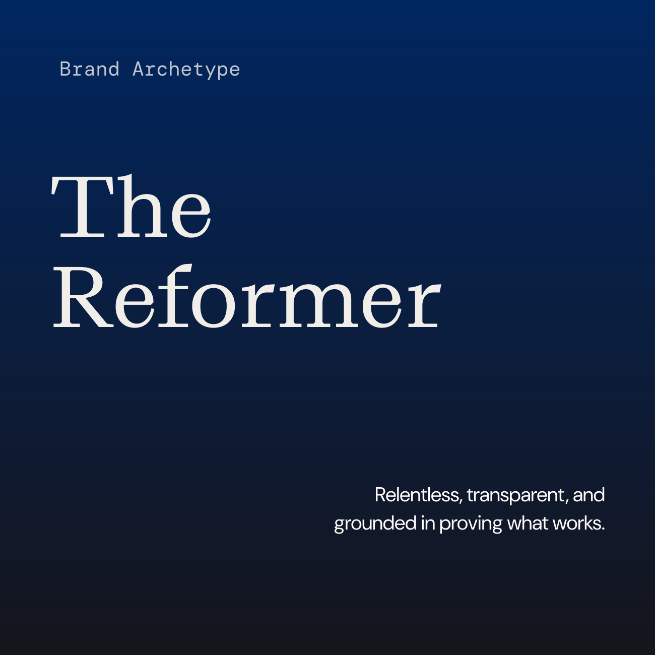
CData’s brand attributes are Cutting-Edge, Catalyst, and Technical. Its archetype, The Reformer, is relentless, transparent, and grounded in proving what works. Together they cast CData as a company that pushes the industry forward without giving up the stability enterprises rely on. The strategy came down to two lines: connectivity as infrastructure, and data access meets the AI era.

Modern office space with a large yellow archway featuring a built-in cushioned seat with pillows, several desks with computers and ergonomic chairs, mid-century style armchairs around a small coffee table, wood paneling on walls, concrete pillars, large windows, polished concrete floors, green plants, and gold starburst pendant lights.
Dark blue gradient background with text 'Brand Archetype' in small font, 'The Reformer' in large font, and below this, a phrase reading 'Relentless, transparent, and grounded in proving what works.'

Verbal Identity

Verbal Identity

CData’s old voice was accurate and credible, but it kept readers at arm’s length. It led with the platform and its features, and it often let technical terms do the explaining.

‍

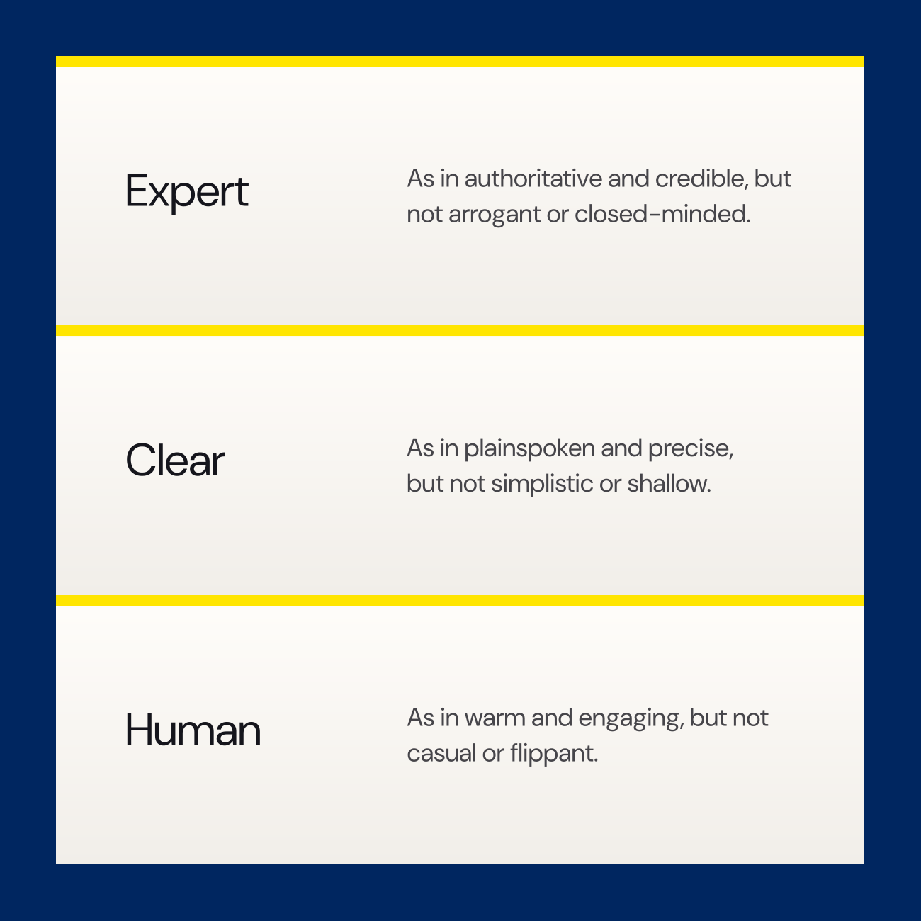
CData’s new brand voice is Expert (authoritative and credible, but never arrogant), Clear (plainspoken and precise without being shallow), and Human (warm and engaging, with a touch of wit that makes complex ideas easier to follow).

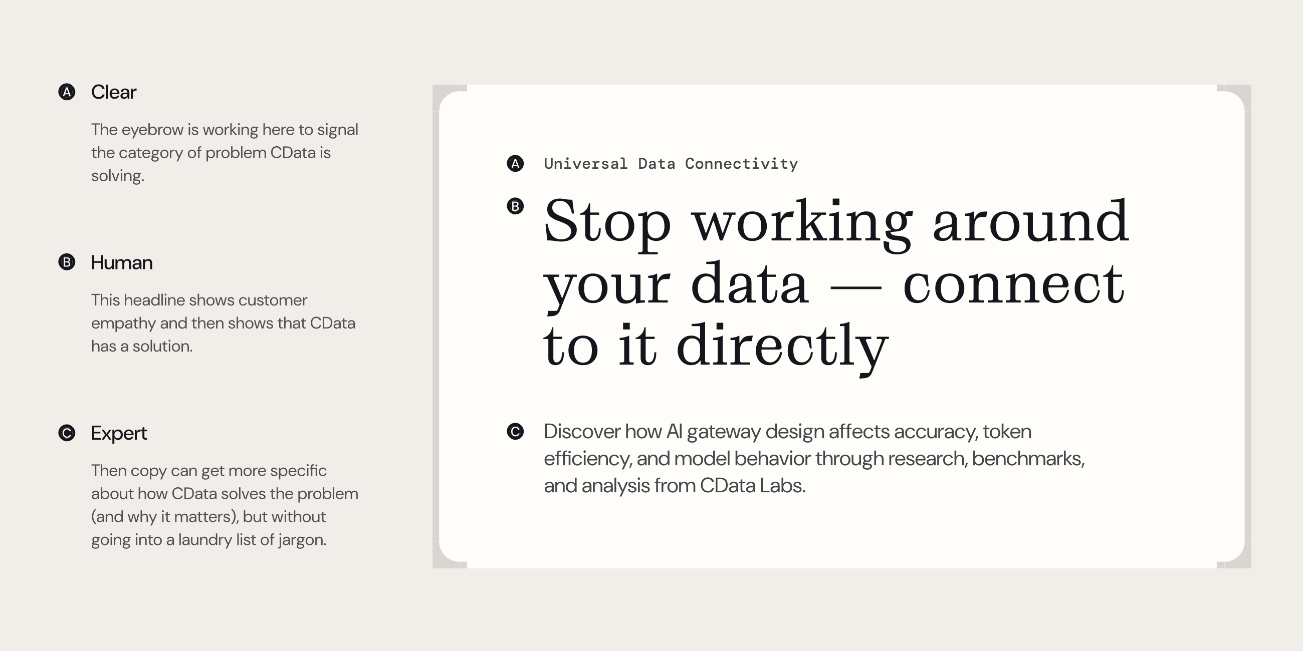
In practice, the writing starts with the customer’s problem before it gets to the product. Big-picture pages stay plainspoken, and the technical depth waits further in, where readers go looking for it. That restraint does its own work. Saying less up front shows that CData knows what matters most. One clean, jargon-free line shows how the new system shifts the focus: Built for data that has to be right.

Diagram with three labeled sections describing content clarity levels: Clear explains the eyebrow signals the problem category CDATA solves; Human shows a headline expressing customer empathy and CDATA's solution; Expert details how copy specifies CDATA's problem-solving without jargon. Beside it, a card displays text: Universal Data Connectivity, headline 'Stop working around your data — connect to it directly,' and description explaining how AI gateway design impacts accuracy, token efficiency, and model behavior based on CDATA Labs research.
Three horizontal sections with yellow borders on a white background against a dark blue backdrop. Each section contains a word and a description: Expert - as in authoritative and credible, but not arrogant or closed-minded; Clear - as in plainspoken and precise, but not simplistic or shallow; Human - as in warm and engaging, but not casual or flippant.
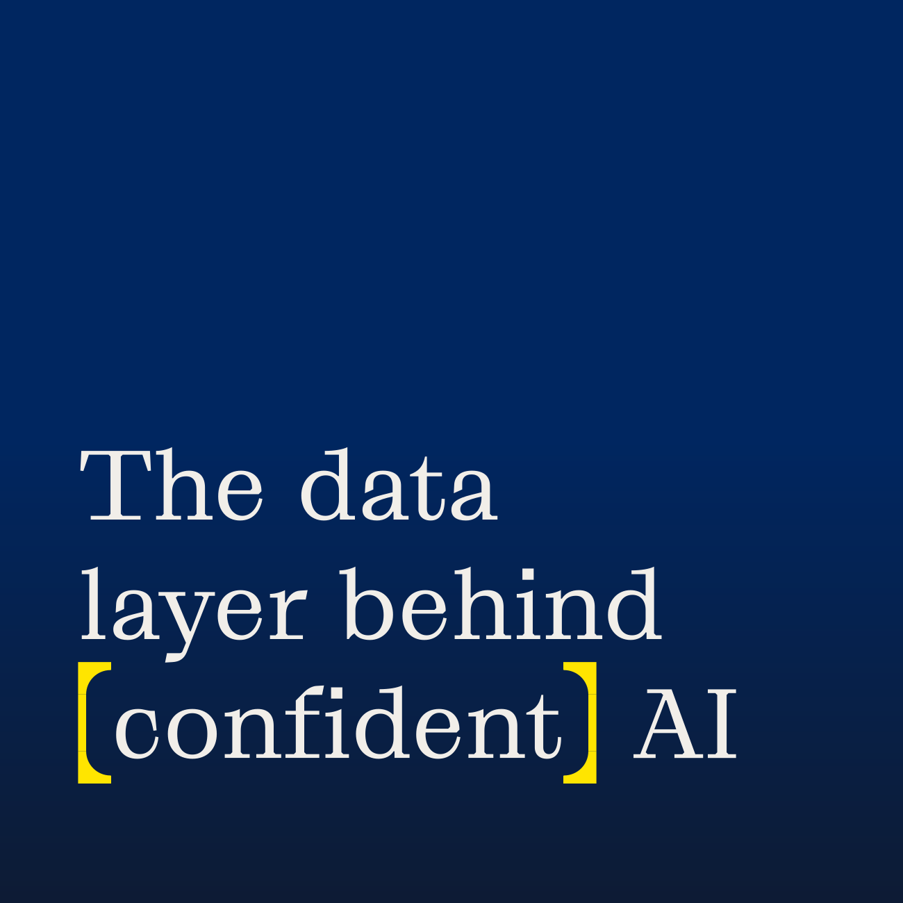
Text on a dark blue gradient background reading: The data layer behind [confident] AI, with the word 'confident' highlighted by yellow brackets.

Logo

Logo

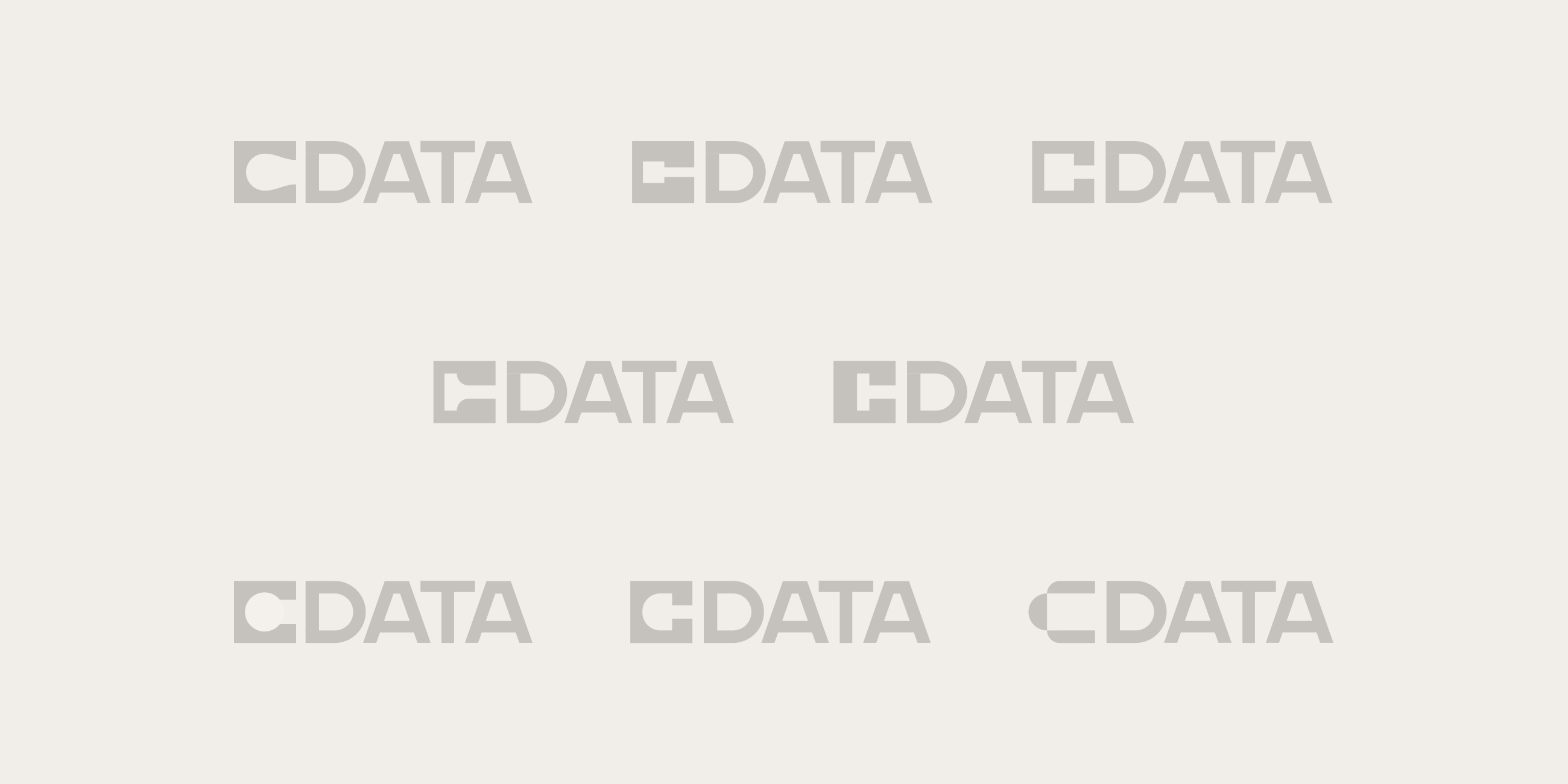
CData asked for a logotype that was unmistakably readable, with a supporting mark only if it earned its place. The answer started with the C: simplified into a solid block with a rounded cut, it reads as a building block, a nod to the modular systems CData assembles for its customers. It leads the wordmark, and pulled out on its own, it becomes the logomark.

‍

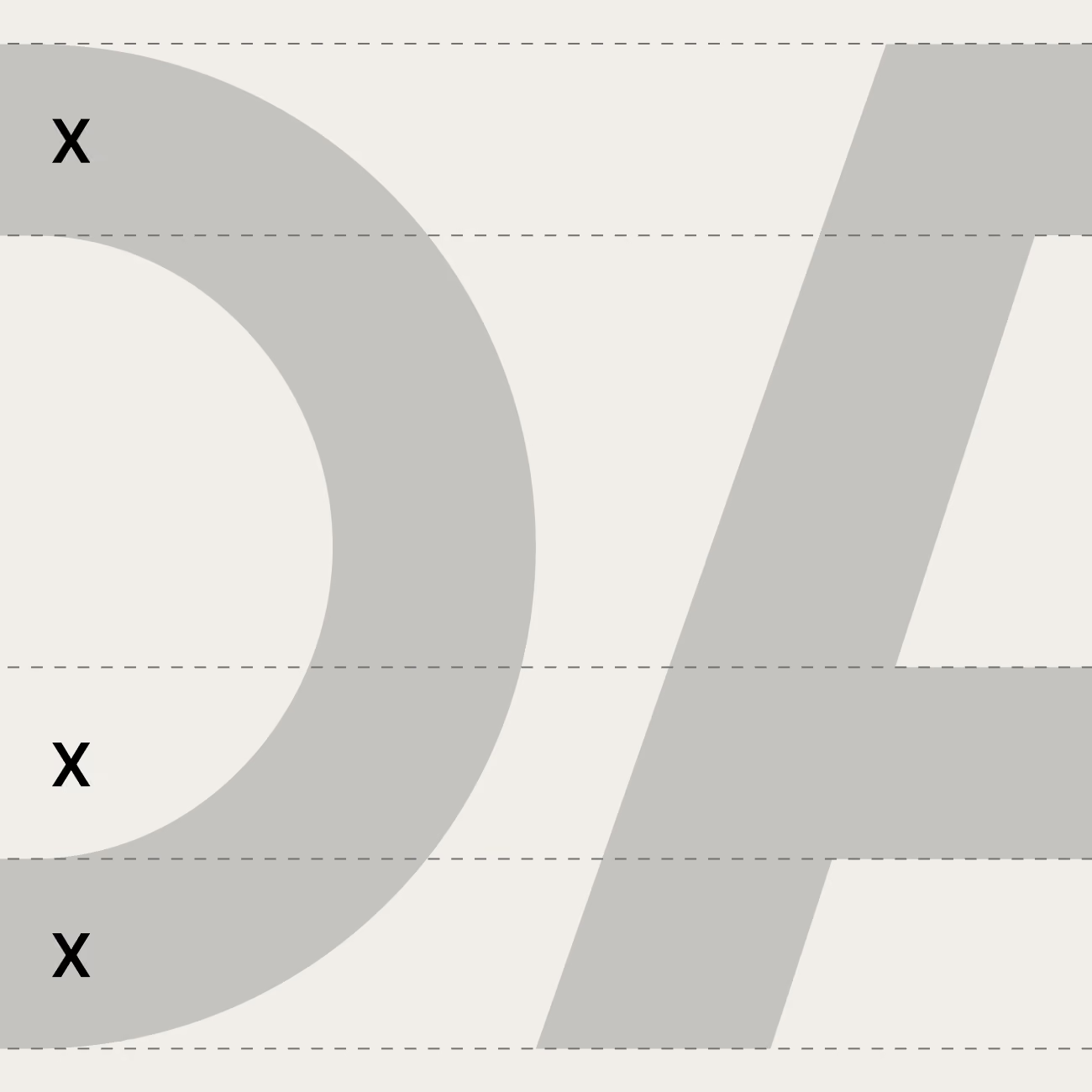
Later rounds tested several alternate versions of the C. None held up as well as the original, so the work went into refinement. Cutting the C deeper protects its form and keeps it legible at small sizes. The D, A, and T were rebalanced around it, with stroke weights and crossbars aligned to a shared geometry. The result reads as one engineered unit rather than a name set in type.

‍

Various stylized logo designs for the text 'CDATA' arranged in three rows on a neutral background.
Zoomed-in partial view of a logo with large light gray letters 'C' and 'A' on an off-white background, with three small black 'X' marks placed around the 'C'.
Black stylized 'C' shape inside a yellow square centered on a dark blue to black gradient background.
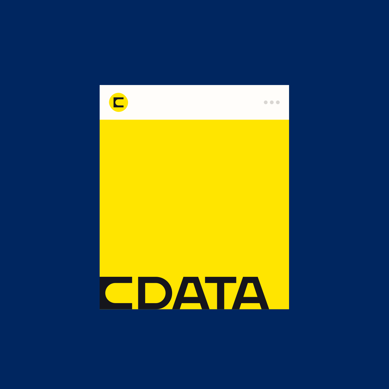
A square logo with a bright yellow background and a white bar at the top featuring a smaller yellow circle with a stylized black letter 'C' inside it; the bottom portion shows part of the bold black text 'CDATA' extending partially out of view.
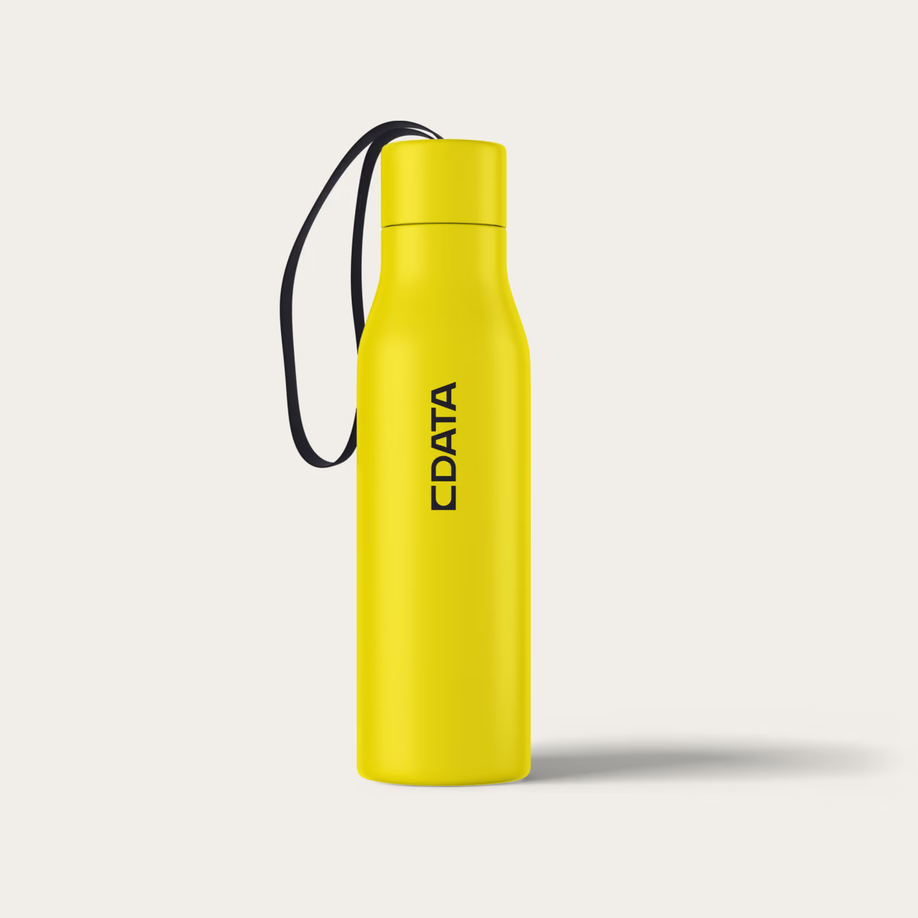
Yellow water bottle with a black strap attached, featuring the word CDATA vertically printed in black on the side.

Visual Language

Visual Language

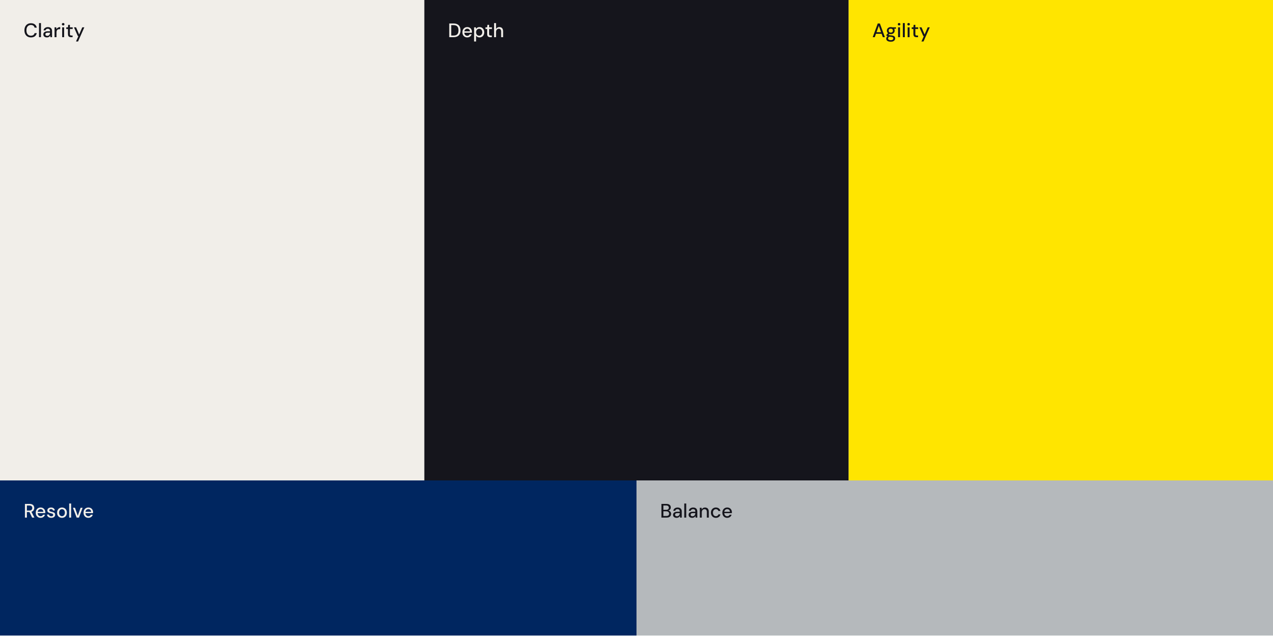
The palette starts with warmth. A warm off-white and a near-black form the foundation, giving CData a human edge in a category that almost always defaults to cold, clinical blues. An electric yellow creates sharp contrast at the moments that matter, and it’s used sparingly so it never loses its charge. Blue still has a place, because it carries years of CData’s history. The palette keeps a deep navy in a supporting role, stripped of its green undertone so it reads more confident and more trustworthy. A cool gray adds balance and helps the system scale.

‍

Grafier leads the type system, and its connected serifs build the idea of connection into the letterforms themselves. DM Sans handles body copy and headings. DM Mono adds the technical texture of code to eyebrows and callouts, a signal developers recognize at a glance.

‍

The brackets come straight from the logomark. They frame compositions, highlight key phrases, and group related content without fully enclosing it, so the structure stays visible and the content stays open. Data visualizations show connectivity through nodes, pathways, and containers. They stay abstract on purpose, explaining how systems relate without turning into schematics. Portraiture gets the same treatment: clean framing, controlled light, and bold fields of brand color. The look feels dependable, and the color keeps it current.
Color palette with six rectangular blocks labeled with traits: a light beige block named Clarity, a dark gray block named Depth, a bright yellow block named Agility, a dark blue block named Resolve, and a light gray block named Balance.
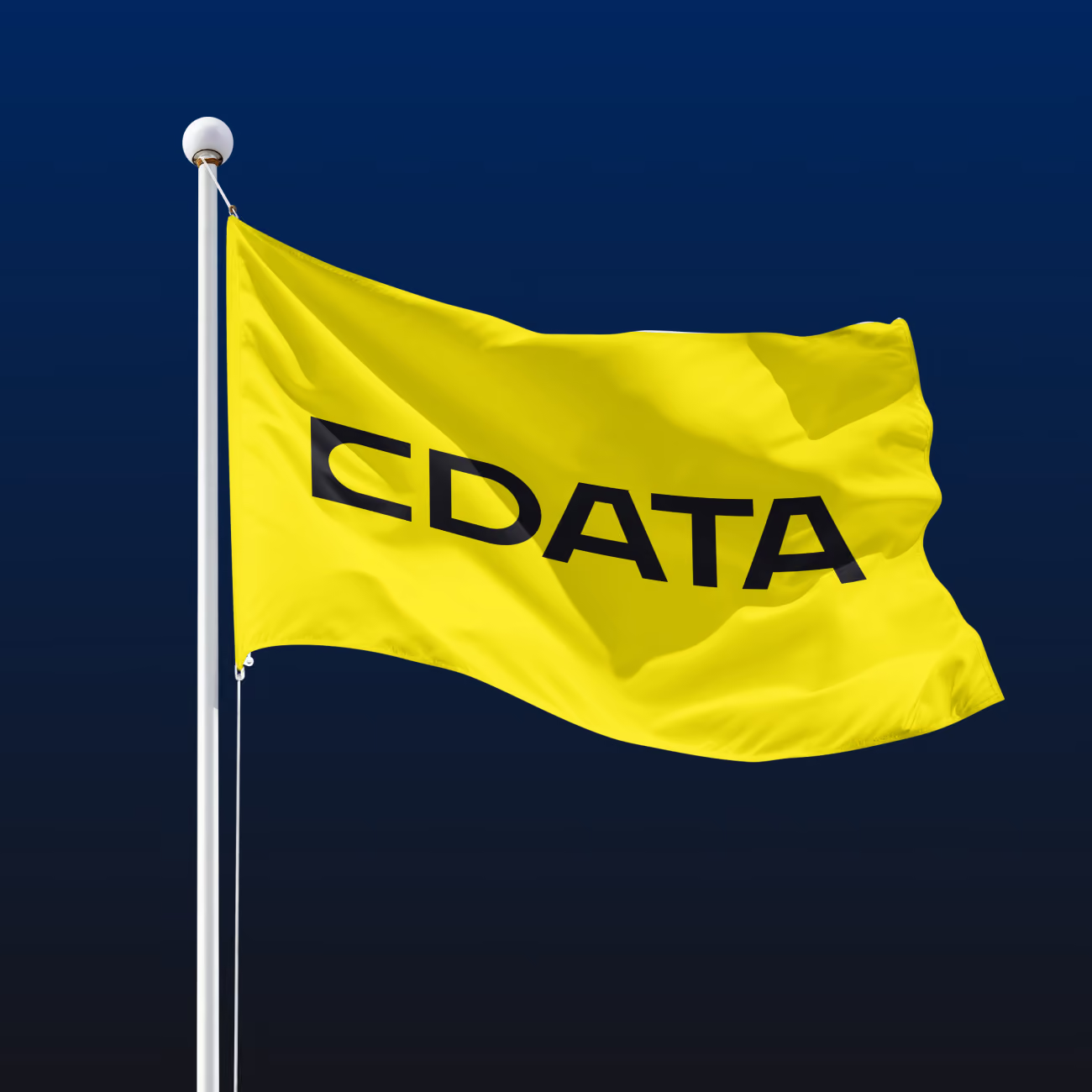
Bright yellow flag with the black text 'CDATA' waving on a white flagpole against a dark blue sky.
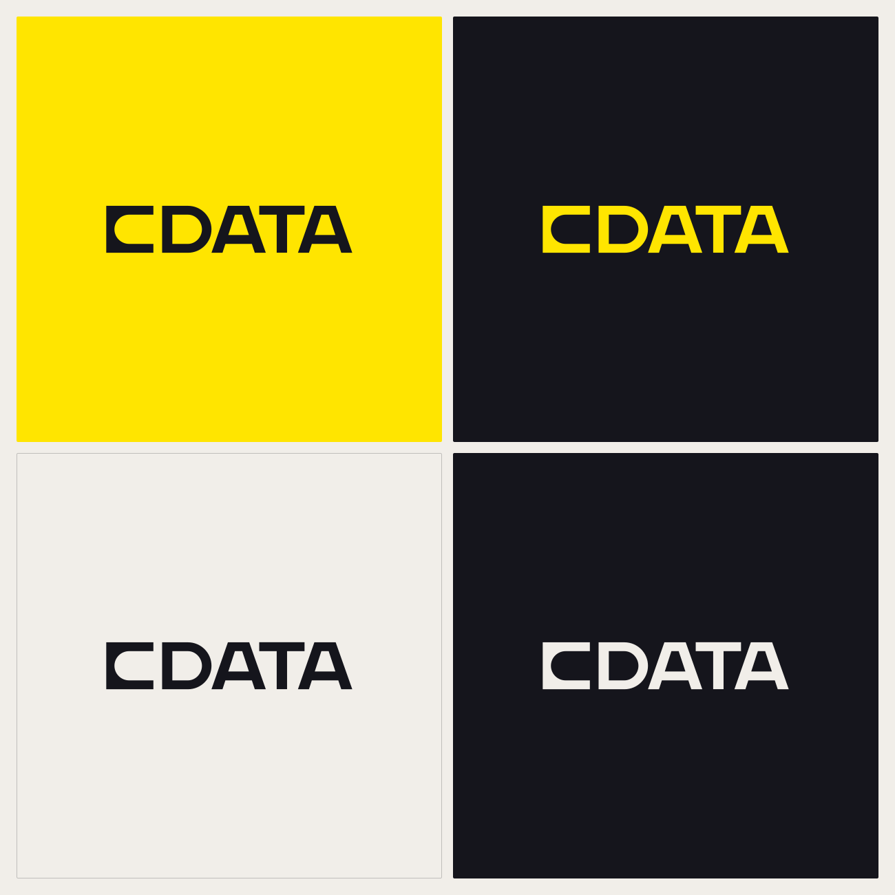
Four versions of the CData logo displayed in a 2x2 grid: top-left with black text on yellow background, top-right with yellow text on black background, bottom-left with black text on light gray background, and bottom-right with light gray text on black background.
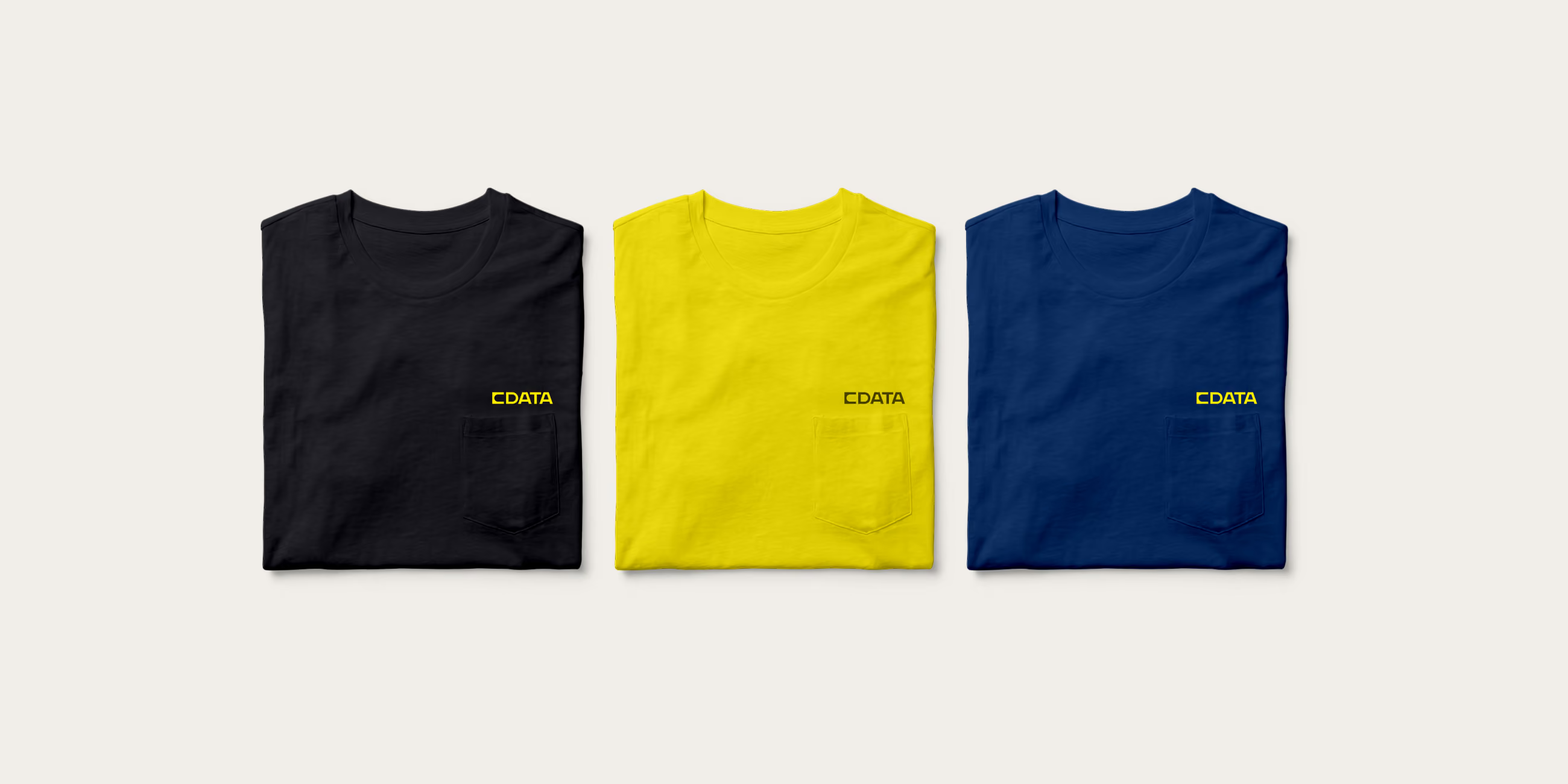
Three folded t-shirts in black, yellow, and navy blue arranged side by side on a light background, each with a small yellow CData logo printed above the front pocket.
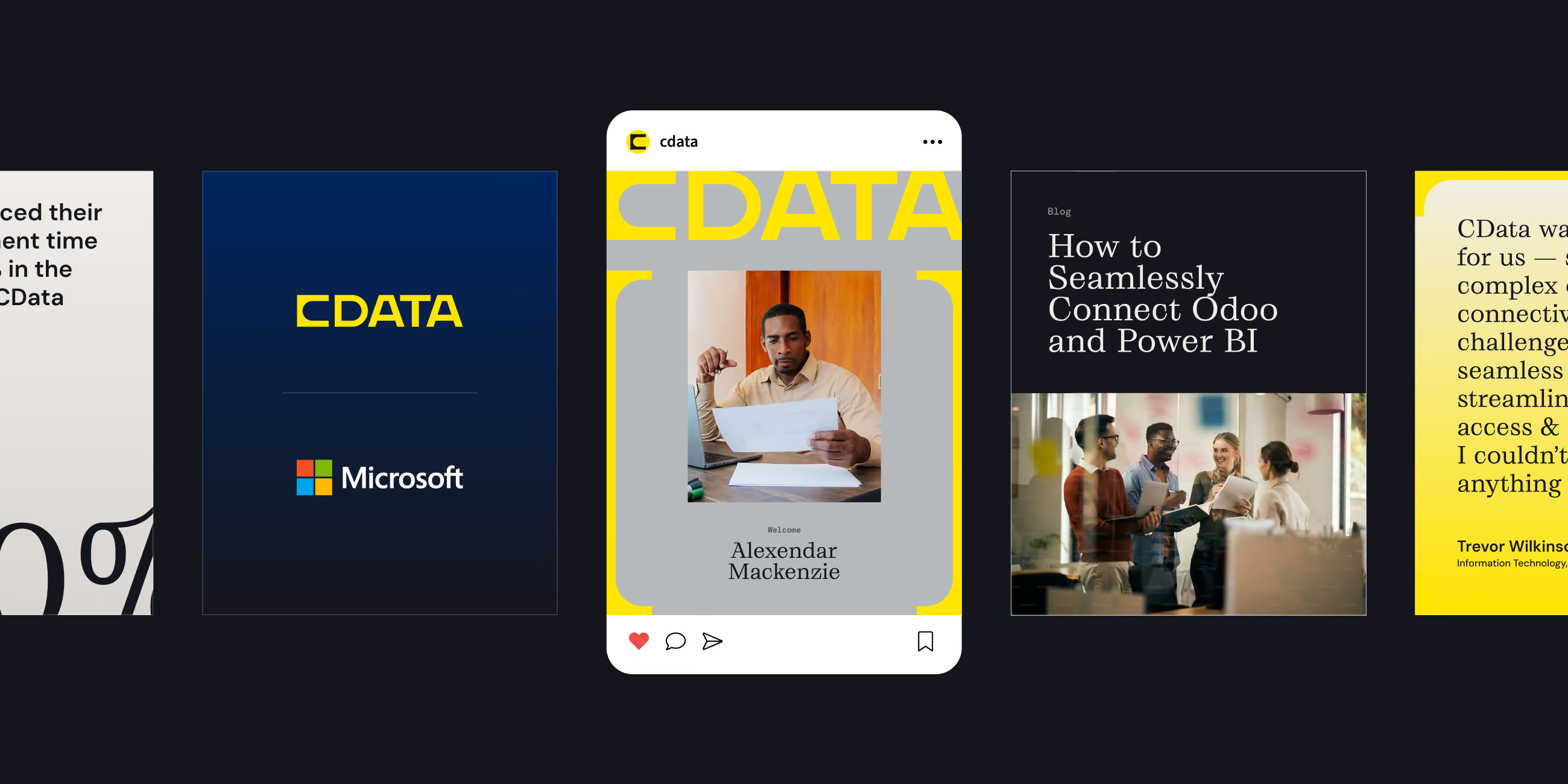
A digital banner showing five side-by-side panels: the first with large partial text and percentage; the second with yellow CData logo above Microsoft logo on dark background; the third a social media style post with a photo of a man named Alexander Mackenzie holding papers; the fourth a blog post titled 'How to Seamlessly Connect Odoo and Power BI' with a photo of four people discussing in an office; and the fifth panel with a testimonial in black and yellow from Trevor Wilkinson about CData solutions.
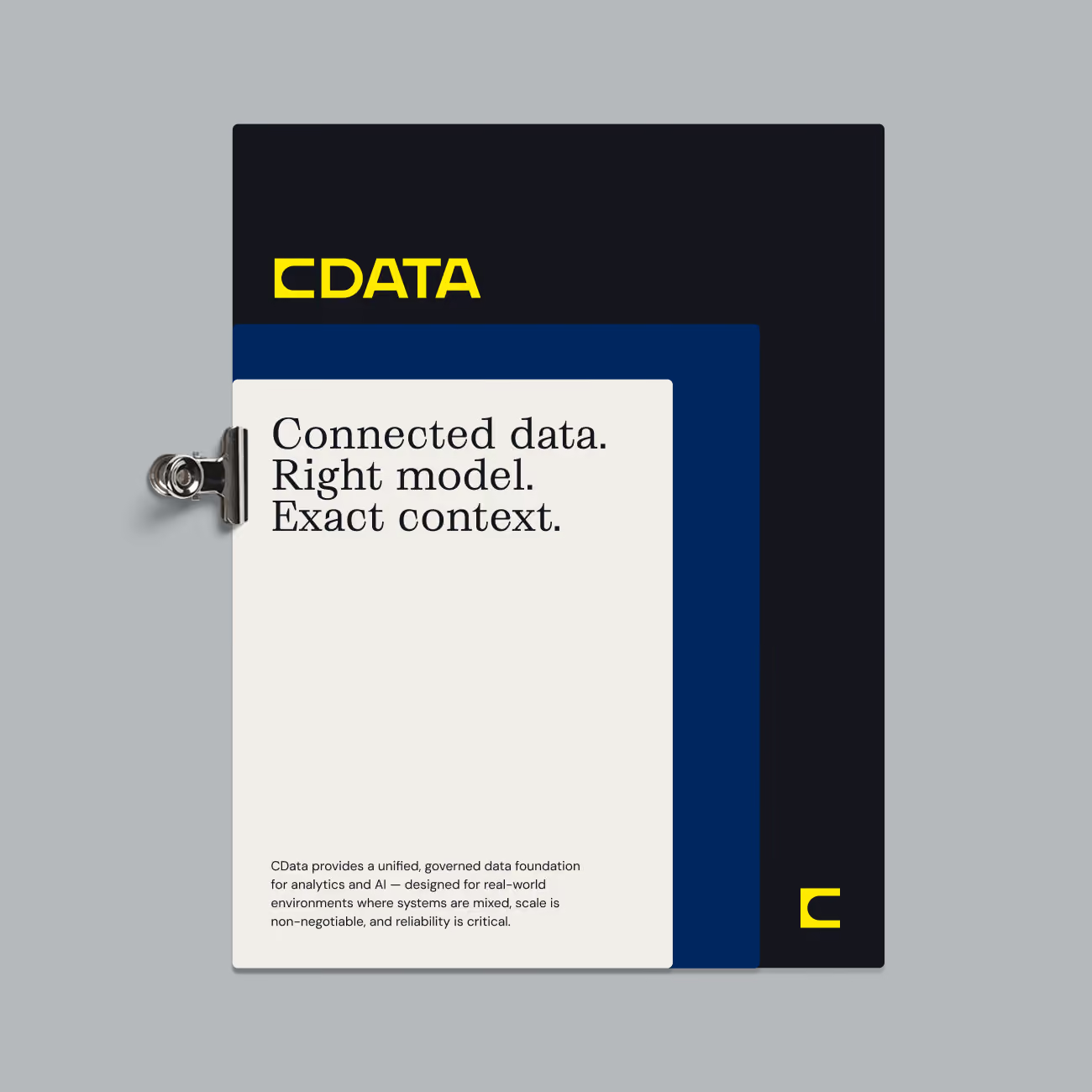
Graphic with layered paper sheets clipped together on a gray background, featuring the yellow CDATA logo and the text: Connected data. Right model. Exact context. A smaller paragraph below states CDATA provides a unified, governed data foundation for analytics and AI designed for real-world mixed system environments emphasizing scale and reliability.
A large solid navy blue bracket shape with rounded corners on a bright yellow background.
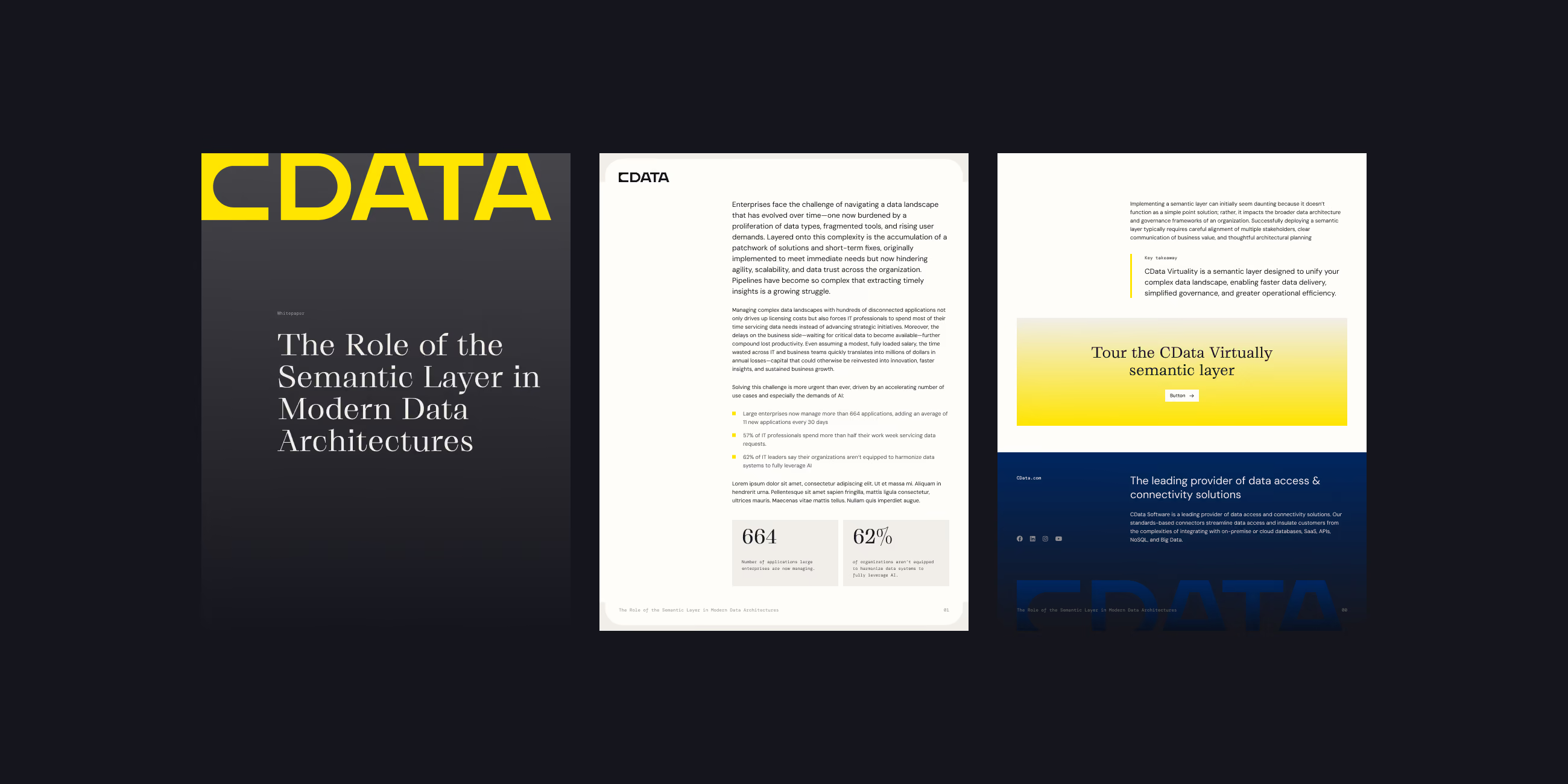
Cover and inside pages of a CData whitepaper titled 'The Role of the Semantic Layer in Modern Data Architectures' featuring text about enterprise data challenges, a statistic showing 664 petabytes of data in 2017, and a 62% rise in applications using data. Also visible are a highlighted section inviting readers to tour the CData Virtually semantic layer and a footer mentioning CData as a leading data access and connectivity solutions provider.
Modern office lounge area with brown leather sofa, gray armchairs, round wooden coffee table, and a large yellow and black decorative wall feature framing a workspace with desks and computers in the background.

Web Design

Web Design

CData’s website had to win over two audiences at once: the enterprise teams who had trusted its products for years, and the developers just starting to build with AI. Focus Lab rebuilt the site’s top level so AI leads the story, with established products still close at hand. From there, the system carried all the way down to the Developer Center and Knowledge Base.

‍

On screen, the brackets do their best work. They frame hero headlines and isolate a single word, so the homepage reads as the data layer behind [confident] AI. Warm neutral sections carry most of the reading. Bands of yellow and near-black break in at the moments that ask for action. Because every connector page follows one template, CData’s team can scale the site across hundreds of sources without redesigning a thing.

Text on a yellow gradient background reading 'Ready to get started?' with a subtext encouraging trying CData with your own data or talking about your use case, accompanied by buttons labeled 'Start Free' and 'Talk to an Expert.'
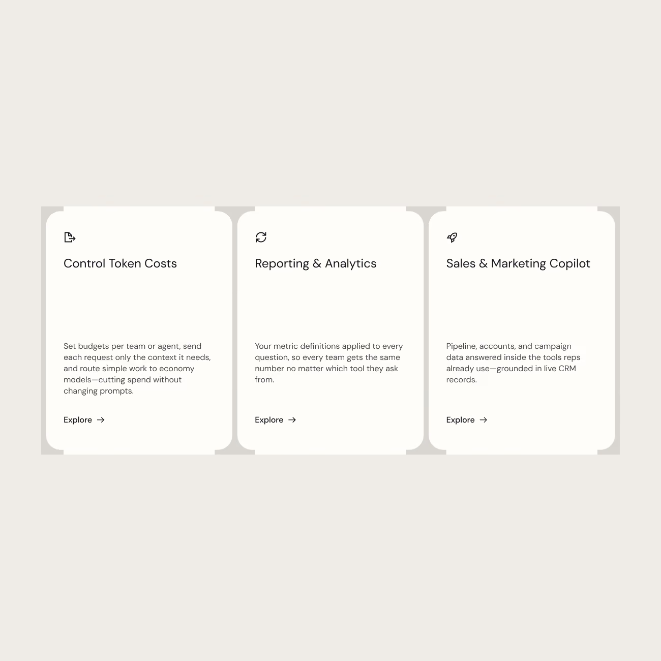
Three info cards on a beige background: 1. Control Token Costs: Set budgets by team or agent, send requests only with needed context, route work to economy models to cut spend without changing prompts. 2. Reporting & Analytics: Apply metric definitions to every question, ensuring consistent metrics across all tools for all teams. 3. Sales & Marketing Copilot: Pipeline, accounts, and campaign data answered inside tools reps use, grounded in live CRM records. Each card has a small icon and an Explore link.
Dark blue to black gradient footer with the yellow CData logo and text describing CData Software as a provider of data access and connectivity solutions, plus icons for Facebook, LinkedIn, Instagram, and YouTube. Footer also lists categories with links: ODBC Drivers, Java (JDBC), ADO.Net, Python; CData Sync, SQL SSIS Tools, DBAmp, Amazon API Connector, PowerShell; Connect AI, API Server, REST Connectors; Connectors, Cloud; About CData, Press Releases, Newsroom, Awards, Leadership, Partners, Careers, Contact Us.
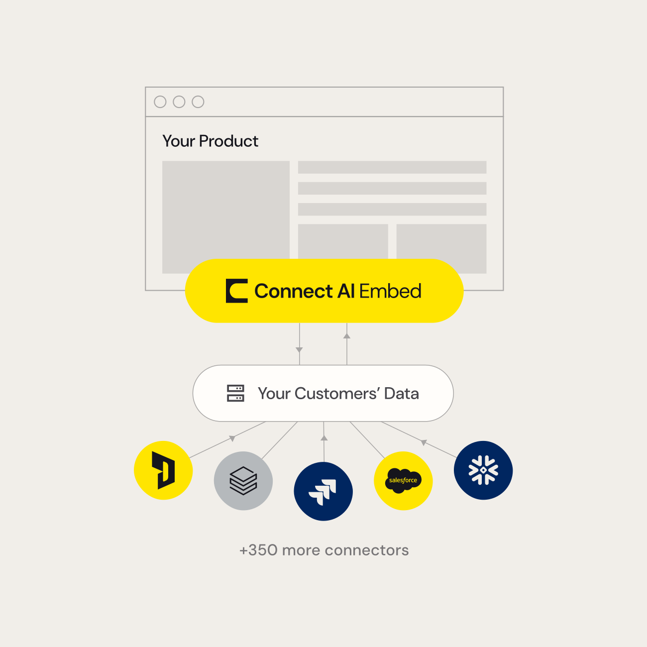
Diagram showing integration of Connect AI Embed with your product and customers' data from various sources including Jira, Salesforce, and others, highlighting over 350 more connectors.

Brand Activation

Brand Activation

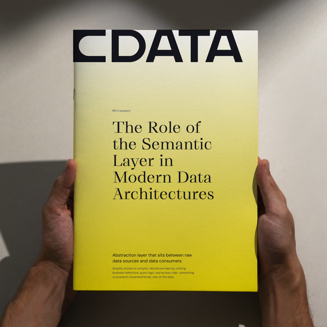
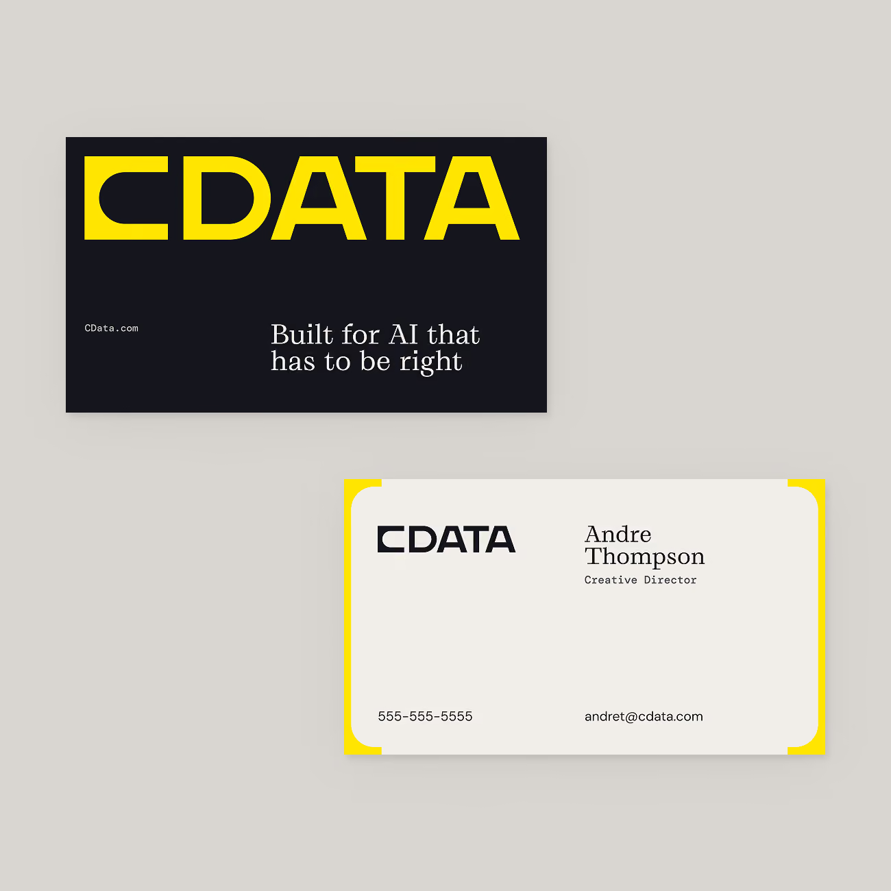
After launch, Focus Lab stayed on to put the system to work. That started with the everyday materials: presentation templates, a whitepaper and sell sheet system, business cards, email templates and signatures, social banners and templates, paid ads, and lower thirds for video. A refresh of CData’s brand kit kept the tools current as the system grew.

‍

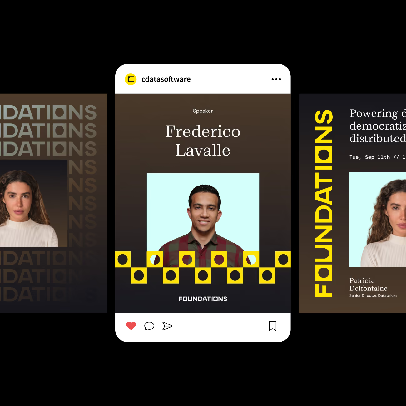
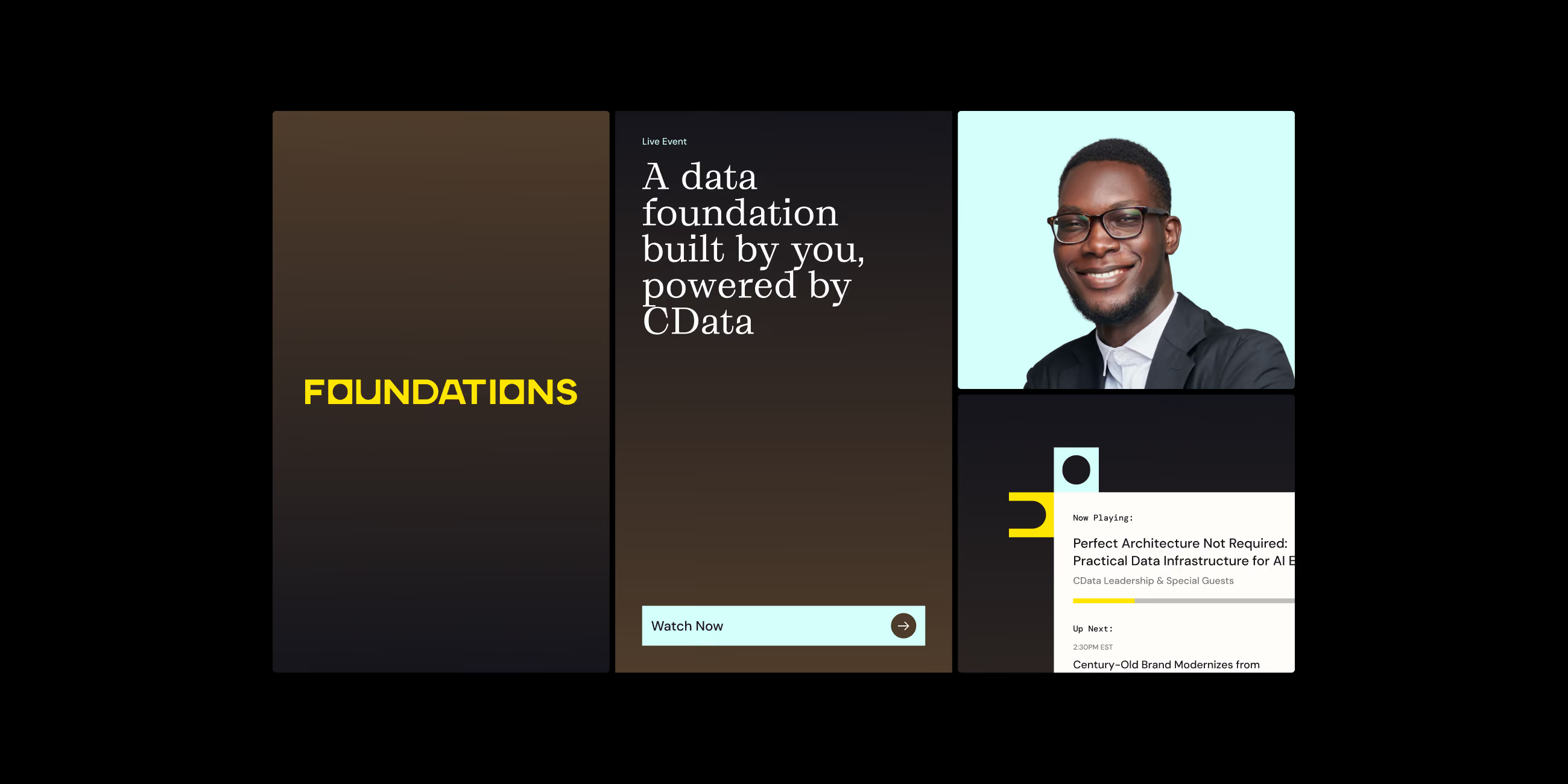
The bigger test came with new names under the CData umbrella. Focus Lab created an identity, landing page, and social campaign for Foundations, CData’s annual virtual conference, and designed a logo for Connect AI’s developer offering. Both borrow the core brackets, palette, and type, and still have room for a personality of their own.

‍

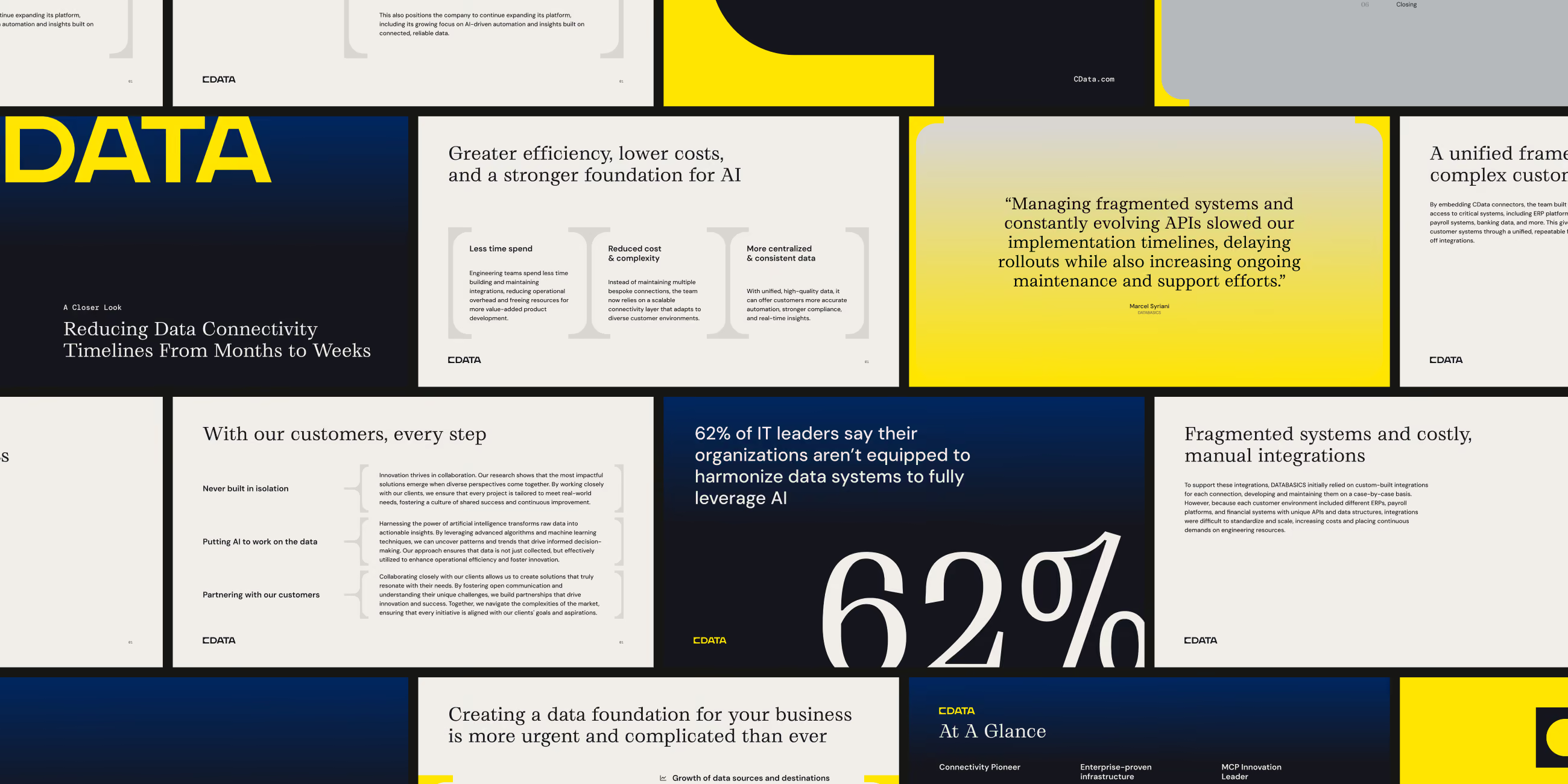
Presentation slides with key points on data connectivity, AI efficiency, cost reduction, and challenges with fragmented systems and APIs, showing statistics like 62% of IT leaders say their organizations can't fully leverage AI due to data system issues.
Digital graphic featuring a social media post from cdatsoftware highlighting speaker Frederico Lavalle, with his portrait and the word FOUNDATIONS below, surrounded by designs with yellow and black squares and circular shapes.
Digital event announcement titled 'A data foundation built by you, powered by CData' with a 'Watch Now' button, a portrait of a smiling man with glasses in business attire, and a small section showing a video player screen with text about practical data infrastructure.
Hands holding a yellow gradient booklet titled 'The Role of the Semantic Layer in Modern Data Architectures' with a subtitle about abstraction layers and data sources.
Two CData business cards on a light gray background; the top card is black with large yellow CData text and the slogan 'Built for AI that has to be right,' the bottom card is white with yellow corners and displays CData logo, and contact info for Andre Thompson, Creative Director, including phone number 555-555-5555 and email andret@cdata.com.

[Focus Lab] brought the creative rigor and outside perspective we needed, challenging our assumptions and pushing us toward bolder visual choices than we might not have made on our own.

[Focus Lab] brought the creative rigor and outside perspective we needed, challenging our assumptions and pushing us toward bolder visual choices than we might not have made on our own.

andre thompson, Creative director, Cdata
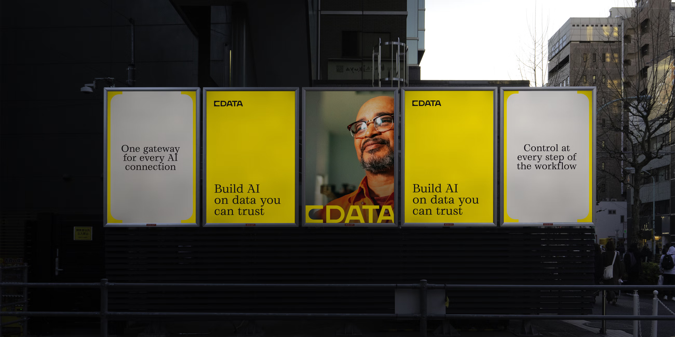
Outdoor digital billboard in an urban area showing five panels: two panels with the text 'One gateway for every AI connection' and 'Control at every step of the workflow', two panels with yellow backgrounds and the text 'CDATA Build AI on data you can trust', and a center panel with a photo of a man wearing glasses and smiling, with the text CDATA across the bottom.
Read the next case study