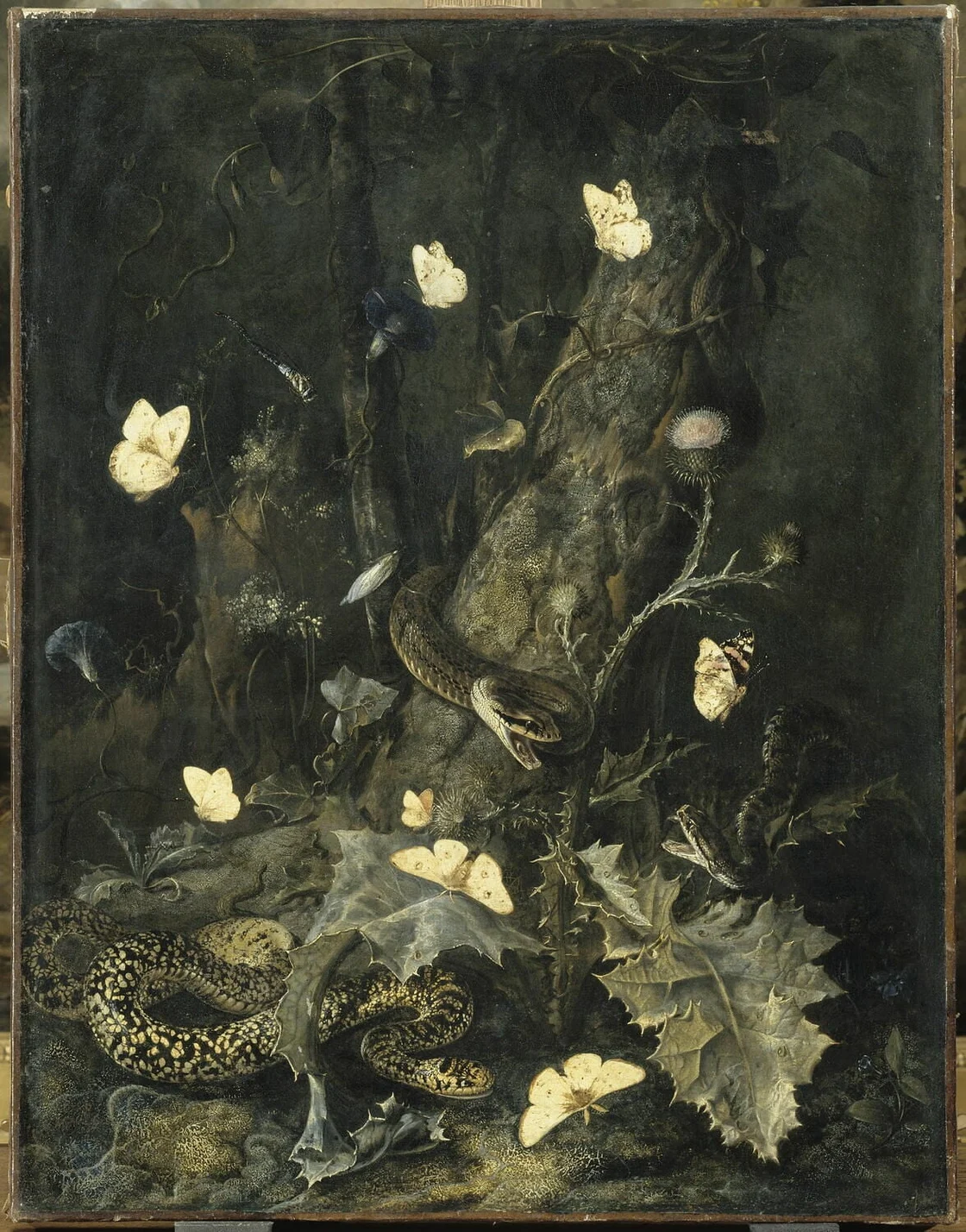
In the 17th century, there was a genre of Dutch still-life paintings called “Sottobosco.” Translated from the Italian word for “undergrowth,” these paintings (like the below “Snakes and Butterflies” by Dutch artist Otto Marseus van Schrieck) put the viewer directly on the shadowed forest floor in a humble, up-close-and-personal view of botanical life.
But “Sottobosco” can also be translated to “lowlife.” Paintings of the dirty ground? The forest floor? Perhaps they were not deemed fit to grace the homes and salons of wealthy patrons. After all, this was also the Baroque period that produced Bernini’s “Ecstasy of St. Theresa” and grand, otherworldly scenes like “The Triumph of the Immaculate” by Paolo de Matteis.
Living just outside of Portland, I spend a lot of time in the Oregon Cascade forest and observing its understory. A mountain chain created by millions of years of (still-active) volcanic activity, the rich soil is what provides the foundation for the beautiful, thriving forests that are synonymous with the Pacific Northwest.
In Create First, I’m inviting you to experience creativity “in Sottobosco”: the forest floor, the rich soil, the foundation on which great creative work can grow and thrive. From living a balanced creative life, to the branding challenges we face, to honing your craft, to inspiration gathered inside and outside of Focus Lab, I offer a humble view on the fascinating inner workings of creative innovation.
Stay inspired,
Natalie Kent, Creative Director
“Snakes and Butterflies” by Otto Marseus van Schrieck
Sports team rebrands are one of the hardest things to do when you have some of the most devoted, protective fans. For better or worse, always interesting to see how it's tackled.
April is Earth Month, and we’re thinking about Solarpunk, which Wikipedia defines as “a literary and artistic movement that envisions and works toward actualizing a sustainable future interconnected with nature and community.”
"Strategy isn’t meant to be siloed," our Brand Strategist Haley Bridges wrote in her LinkedIn post. She's looking to build a tight-knit group of brand strategy peers to share, connect, and grow.
We had the pleasure of using Vocal Type's Carrie typeface in their recent work with Climb Hire. From their site, "Vocal is for the creative that cares about telling the stories of the people we serve and not the false history of the industry we work in. Vocal is for the creative that wants to build a community—not a following."