Merge

Merge is the creator and leader of the unified API category, helping companies connect to hundreds of software integrations through a single, standardized interface.

Built to solve the complexity of managing integrations, the platform has quickly become the trusted solution for B2B companies that need reliable data connections across their tech stack.

As the company grew and began targeting larger enterprise customers, the brand needed to evolve with it. Merge had established a reputation as the unrivaled unified API provider, with the most integrations and some of the strongest customer support in the space. But visually and verbally, the brand blended in with competitors and a growing wave of copycats. Its identity lacked the clarity and distinctiveness needed to communicate its leadership, and messaging often struggled to succinctly explain the full scope of what Merge provides beyond simply building integrations.

Services Provided

Focus Lab partnered with Merge to refine and mature the brand, helping the category leader clearly communicate its enterprise-grade platform, industry expertise, and position as the original unified API solution for modern software companies.

Brand Strategy

Brand Strategy

As Merge moved upmarket toward enterprise customers, the brand needed to communicate greater maturity and authority while still reflecting the technical ambition that made it successful in the first place. The opportunity was not to reinvent the company but to clarify and elevate what was already true. 

While competitors were emerging with similar messaging and even copying Merge’s visual presence, none had the same depth of product or experience. The brand needed to confidently claim its position as the originator of the unified API category while making the value of that leadership clearer to companies building integrations for the first time.

This thinking led to the concept of Shift Into High Gear. Merge had already proven the technology. Now it was time for the brand to reflect the momentum of a company accelerating ahead of the field. The concept positions Merge as the partner that helps companies move faster once integrations are in place, unlocking the full value of their data and systems.

Rather than emphasizing what Merge facilitates through API integrations, we turned to what comes next. With integrations handled, customers are free to focus on growth, product innovation, and closing more business. Merge is not just the company that connects systems; it’s the platform that keeps businesses moving forward.

Collage showing previous visual identity with Vizard logo on blue background, Poppins font alphabet samples on red background, social media apps with video thumbnails, woman working on laptop, and website homepage with blue theme.
Text listing brand attributes: Effortless, Transformative, Essential on a purple background.
Merge's brand attributes are Exciting, Cutting-Edge, Timeless

Verbal Identity

Verbal Identity

Merge’s previous voice was clear but largely indistinguishable from the rest of the category. Messaging tended to stay at a high level, with headlines that described the product but did little to highlight what actually sets Merge apart.

Merge’s new brand voice is confident, clever, and committed. Confident in the sense of clarity and expertise, not bravado. Clever in a way that adds energy without becoming corny. And committed to helping customers succeed, reinforcing that Merge is an active partner in their integration journey. This comes through in active voice, frequent first-person language, and messaging that connects product capabilities directly to outcomes like faster integrations, closed deals, and saved engineering time.

We also moved away from vague claims like “the #1” or “the leading” solution. Those phrases are easy for competitors to copy and often feel unconvincing without proof. Instead, the messaging shows leadership through specifics, clear value propositions, and the real results customers experience when building with Merge.

Collage showing previous visual identity with Vizard logo on blue background, Poppins font alphabet samples on red background, social media apps with video thumbnails, woman working on laptop, and website homepage with blue theme.

Logo

Logo

Merge's previous logo already had recognition in the market, and the abstract mark had a lot of love for its straightforward representation of the product’s functionality. We knew we didn't want to move away from this existing concept, so the new mark reflects a more precise and polished Merge. Our work focused on tightening the geometry, aligning the mark to a grid, and simplifying anchor points to create a cleaner, more balanced form.

The logotype is the Gotham typeface with subtle adjustments. It closely resembled the structure of Merge’s previous wordmark, which helps preserve continuity. At the same time, the more open counter in the “R” introduces a softer curve that reduces the blocky feel of the previous logo. Gotham’s monolinear construction also aligns naturally with the logomark, creating a cohesive system where the symbol and wordmark feel balanced, sturdy, and distinctly Merge.

For the Merge logomark, we widened the "M" for a more sturdy and cohesive balance. We also made a slight adjustment to the leg of "R"
A grid of many explorations of the Merge mark

Visual Language

Visual Language

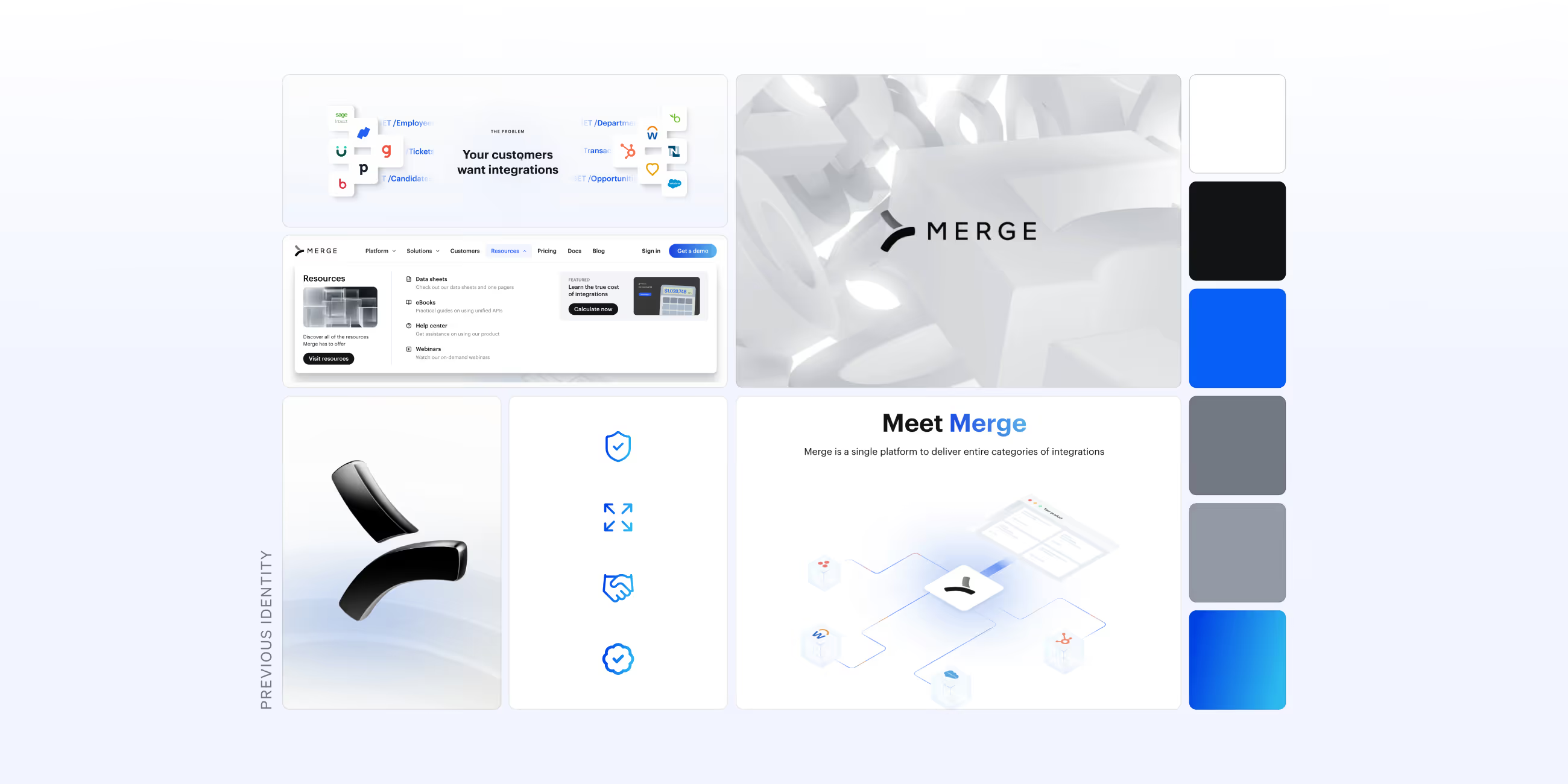
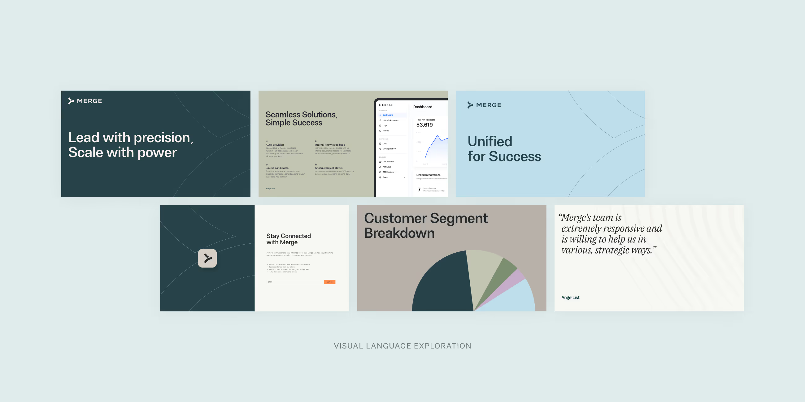
Merge’s visual language was designed to be more mature and cohesive while still signaling energy and momentum. The primary palette centers on warm neutrals, creating a grounded foundation that’s practical and enterprise-ready. Orange is used sparingly for emphasis, adding moments of energy and clarity. A supporting set of muted secondary colors rounds out the palette, giving the brand flexibility while maintaining a restrained, ownable look.

Typography reinforces this balance of precision and approachability. Headlines use FH Oscar Pro, a typeface selected for its strong presence and excellent readability across both screen and print. Its slightly softened edges echo the curvature of the refined logo, helping the system feel cohesive. Several glyphs were customized with the type foundry to better align with the brand’s identity.

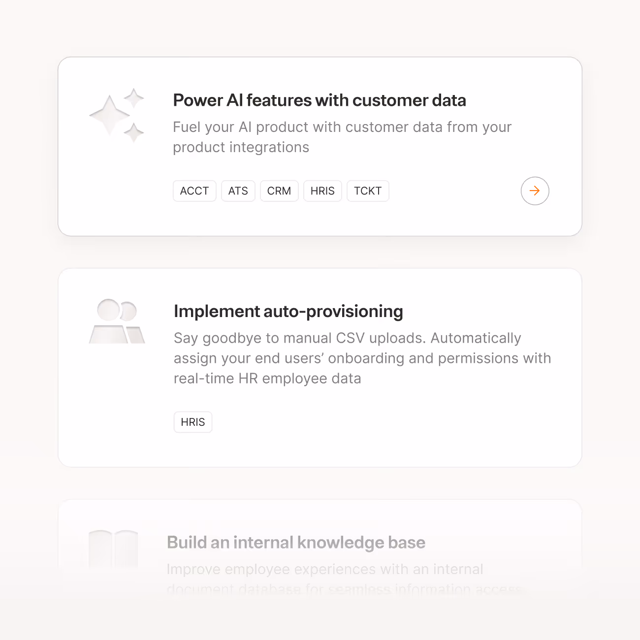
Icons build on the foundation of Font Awesome 6 Pro but were adapted to reflect a distinctive embossed treatment. The choice of emboss and deboss wasn't arbitrary; it carries a dual meaning. Just as the platform embeds itself into a customer's stack to power integrations behind the scenes, the icons don't sit on the surface — they’re inherently ingrained. The technique signals a premium, high-end aesthetic while simultaneously expressing the idea of something pressed into the material itself, permanently part of it. 

Illustration follows a similarly restrained approach. Inspired loosely by the clean industrial design of Braun, Merge’s illustrations are minimal and purposeful. Graphics focus on clarity over decoration, using simple forms and selective accents of orange to highlight key concepts. The result is a visual system that communicates complex ideas with confidence, keeping the emphasis on understanding rather than embellishment.

Grid of brand guideline slides showing Vizard's visual identity including logo, color palette, typography, and website interface.
We use FH Oscar Pro Semi Bold for headlines. Oscar Pro Semi-Bold works well for subheads. As our subheads get smaller, we use FH Oscar Pro Semi Bold.
A wavy embossed texture
Purple background with white and orange text describing AI-powered social-ready short clips, titled 'Repurposing Webinars with Magic', with a paragraph about content marketers and two buttons for email address and start repurposing.
Text listing brand attributes: Effortless, Transformative, Essential on a purple background.
Motion by the Merge team

Interactive

Interactive

To bring the refreshed visual language to life, we applied the new system to the homepage and core category pages, establishing a foundation Merge’s team could build upon and scale with confidence. The designs account for the full range of real-world content needs, with layout variants for each module ensuring flexibility without sacrificing consistency. The embossed treatment that defines the icon system carries through to homepage textures and subtle gradient transitions, giving the site the same sense of depth and permanence that runs across the rest of the brand.

A graph illustrating the UI style
Two side-by-side social media posts from Vizard with purple branding; left post announces team growth with a geometric pattern image, right post shows a woman smiling while talking on the phone.
A subtle emboss version of the Merge logo
Outdoor billboard advertising Vizard with the text 'Repurpose long videos into social-ready clips with AI' and a description about transcribing videos and editing clips using AI.
Totango Intro
Read the next case study