Giga Energy

Giga Energy builds electrical infrastructure for the projects powering tomorrow.

Founded in 2019 by two Texas A&M students who saw a smarter way to source and deliver electrical equipment, Giga was built on a simple premise: the industry's traditional players were too slow, too expensive, and too unresponsive to serve a new generation of infrastructure builders. Giga's answer combines overseas manufacturing speed and pricing with American quality assurance and service.

The company needed a new identity to reflect who they had become and how they were delivering on this promise.

Services Provided

As a young company, Giga had built a distinct edge in a traditional industry. Now it needed a brand that could earn trust — without losing the energy that made it different.

Brand Strategy

Brand Strategy

The electrical equipment industry tends to reward conservatism. Customers choose vendors based on familiarity, reputation, and risk aversion — not because a brand excites them. For legacy players, that conservatism is an asset. For Giga, it was the problem to solve.

That concept is “Energy, transformed.” Giga is in the business of moving and managing electrical energy, but the deeper read is a statement about the company itself: an infusion of new perspective into a calcified industry. 

Three brand attributes give that concept its structure: technical, mature, and energetic. “Technical” reflects the standard Giga holds itself to — precision-built equipment, rigorous quality assurance, and the kind of deep product knowledge that lets customers trust the process and stop worrying about the output. “Mature” signals that this is not a company cutting corners to move fast — professional systems, accountable teams, and warranties that mean something. “Energetic” is the differentiator — the startup spirit in an industry of incumbents, the culture that surprises customers when they walk into the office, and the responsiveness that keeps them coming back.

Collage showing previous visual identity with Vizard logo on blue background, Poppins font alphabet samples on red background, social media apps with video thumbnails, woman working on laptop, and website homepage with blue theme.
Text listing brand attributes: Effortless, Transformative, Essential on a purple background.
Large blue industrial container labeled GIGA inside a warehouse with yellow overhead crane.

Verbal Identity

Verbal Identity

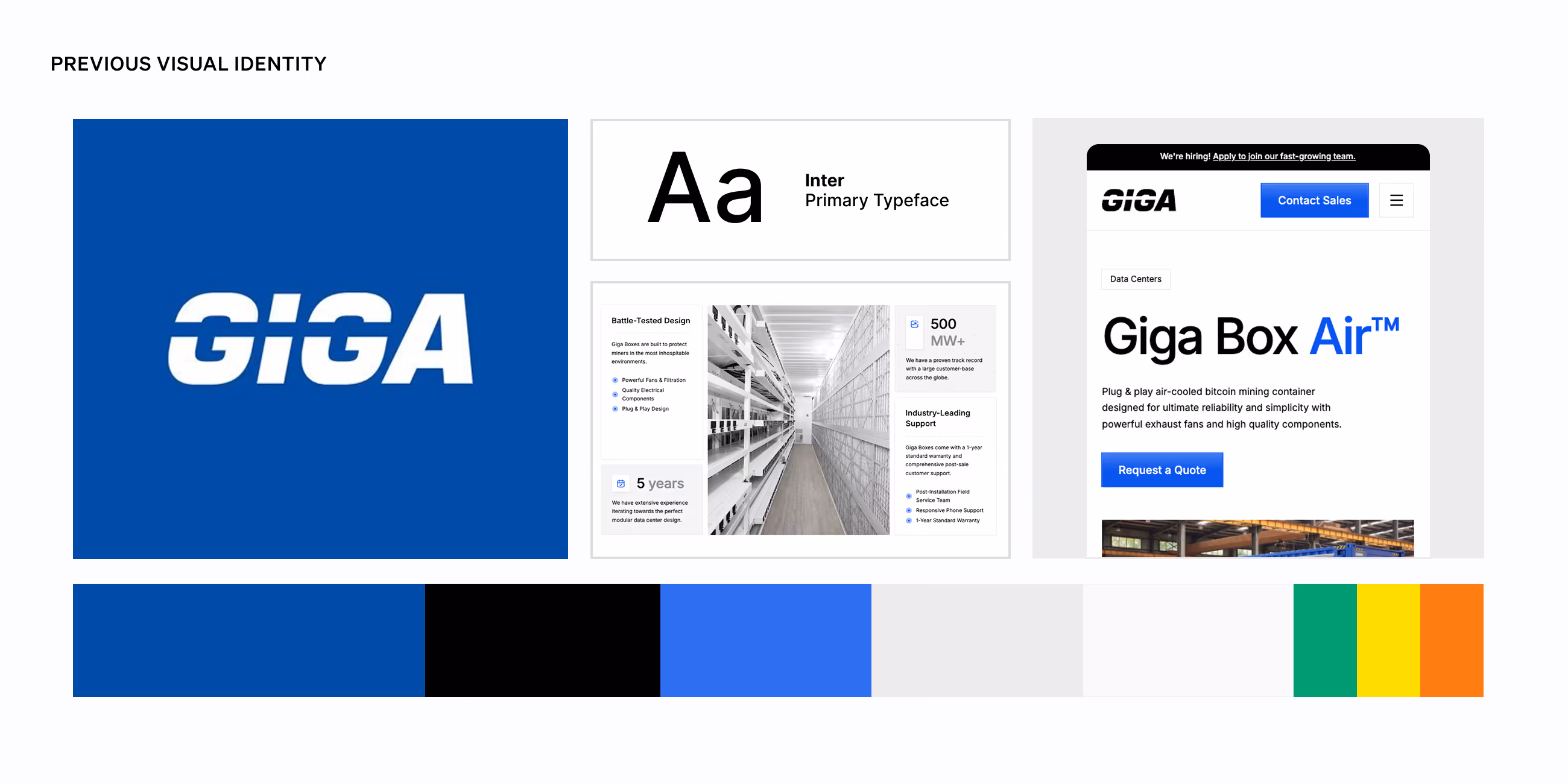
Before the rebrand, Giga's voice was direct and factual, well-suited to a technical audience, but missing the personality that might make customers feel like they were talking to a company that genuinely wanted to solve their problem. There was information, but not a stance.

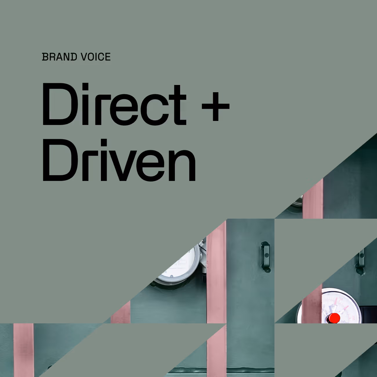
The rebrand gave Giga's voice a clear identity: Direct and Driven.

“Direct” doesn't mean cold or clipped. It means confident and clear. Giga knows the industry, knows its customers' pain points, and speaks from that knowledge, no hedging, no throat-clearing. “Driven” is where the energy comes through on the page. Short sentences. Lead with verbs. Fragments, deployed with purpose, create rhythm and pace. “Driven” isn't aggressive; it's dynamic, purposeful, and engaged. It’s a strong point of view.

The brand story crystallizes that point of view around a single question Giga believes its customers should never have to ask: "Now what?" The answer is Giga — not just a manufacturer of quality electrical equipment, but a partner that exists to make complicated projects run smoothly.

That promise has a name: Proven Energy. It anchors Giga's two most important qualities, rigorous manufacturing and responsive service, in a phrase that's specific, ownable, and true to what the company actually delivers.

Text 'Direct + Driven' with partly visible industrial pressure gauge behind green geometric shapes.
A blue square with the words "Proven Energy" in white

Logo

Logo

The previous Giga logo had its own logic — a bold blue wordmark with a horizontal bar through the G, direct and functional in the way that communicated the category, if not the company.

The fully custom mark is built on precise geometry that reflects Giga's technical character. Rounded exterior corners carry continuity from the original mark, while angled terminal cuts introduce a directional force as an expression of energy moving through the system. The mark embodies the concept of “Energy, transformed.” It’s something new pressed into the shape of an industry that hasn't changed in decades.

A grid of earlier explorations of the Giga wordmark
Blue rectangular sign with white text 'GIGA' on a dark green metal cabinet door with hinge visible.
The final logo for Giga

Visual Language

Visual Language

Giga's color palette draws from a principle the industry understands: safety colors work because they demand attention. Giga blue anchors the system, paired with white for clarity and deep greys and black for structural weight. The Padmount (a type of transformer) green, drawn from the product line itself, grounds the palette in something tangible. Orange is the accent, used sparingly and with the same directness Giga brings to every customer conversation.

Alliance No. 2 serves as the primary typeface, its geometric mass built for large-format applications where presence matters. Space Grotesk handles supporting text, balancing technical clarity without tipping into austerity.

The photography system turns a potential liability into an asset. Rather than obscure the industrial reality of electrical equipment, Giga's photo treatment leans into it. Geometric frames built from trapezoids and shapes drawn from the logo create compositions where the product and the brand reinforce each other. Two patterns extend the visual language further: a dense schematic illustration that signals technical depth, and a spare thin-line treatment that adds rhythm without competing for attention.

The icon system completes the picture. Compound shapes balance negative space and structure, each one reflecting the logo's architecture while representing the physical realities of Giga's product line — ownable enough to be distinctive, grounded enough to be understood.

Grid of brand guideline slides showing Vizard's visual identity including logo, color palette, typography, and website interface.
Purple background with white and orange text describing AI-powered social-ready short clips, titled 'Repurposing Webinars with Magic', with a paragraph about content marketers and two buttons for email address and start repurposing.
Text listing brand attributes: Effortless, Transformative, Essential on a purple background.
Abstract eye graphic with a green iris overlaid on a blue circle, surrounded by yellow, orange, purple, black, and gray geometric shapes including a corner of text.
Blue water bottle with geometric circuit design and 'GIGA' text, plus an orange strap on green background.
A "G" from the Giga logo outlined in thin vector lines
Two side-by-side social media posts from Vizard with purple branding; left post announces team growth with a geometric pattern image, right post shows a woman smiling while talking on the phone.
White industrial electrical transformer with connected cables inside a factory.
GIGA booth with blue backdrop showing transformers, switchboards, data centers, and a display panel.
Two side-by-side social media posts from Vizard with purple branding; left post announces team growth with a geometric pattern image, right post shows a woman smiling while talking on the phone.
Laptop screen showing Giga Energy LinkedIn page with company info and job listings.
Business card for Scott Pickering, Chief Growth Officer at GIGA, with contact info on concrete background.
Purple translucent 20-sided die with gold numbers resting on a dark surface, surrounded by other blurred dice.
Read the next case study