ClearCo

ClearCo helps companies hire, develop, and retain the people who make them work. What started in 2004 as a single applicant tracking system had grown, through two decades of product development and acquisition, into a full talent management platform.

The product had outgrown the brand. Some prospects had never heard of ClearCo, while longtime customers still pictured the ATS it started as. A tagline built around “talent maximization” carried the same gap, never quite giving the sales team language that matched what the platform had become.

‍

Services Provided

After 20 years building toward clarity, ClearCo had the perfect name all along. It just hadn't leaned into its potential.

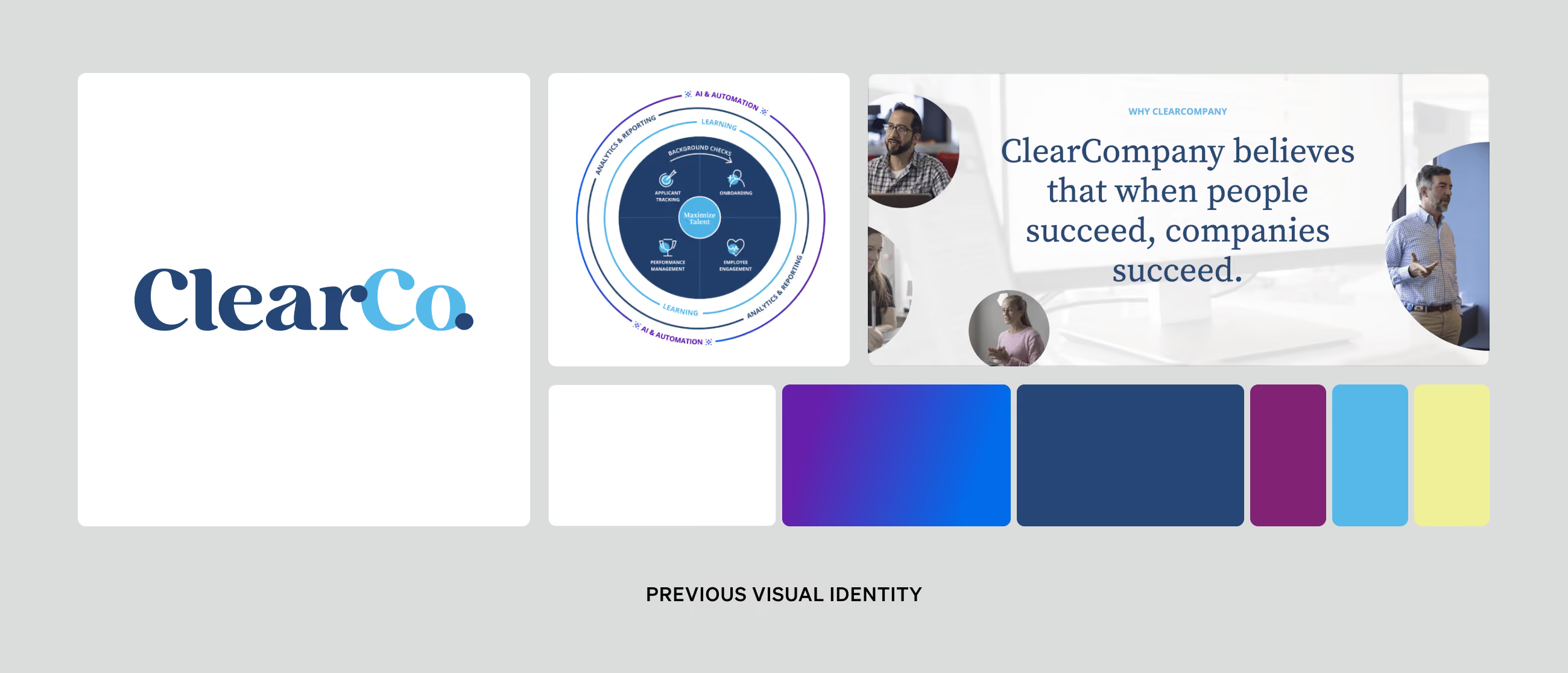
A layout showing ClearCo's previous visual identity with their logo in blue and light blue, a circular diagram of their values and focus areas, a banner stating 'ClearCompany believes that when people succeed, companies succeed' alongside images of diverse professionals, and a color palette featuring dark blue, purple, light blue, and yellow.

Brand Strategy

Brand Strategy

HR tech is a crowded category, and ClearCo's own story had grown harder to tell with every acquisition. HR teams juggling disconnected tools wanted one partner who could make sense of the whole picture, so Focus Lab's strategy work started with the idea the company had been sitting on since it chose its name in 2004: clear. 

‍

The organization, called ClearCompany at the start of our work together, had already been shortening that name to ClearCo internally, and making that shift official became one of the strategy's early recommendations.

‍

“Clarity” became the lens every decision had to pass through, starting with one question: What does it look like when hiring, developing, and retaining talent adds up to something bigger, instead of being just another tool? The concept gave ClearCo permission to stop explaining itself in product terms and start speaking to the outcome its customers actually wanted, which was a full, legible view of their people — not another dashboard to manage.

‍

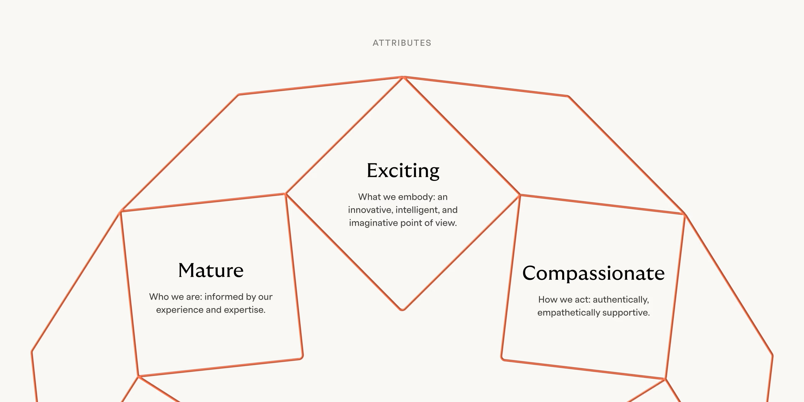
ClearCo's brand attributes are Mature, Compassionate, and Exciting. Mature, so the brand reads as a dependable authority. Compassionate, because the people using ClearCo carry real weight for their organizations and rarely get credit for it. Exciting, so “mature” never tips into forgettable. Layered against The Guide archetype, the strategy gave ClearCo a steady, dependable presence – a brand equipped to lead people through complexity toward something clear.
The brand concept was Clarity, which was inspired by ClearCo's existing name
Smiling woman wearing a gray cap and black apron holding a takeaway cup in a coffee shop.

Verbal Identity

Verbal Identity

ClearCo's previous voice leaned technical, feature-first, and inward-facing – the kind of language that lists what a product does without ever landing on why a customer should care. Sales teams found themselves explaining “talent maximization” more than they were closing on it.

‍

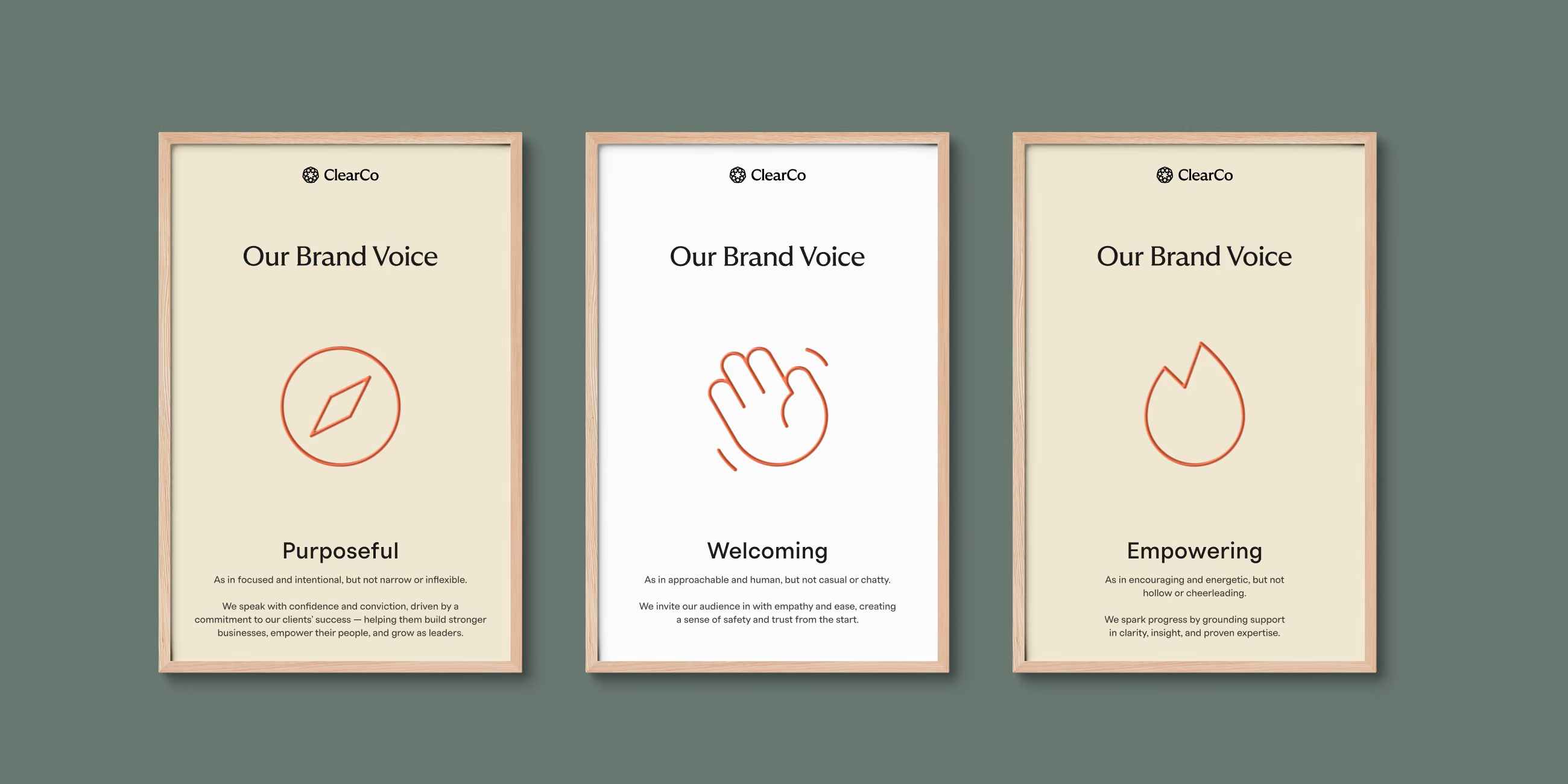
The new voice runs on three attributes — welcoming, purposeful, and empowering — and leads with outcomes ahead of features.

The brand's new value proposition puts the customer's stakes first: visibility into the entire workforce, the agility to respond quickly, the confidence to decide. Only after that does it describe the platform underneath.

‍

The new brand story closes on the line that now anchors the whole verbal system: “This is people management the way it should be: Clear.”

Diagram titled 'Attributes' showing three connected shapes labeled 'Exciting', 'Mature', and 'Compassionate'. 'Exciting' is described as embodying an innovative, intelligent, and imaginative point of view. 'Mature' is described as being informed by experience and expertise. 'Compassionate' is described as acting authentically and empathetically supportive.
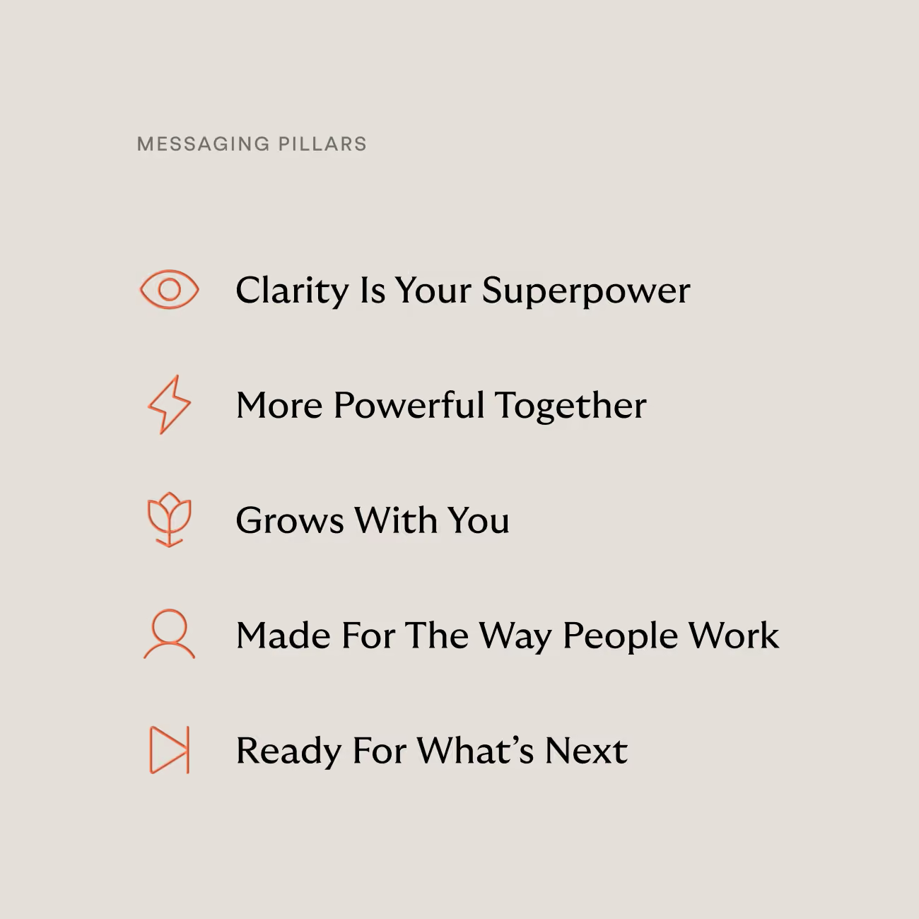
List titled Messaging Pillars with five points and icons: an eye for Clarity Is Your Superpower, a lightning bolt for More Powerful Together, a flower for Grows With You, a person outline for Made For The Way People Work, and a forward arrow for Ready For What’s Next.
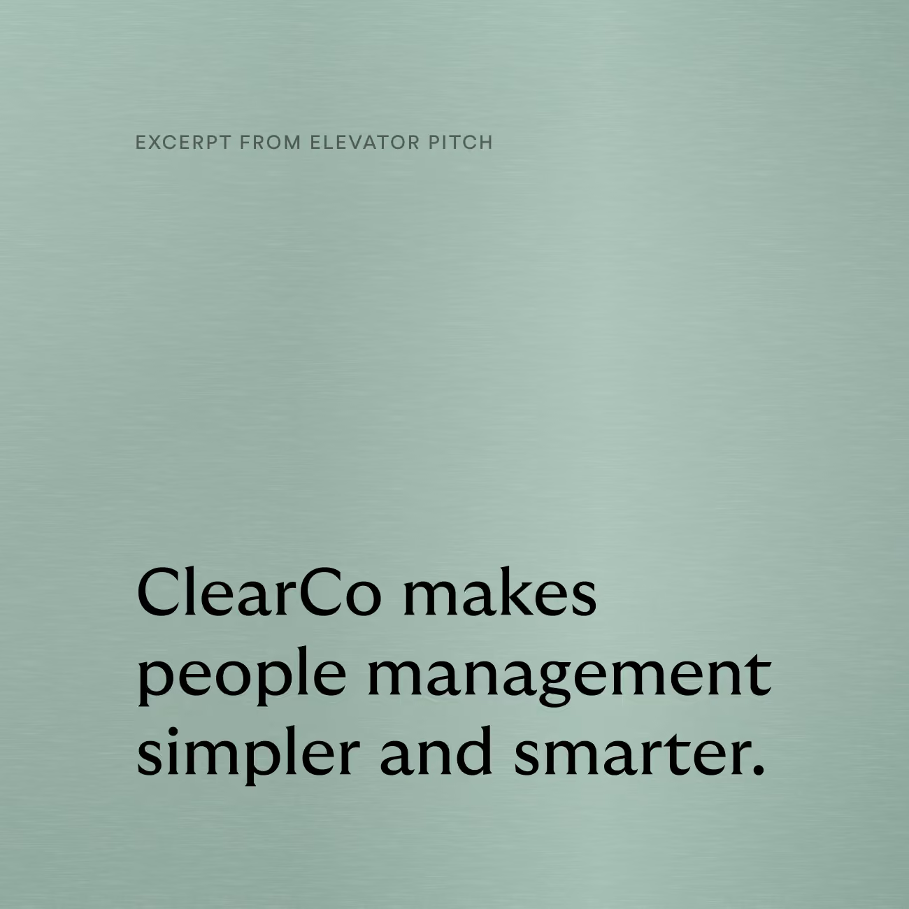
Text on a light green textured background reading: 'EXCERPT FROM ELEVATOR PITCH' and below in larger font: 'ClearCo makes people management simpler and smarter.'
Three framed posters with ClearCo logo and the title Our Brand Voice, each highlighting a different value: Purposeful with an orange compass icon, Welcoming with an orange waving hand icon, and Empowering with an orange flame icon, accompanied by brief descriptive text under each value.

Logo

Logo

ClearCo's mark draws its logic from a Hoberman sphere — a structure that collapses and expands without ever losing its form. Built from a lattice of interlocking shapes, the logomark visually performs the same idea the brand is built on: something that scales with a company, rather than a symbol that only works at one size.

‍

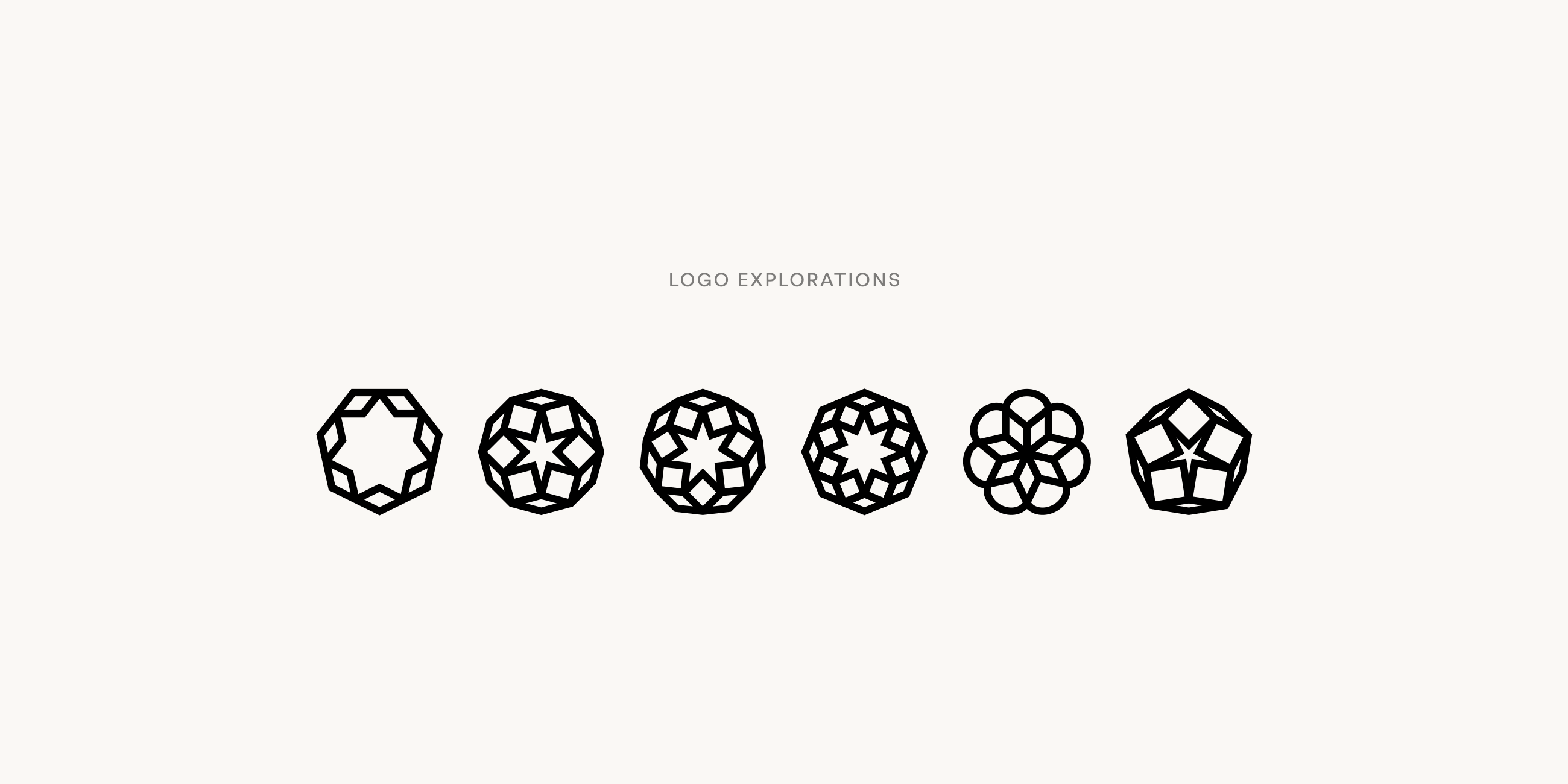
Early rounds tested denser, more literal versions of the geometry, with more rings, more shapes, and more connection points. The final mark strips that back to seven repeating forms, thick enough to hold their weight at a glance and open enough to read as expansion rather than clutter. 

‍

The wordmark pairs a confident serif with a clean sans-serif companion, a lockup that lets the logomark carry the concept while the type keeps the name legible and grounded at any scale.

‍

Six alternatives to the final ClearCo logo, all inspired by hobermans
Black baseball cap with the ClearCo logo and name on the front, placed on a curved wooden surface against a peach-colored background.
ClearCo logo with a geometric star-shaped icon to the left of the word ClearCo on a dark background.

Visual Language

Visual Language

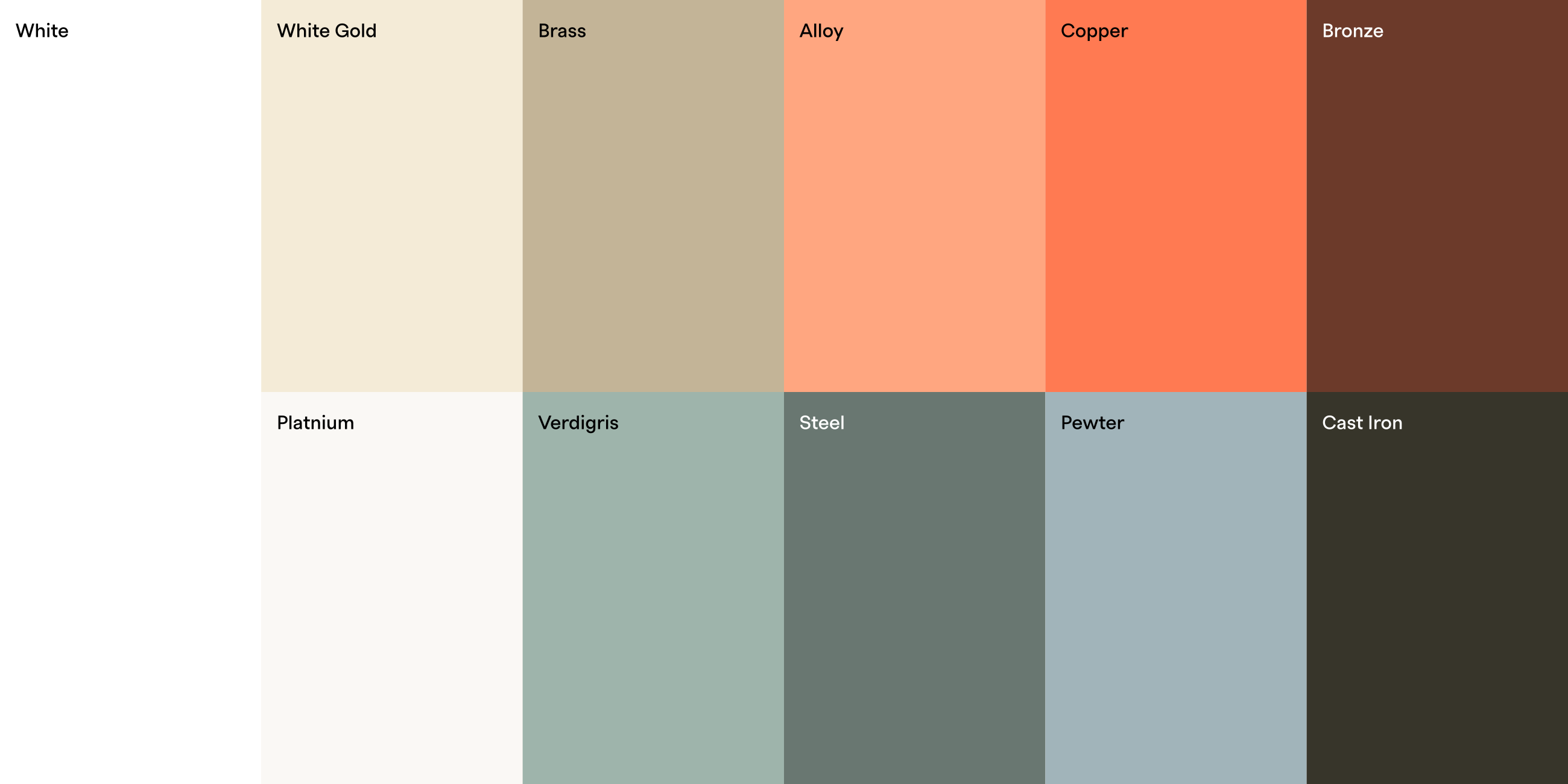
The color palette takes its cue from metal as a material that connects, conducts, and transforms over time. Copper leads the palette as ClearCo's signature accent: warm, energetic, and distinct in a category that leans hard on cool, corporate blues. A cooler secondary tone, Verdigris, plays on copper's own patina, giving the system a way to signal growth without introducing an unrelated hue. Warm neutrals ground the rest, keeping the palette confident rather than loud.

‍

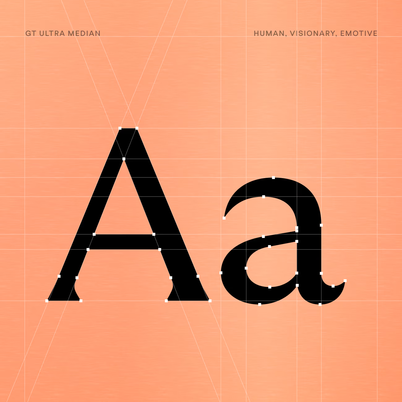
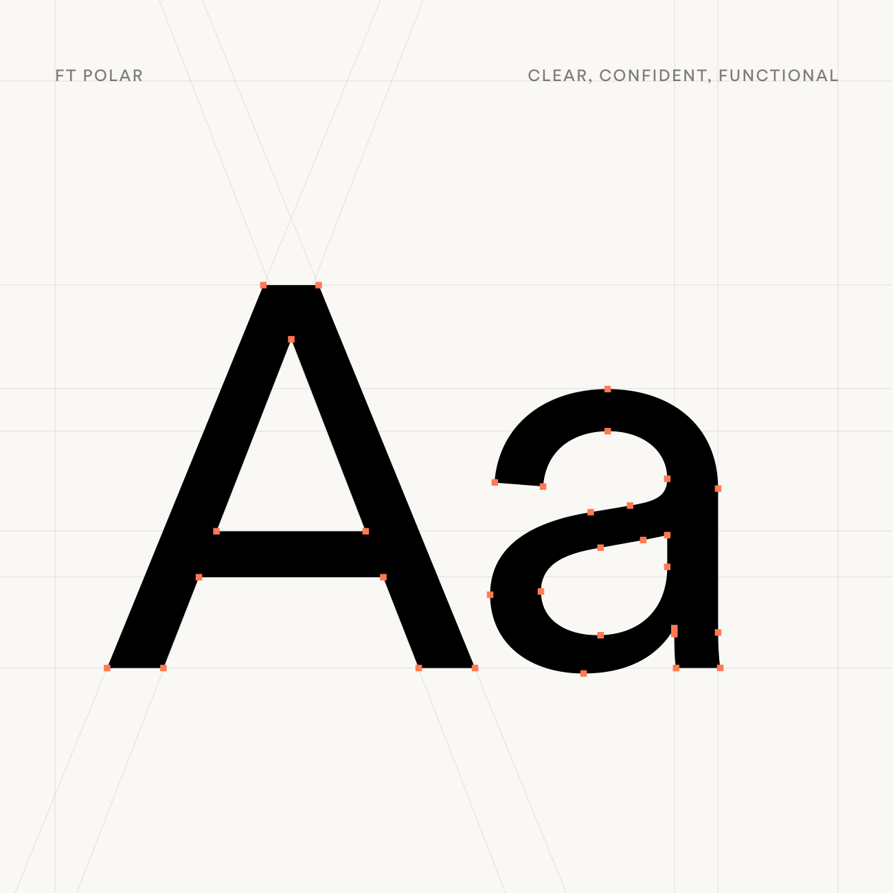
For typography, headlines open in a serif, GT Ultra Median, before resolving into a cleaner sans, FT Polar — a visual move from character to clarity within a single line. The same serif appears in quotes and callouts, while FT Polar carries the workhorse copy: body text, captions, and interface language built to stay legible at any size.

‍

Photography favors an authentic, film-inspired approach with real people, direct eye contact, and moments of visible progress. Marketing iconography borrows the same copper wire motif seen elsewhere in the system. We also defined an illustration style built from metal: three-dimensional objects assembled from layered sheets, set up in a generative AI tool for the ClearCo team.

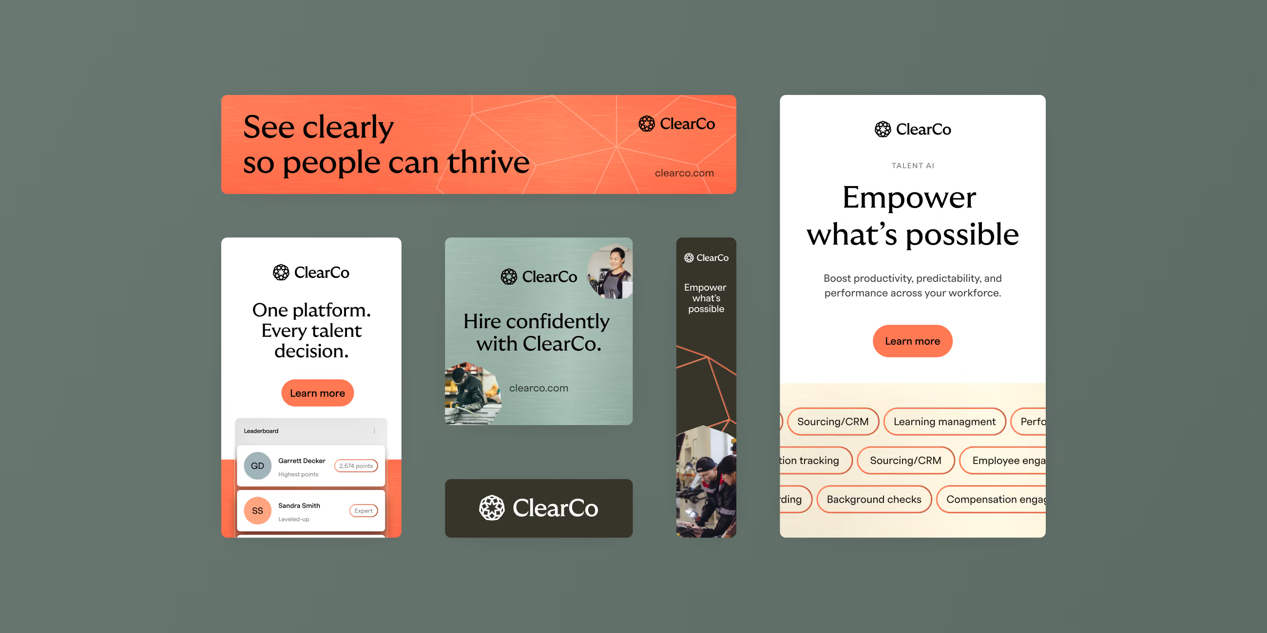
Advertising banners for ClearCo featuring the slogans: 'See clearly so people can thrive,' 'One platform. Every talent decision,' and 'Hire confidently with ClearCo.' One banner states 'Empower what's possible' to boost workforce productivity, displaying tags like Sourcing/CRM, Learning management, and Compensation engagement.
Black uppercase and lowercase letter A in GT Ultra Median typeface with visible vector editing points and peach background, labeled 'GT Ultra Median' on left and 'Human, Visionary, Emotive' on right.
A sample of the Polar typeface used in ClearCo's rebrand
The ClearCo color palette
Minimalist desk setup with a metallic chair, wooden desktop, and a computer with a copper-colored screen and matching keyboard.
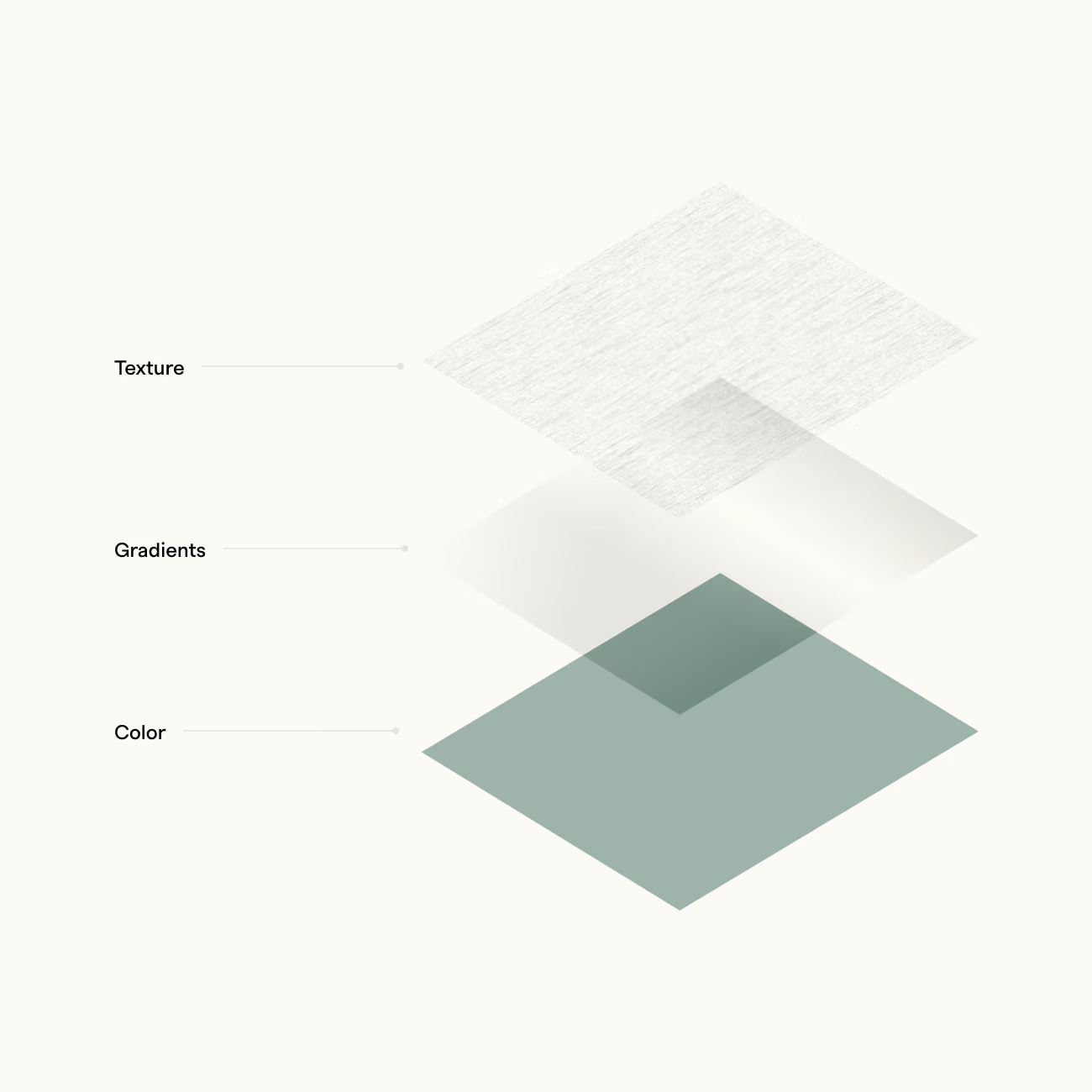
Diagram showing three layered elements labeled Texture, Gradients, and Color, arranged from top to bottom with textured, gradient, and solid color squares.
A bronze trophy cup with handles on both sides against a muted green background, above which is the text 'Clarity wins. Always.' in black font.
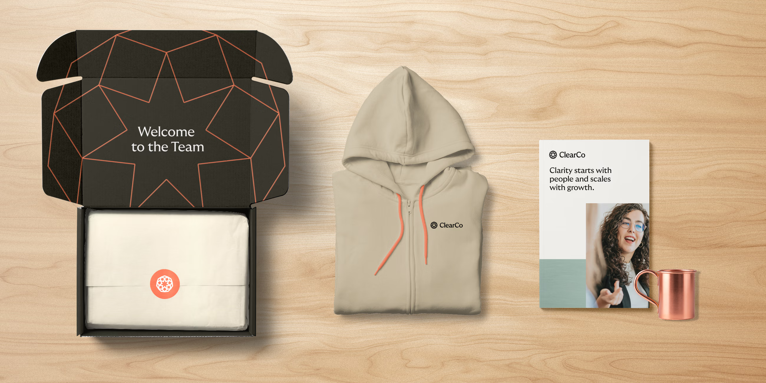
Welcome kit including an open black box with 'Welcome to the Team' text inside and a folded white item inside, a beige ClearCo-branded zip-up hoodie, a ClearCo pamphlet with text 'Clarity starts with people and scales with growth,' and a copper cup, arranged on a light wood surface.
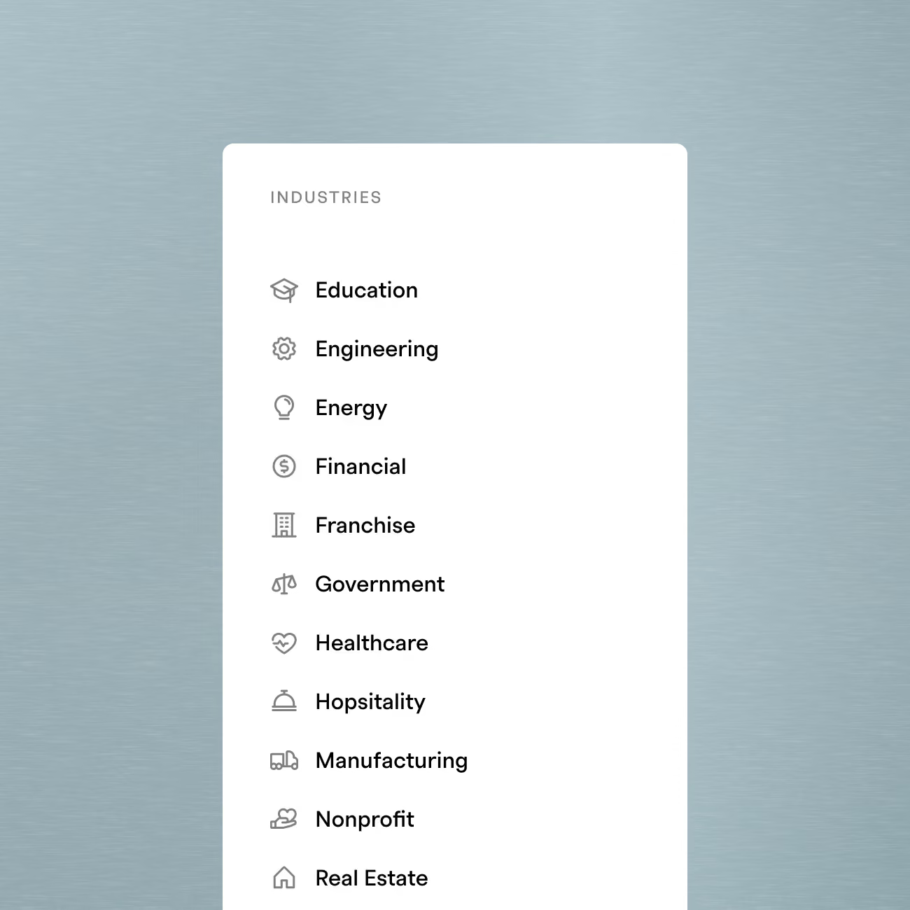
List of industries with icons including Education, Engineering, Energy, Financial, Franchise, Government, Healthcare, Hospitality, Manufacturing, Nonprofit, and Real Estate on a white card over a blue background.
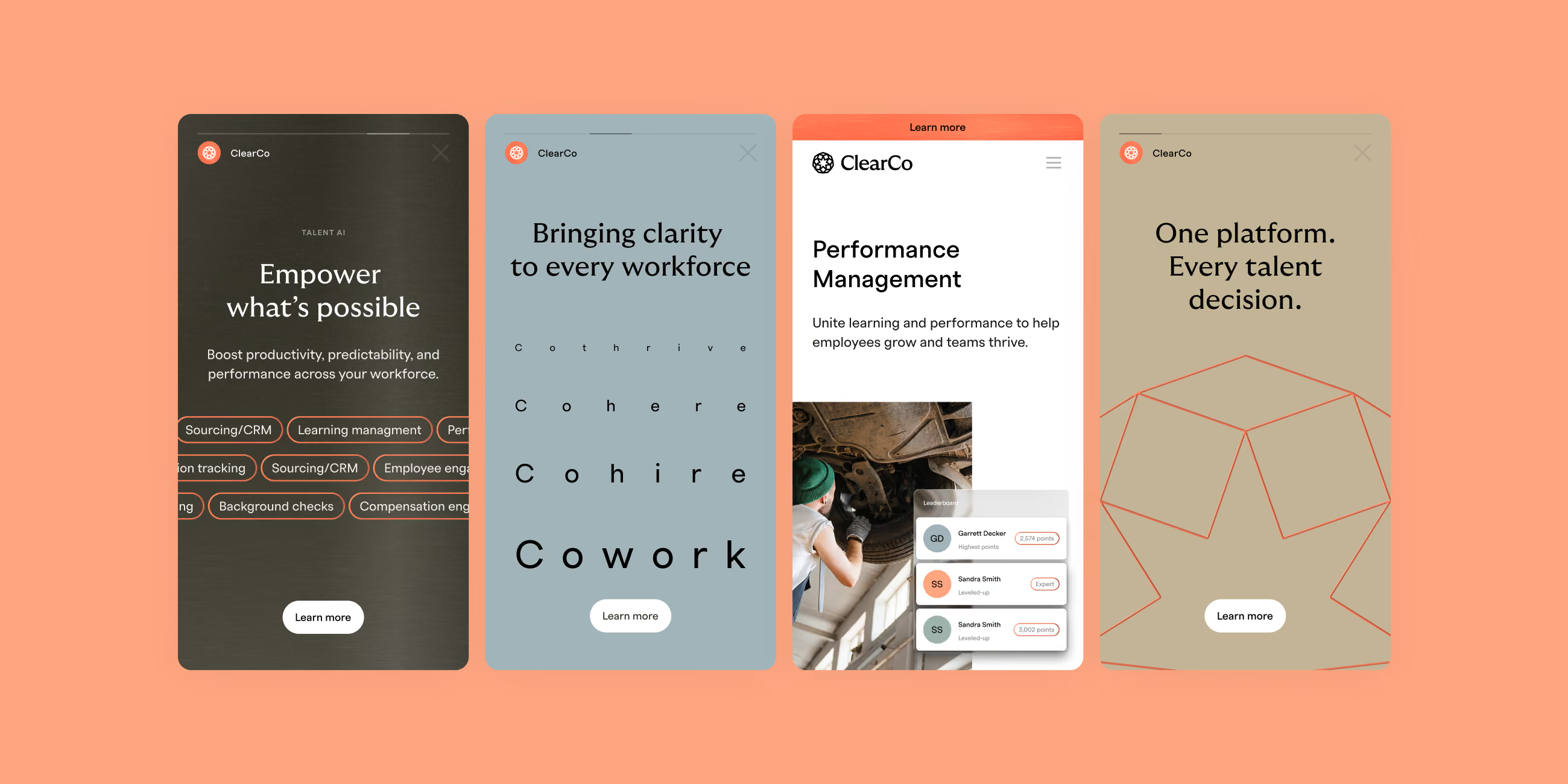
Four ClearCo app interface screens on a peach background showing features: empowering workforce with sourcing and background checks, bringing clarity to workforce with the word Cowork highlighted, performance management with employee task view, and one platform for every talent decision with a network diagram.

Brand Activation

Brand Activation

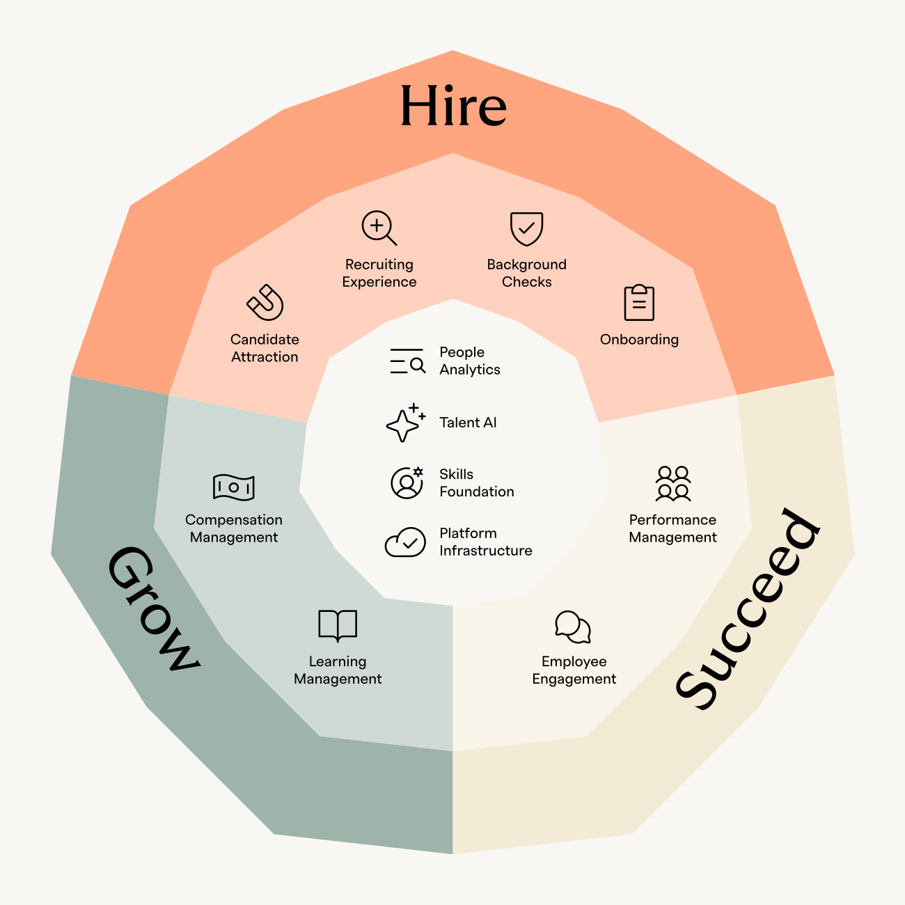
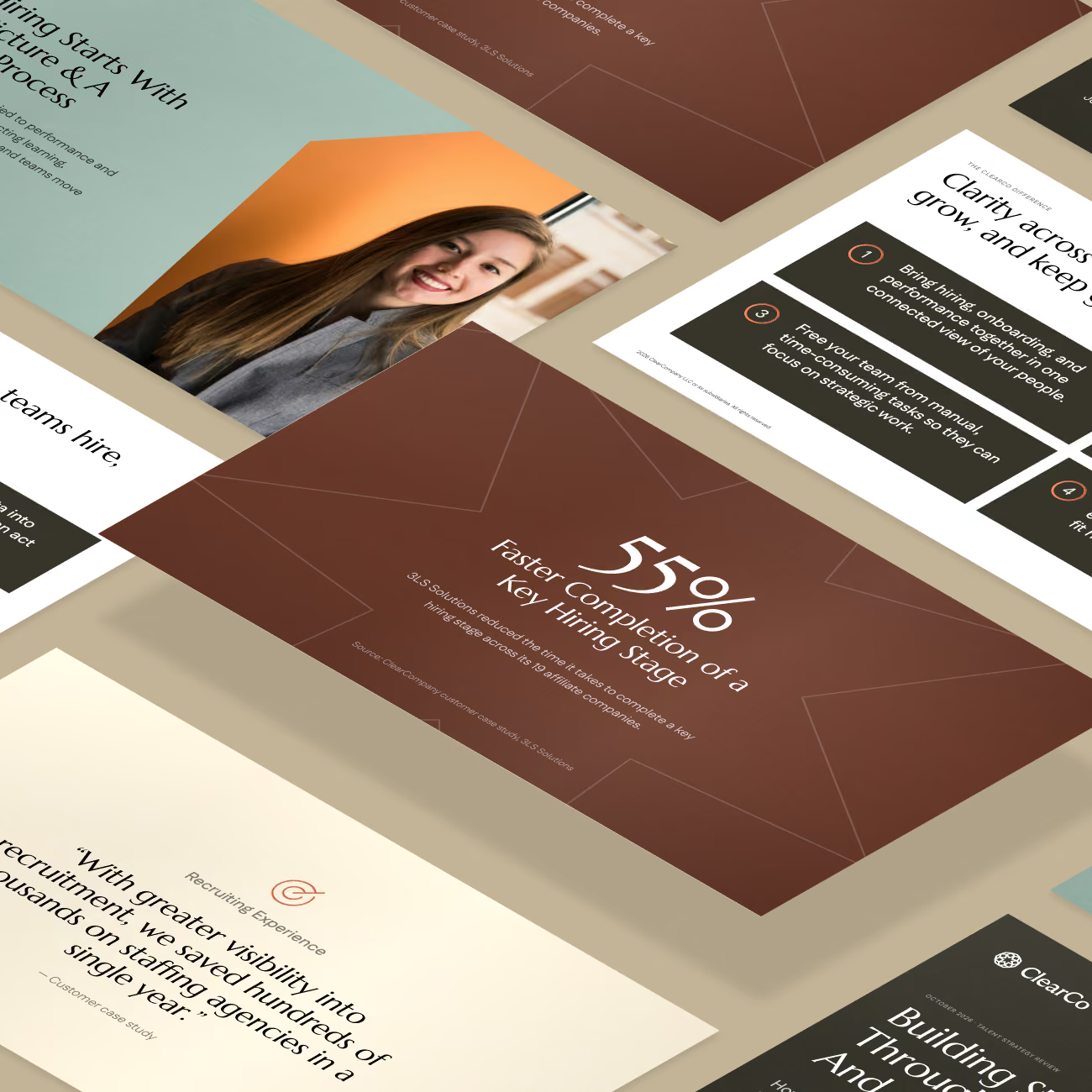
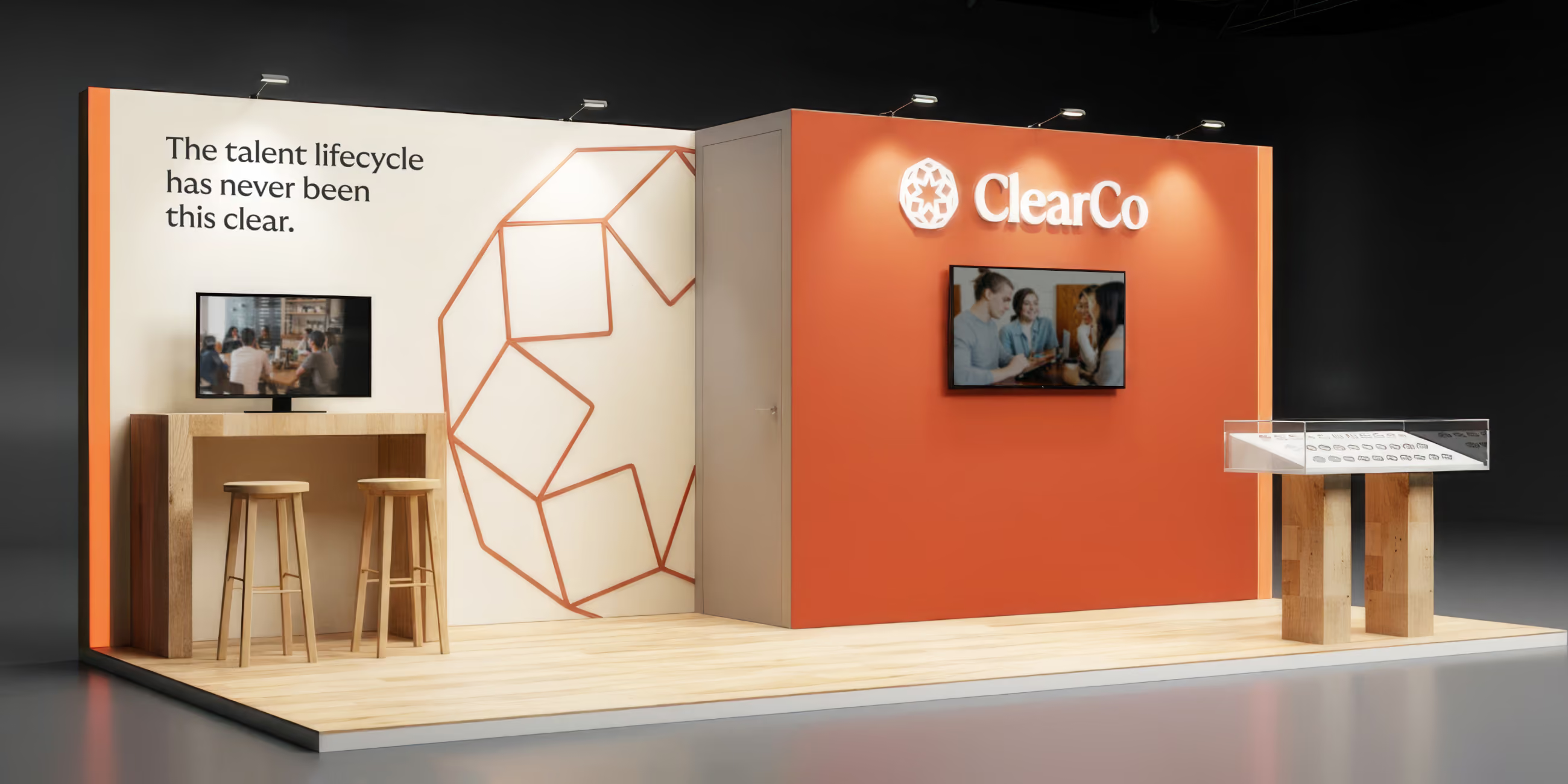
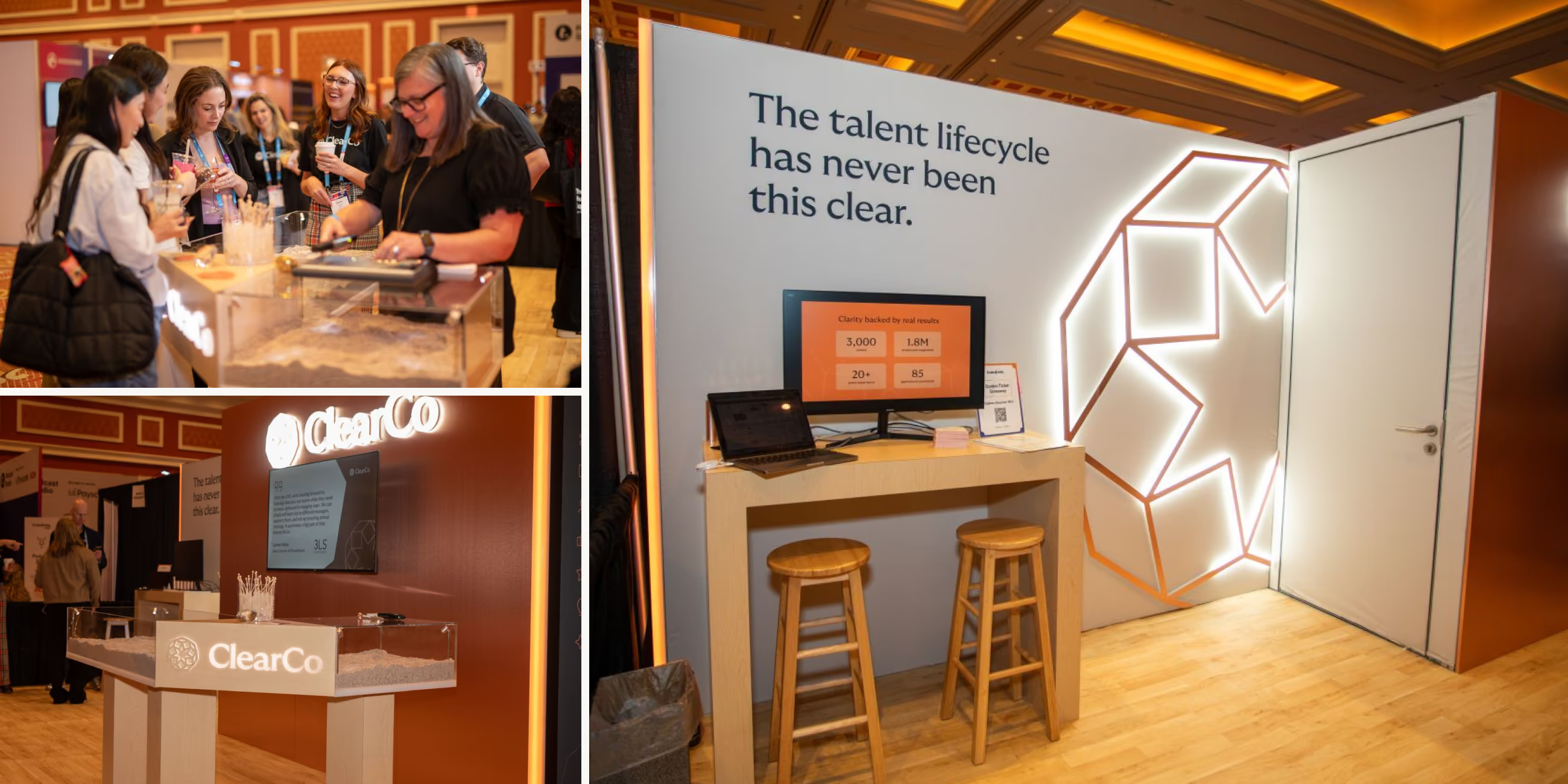
The system extended past the guidelines and into the materials ClearCo runs on day to day: a presentation template, the Talent Lifecycle Wheel, and an expanded set of marketing icons. Focus Lab also stayed on in a more consultative role, curating a secondary photography library, helping refine ClearCo's existing booth design and reviewing other brand applications, including video, to keep them consistent with the system.

‍

We had a perfect name for our company. We just had never really leaned into its potential.

We had a perfect name for our company. We just had never really leaned into its potential.

Rhiannon Staples, CMO, ClearCo
Read the next case study