There’s a story that logo legend Tom Geismar tells. It was 1961, and Geismar was working on a new logo for the company that was then Chase Manhattan Bank. You know the one: the octagon with a square in the middle.
Chase Bank octagon logo by Tom Geismar for Chermayeff & Geismar
“I really don’t understand it and I don’t like it”
Company President George Champion and Chairman John McCloy both hated the new logo. It was abstract. It didn’t mean anything. They countered with suggestions for a picture of the building or a sculpture. Something that meant something.
But they also knew enough to trust the expert they’d hired. As Geismar tells it, McCloy told him fine, go ahead, “But I don’t want to see it on my letterhead. I don’t want to see it in my office. I don’t want to see it. I really don’t understand it and don’t like it.”
Six months later, Geismar ran into McCloy and there he was, sporting the octagon logo on his tie, cuff links, even a pin in his lapel. Today, more than 60 years later, that logo is one of the most recognizable in the world.
So if you’re feeling anxious about choosing a new logo, you’re in good company. But how did McCloy get from “I don’t like it” to logo cuff links?
{{divider}}
New Is Uncomfortable
Six months passed. That’s what happened. New things are uncomfortable, and McCloy had to get used to the new logo.
However, that doesn’t mean that he would have become so enthusiastic about just any logo. The one Geismar designed is really effective. But what this example shows is that you can have an absolutely terrific logo sitting on the screen in front of you, something that you could grow to love, and not be able to recognize it.
{{divider}}
The Soulmate Trap
The first step is letting go of the idea that there is one right logo for your company. Many leaders expect to feel an instant soulmate connection with a new logo.
You look at a logo like the Chase Octagon Symbol or the Nike Swoosh and it means something to you.
The octagon shape suggests coins, money; the forward motion of the geometry implies a forward-thinking company, while the space in the center suggests a safe, protective vault.
The Swoosh feels like energy, movement, motivation — all the goals you’re going to achieve when you “just do it.”
But just as the Chase leaders initially balked at the octagon shape, the first time Nike leaders saw the Swoosh, they were unimpressed.
Nike "Swoosh" by Carolyn Davidson
Nike tells the story on its own website, with nostalgia rose-tinting the awkward moment. Presented with half a dozen options, “It came down to a matter of which was the least awful,” recalls Jeff Johnson, Nike’s first full-time hire.
Philip Knight, Nike co-founder, remembers a certain resignation: “Well, I don’t love it,” he told designer Carolyn Davidson, “but it will grow on me.”
It’s not that the Swoosh was entirely devoid of meaning. There’s a speedy feeling to the shape. For an entirely stationary mark, it nonetheless contains a sense of motion.
Reflecting back on the moment of choosing that particular logo, Knight says, “What we wanted it to stand for was speed, which it did and still does. But now it means much more than that. It symbolizes the best in sports. And it did grow on me!“
If some of the most iconic logos ever failed to wow their company leaders at first look, we suggest that this may simply be a part of the experience, at least for most people.
Sure, the rom coms may have it right: Some people may fall in love at first sight, and they might even have found a perfect match, a soulmate.
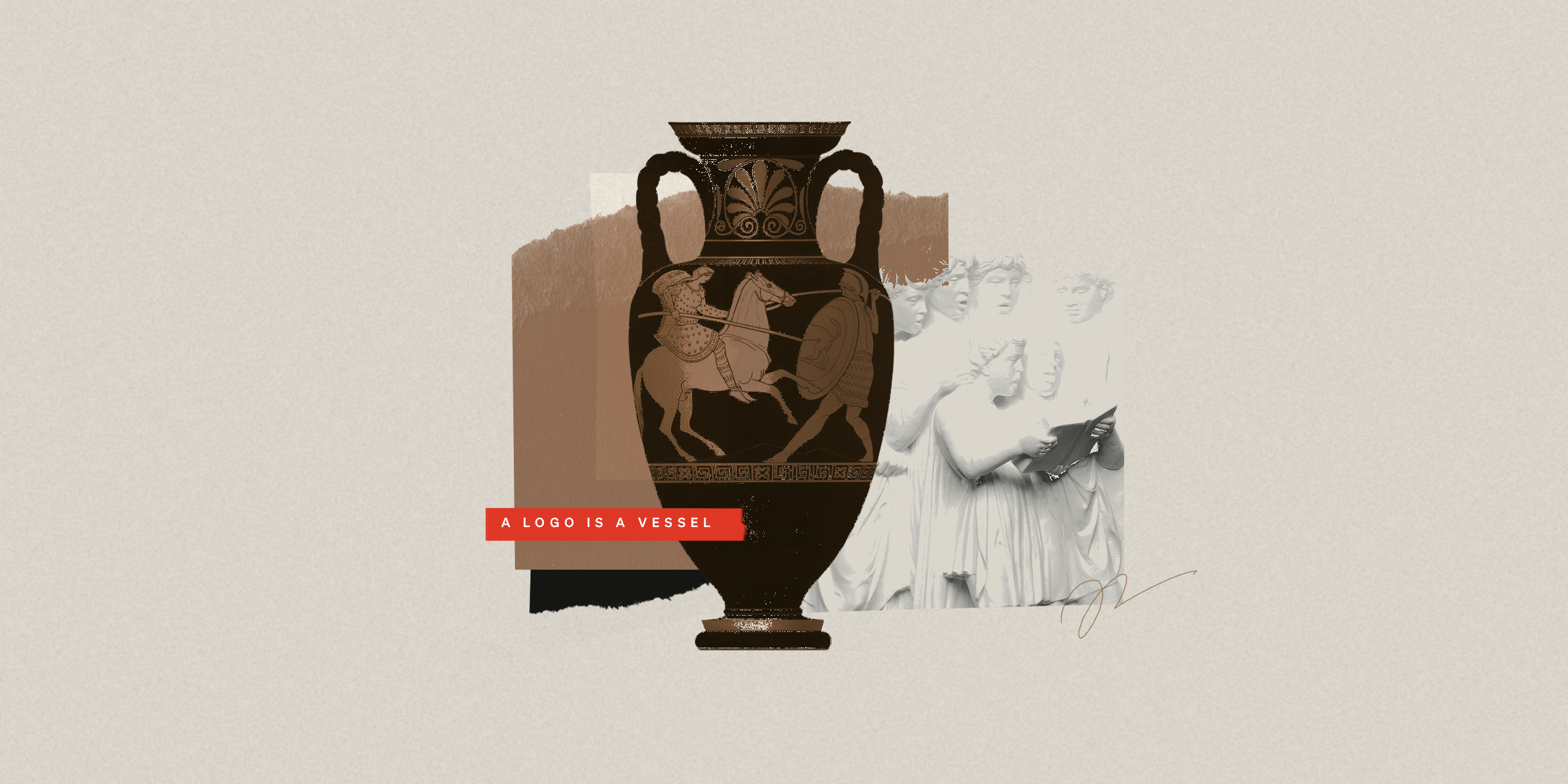
But a logo isn’t a person, already uniquely complex, for you to get to know. A logo is a shape, a symbol, a swipe of ink or a collection of pixels. It doesn’t start out filled up with meaning for you to discover. It’s a vessel for you — and your customers — to fill with meaning over time.
{{divider}}
A Logo Is a Vessel
How does a logo, which is really just a shape, often abstract, become imbued with so much meaning?
1) Consistent use over time
The logo shows up everywhere — website, product, ads, packaging, office, events — in a consistent way. People come to connect it with the company.
2) Paired with real experiences
At every interaction — good service, great product, inspiring message (or also bad experiences) — the logo is there.
3) Repetition builds recognition
Seeing the same symbol again and again makes it easy for your brain to recognize and process. Combined with those (hopefully positive) interactions, you get used to associating the logo with the experience of the company. This familiarity can feel like warmth or trust.
4) Brand story and logo together
Campaigns, visuals, stories, taglines (“Just do it”) run next to the logo. Over time, we attach the narrative and values to the symbol.
5) Social proof and cultural reinforcement
When people see others wear or display the logo — shirts, stickers, merch — it gains status. It becomes an identifier, assurance of a shared affiliation, which adds even more meaning.
The brand’s behavior, story, and consistency all load meaning into the logo; the logo then acts as the shortcut that recalls all of that in an instant. The logo becomes a trigger for all those past brand interactions. It’s never about the logo itself: it’s always about the brand associations.
{{divider}}
Choose a Logo — The Right Way
OK, but you’re still staring at a slide full of new logo options and you need to pick a good one, so then you can fill it to the brim with meaning.
If you can’t rely on that soulmate-to-soulmate connection, how do you choose?
The process is straightforward, which is not to say that it’s easy. Here’s how to choose a logo the right way.
1) Anchor in the brand
Get clear on your brand’s core identity, values, and the feeling you want to evoke. Aligning with a brand archetype can be a great way to understand and communicate a multi-faceted brand personality.
2) Use criteria, not vibes
Get clear on your criteria for success, and intentionally review each serious contender against them.
Here are the basic criteria for evaluating a logo:
Recognizable: Simple enough to remember and spot quickly, even when small or far away.
Distinctive: Not generic or easily confused with others in the category.
Appropriate: Feels aligned with the brand’s personality and audience (not childish if you’re a serious B2B bank, etc.).
Flexible: Works in one color, tiny sizes, on screens, in print, on swag, in motion.
Timeless enough: Not hyper-trendy or in danger of feeling dated in a year.
Well-crafted: Clean geometry, spacing, proportions; no weird tangents or awkward details.
3) Imagine it in the real world
Look at how it performs in context, as a website header, app icon, social avatar, signage, swag.
4) Don’t expect an emotional connection on day one
Let go of the fantasy of an instant soulmate connection with your new logo. You’ll grow to love your logo: The chemistry will come with time. Accept that the logo will gain meaning through use.
5) Limit the feedback circle
Don’t crowdsource opinions from everyone you know. Don’t trust Claude or ChatGPT to make your decision for you (that’s not what these tools are good at, though they can help you apply the criteria).
Work with your selected team, made up of people who understand the brand and the brief, and ask them to respond using the same criteria.
6) Make a choice and commit to it
Choose the logo that:
Best aligns with your brand personality and strategy
Is the most distinct and functional
You’re willing to stand behind for years
Commit to using it consistently so it can accumulate meaning and equity.
{{divider}}
“It Will Grow On Me”
The process of choosing a logo, as we’ve laid it out, can sound disarmingly simple. Until we get to that very last bullet.
You have to be willing to stand behind it for years.
A logo only gains all that meaning and power if you give it time. So one of the criteria is that you’re willing to do so. This is where you might fall into the soulmate trap again. Shouldn’t you just know if you’re willing to stand by a logo for years?
Remember Philip Knight? “Well, I don’t love it,” he said, referring to the Nike Swoosh, “but it will grow on me.” This is the winning attitude that choosing a logo demands, and we admit that it’s far easier said than done.
But if you’re in the position of choosing a logo, this is probably a muscle you’ve learned how to flex. It’s the same energy every entrepreneur or CEO channels when they make a big decision with imperfect information. You do your best — you read a blog post about how to choose a logo — and then you choose a logo and you stand by it.
It’s a leap of faith. But the good news is that choosing a good logo is just the first step in imbuing it with meaning. Actually, it isn’t even the first step (see above). It’s the foundation, the groundwork that makes the rest of the steps possible.
{{divider}}
One Voice in the Choir
You choose your new logo, and then you set about the hard work of making it mean something to the world. But that’s all right. You’re doing that hard work already. You’re growing a company. The logo is just one small part.
The logo looms large because it is everywhere (step 1: consistent use over time). But the logo is one voice in the choir, not the soloist.
Another metaphor: It’s the index tab for the brand, a quick handle your brain grabs to recall everything else.
The logo is powerful because it’s attached to all that — but it’s still just one (albeit important) piece of the overall brand system.
Now go ahead: Choose your new logo.
-
This article was written in conversation with Focus Lab designers Shay Bocks, Jon Chapman, Stetson Finch, Kaylee Green, and Brian Perez. It is grounded in their insights about what logos do, what they don’t do, and why changing one can feel so high-stakes.
228
Shirts Sold
Fuerte shirts purchased
$22k
Organization Matches
Additional funds donated by Focus Lab and partner organizations
$26k
Donated to UNIDOS
Total amount donated to PR relief efforts through UNIDOS
More than anything, we want people to succeed, professionally and personally.
More than anything, we want people to succeed, professionally and personally.
Never miss a post.
Sign up for our occasional newsletter. No spam. Unsubscribe at any time.
Thank you! Your submission has been received!
Oops! Something went wrong while submitting the form.
By clicking the submit arrow above, you consent to allow Focus Lab to store and process the personal information submitted above to receive the In Focus newsletter. You can unsubscribe at any time. For more information, please review our privacy policy
By clicking the submit arrow above, you consent to allow Focus Lab to store and process the personal information submitted above to receive the In Focus newsletter. You can unsubscribe at any time. For more information, please review our privacy policy