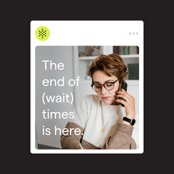
While voice is central to PolyAI’s strength, the challenge was to depict voice in ways that weren’t cliche or misleading. It’s easy to confuse PolyAI’s strength in voice with alternative formats, like text or chat, when trying to convey how the product works. Our goal was to communicate humanity, depth, and emotion with an air of cleverness.
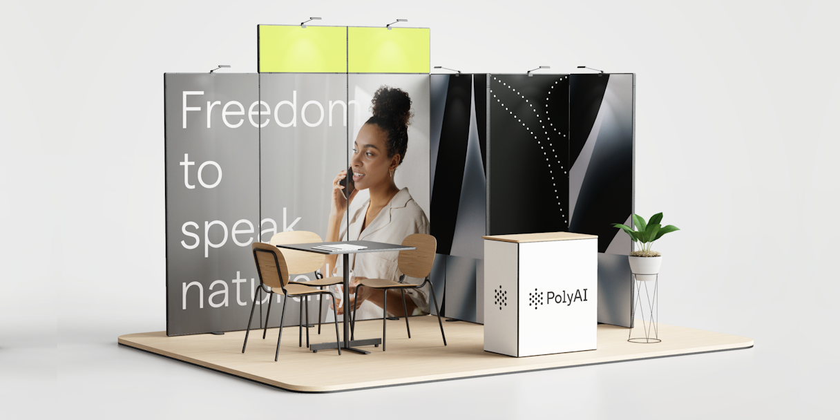
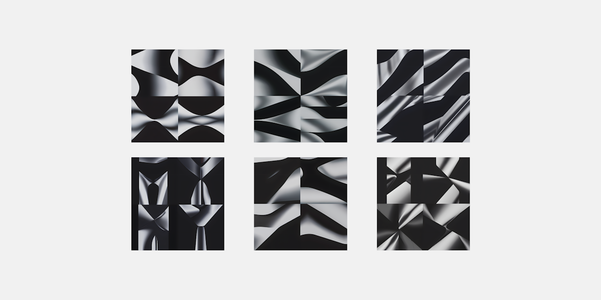
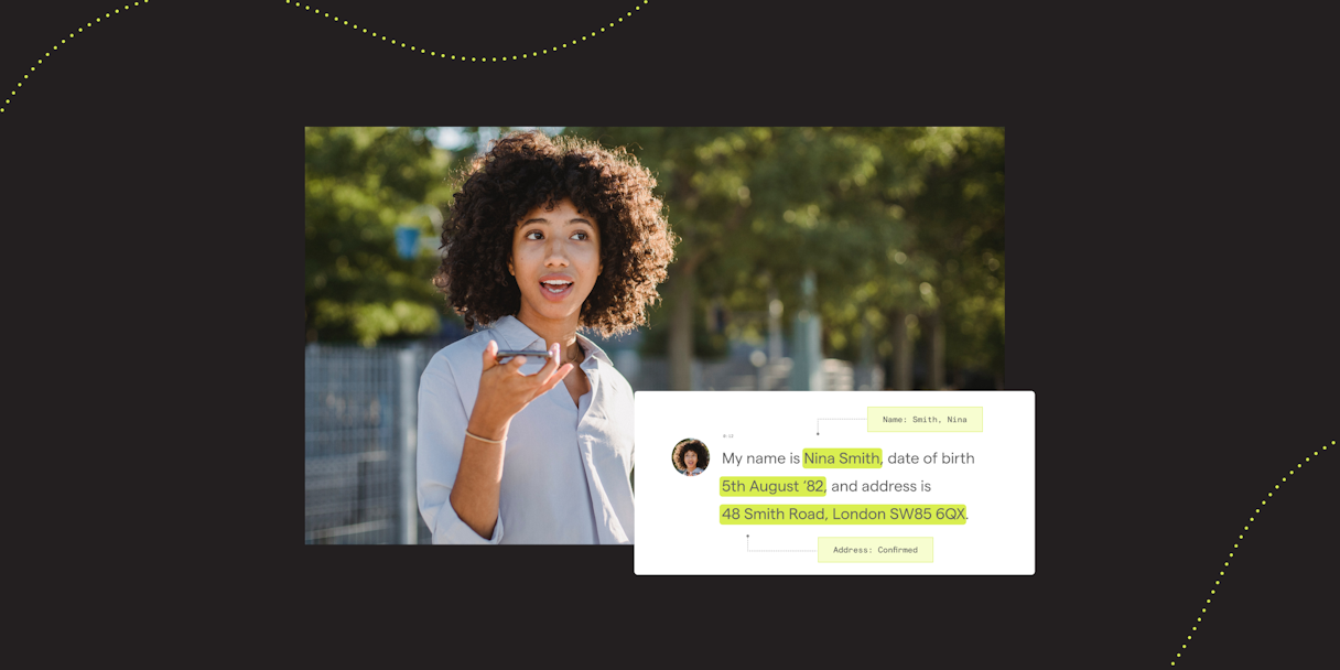
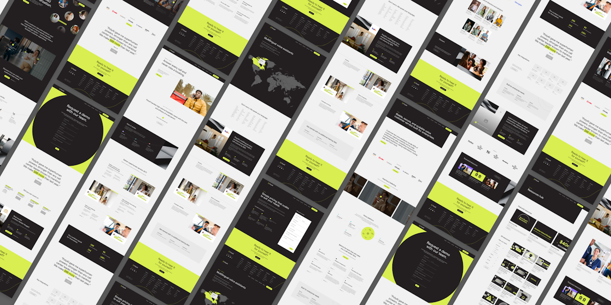
We set out to represent the experience visually — from confusion and anguish to clarity and relief. Using the same visual cues in the mark, PolyAI’s dot language shows voice with movement and motion. Emboldening photography positions contact center leaders as the hero. Transformative textures deliver the premium look and tone of the brand. Clever product illustrations demonstrate how conversations connect to the product and seamlessly help users.
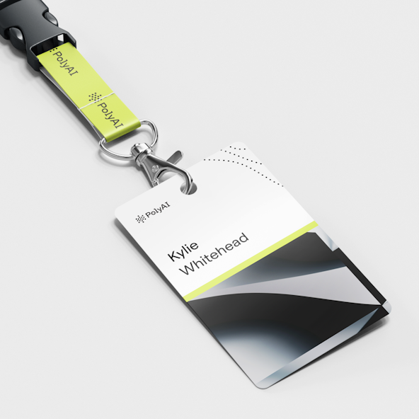
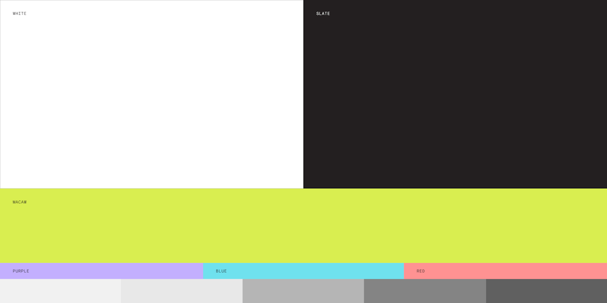
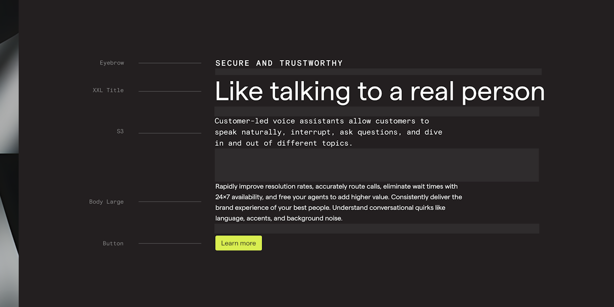
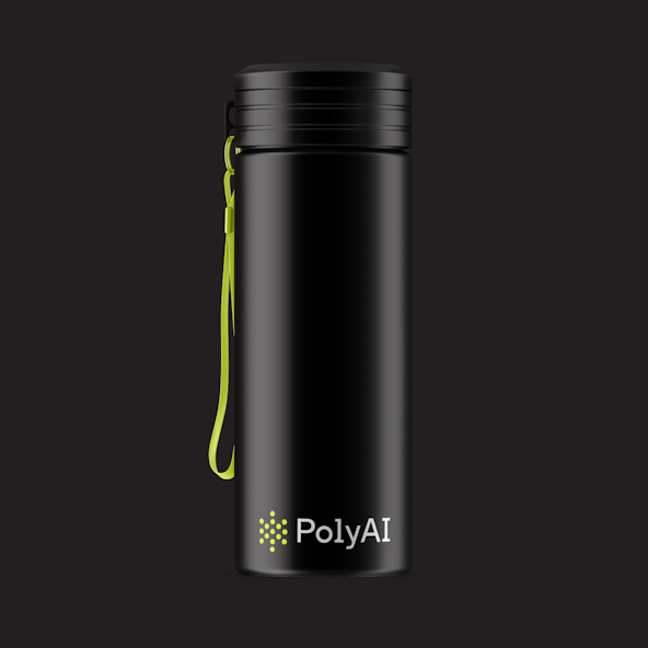
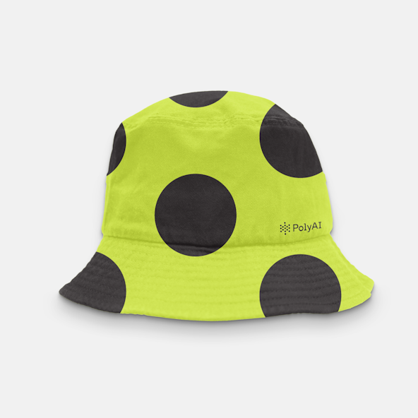
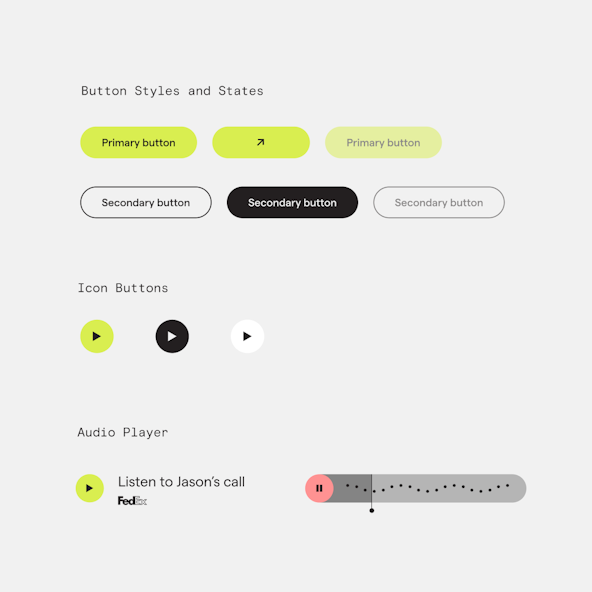
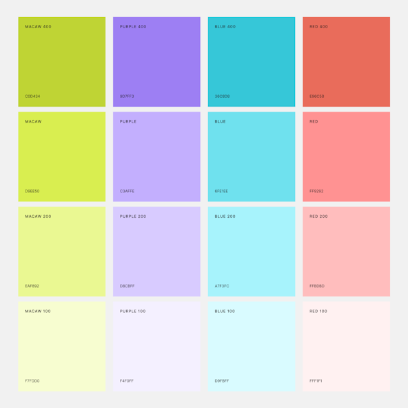
PolyAI's color system is a mixture of confidence and cleverness. The bright green, named Macaw, represents PolyAI’s premium product and exudes confidence. It symbolizes the fresh new take on how people interact with customer service over the phone. The neutral blacks and grays balance the palette and give the brand a high-end look and feel. The secondary colors add an empowering and approachable tone to the brand, further harmonizing the color palette.
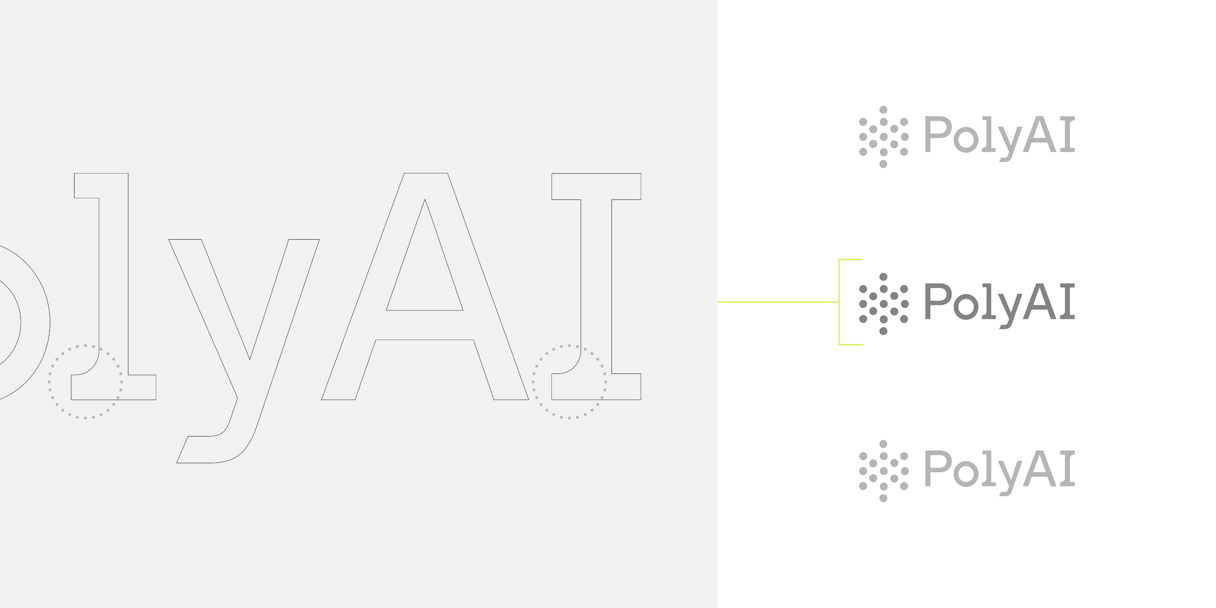
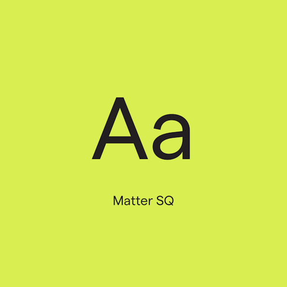
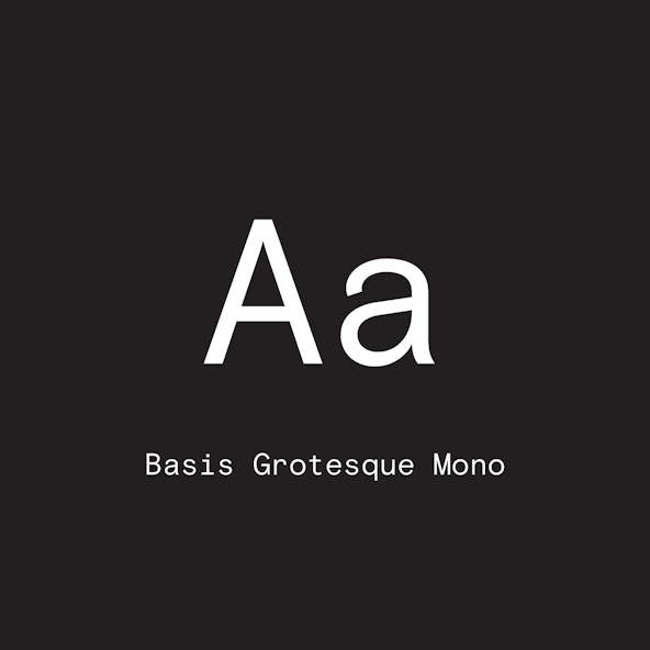
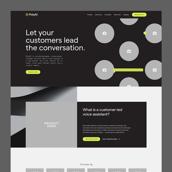
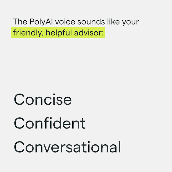
The typographic family of Matter SQ was chosen for its clean and modern characteristics. It reflects the clever and transformative qualities of PolyAI and lends a slick look and feel. Basis Grotesque Mono is PolyAI's secondary accent font. Used for subheadings and occasional body copy, it provides technical contrast to balance the brand's tone.