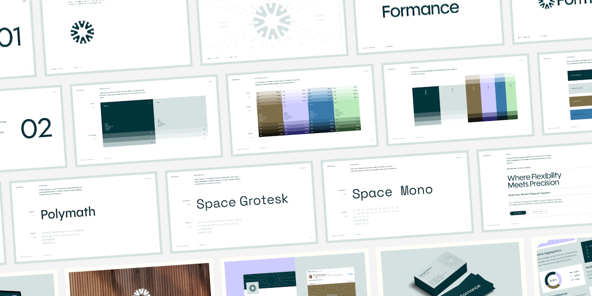
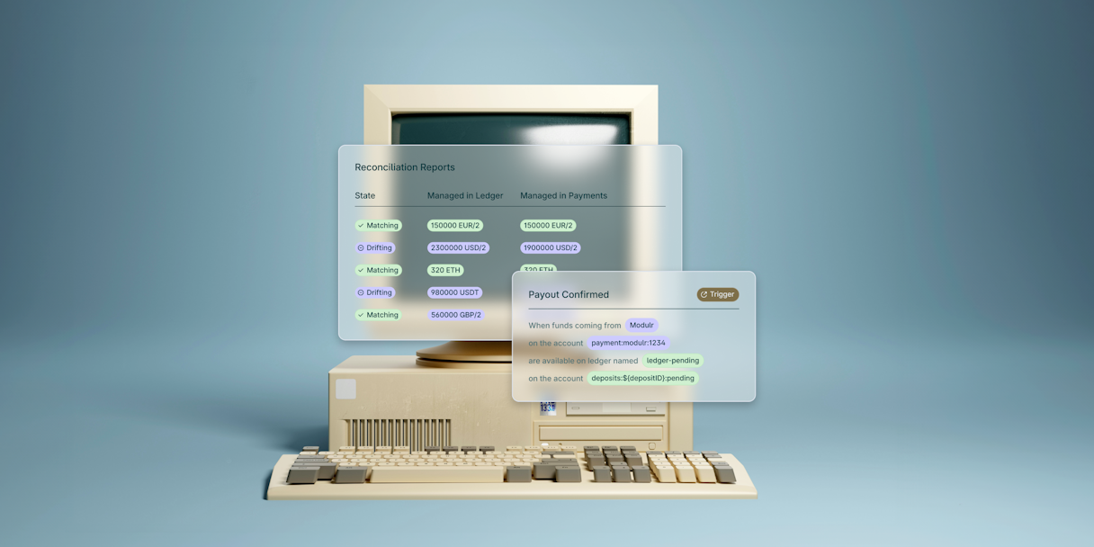
At the core of our branding strategy is a dynamic typographic system. OhNo’s Polymath typeface carries over from the logotype, conveying a sense of forward-thinking while remaining highly legible, ensuring that headlines command attention and communicate the message effectively. Space Mono brings a sense of technicality and modernity, which is perfect for buttons and callouts where precision and clarity are paramount.
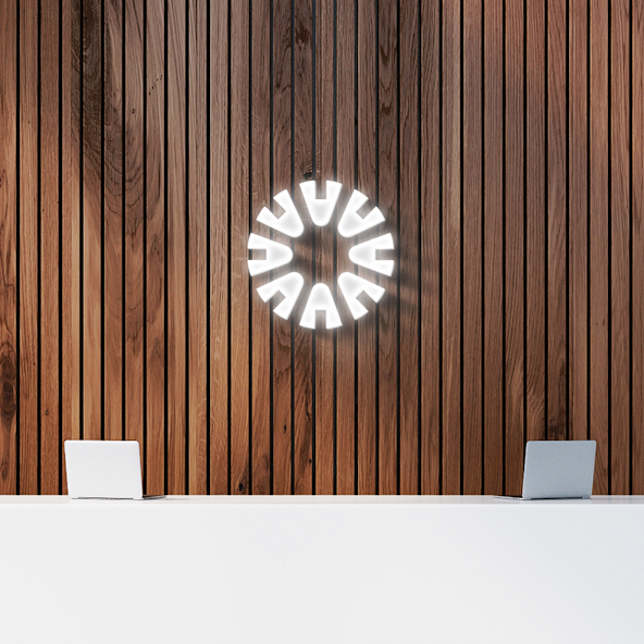
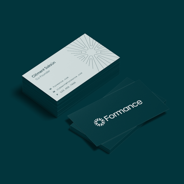
The visual language integrates the connector concept across all facets of the brand. It’s not only adaptable but also scalable, facilitating further graphic representation and an array of shapes to articulate the customization,
infrastructure, and interconnected payment solutions Formance offers.
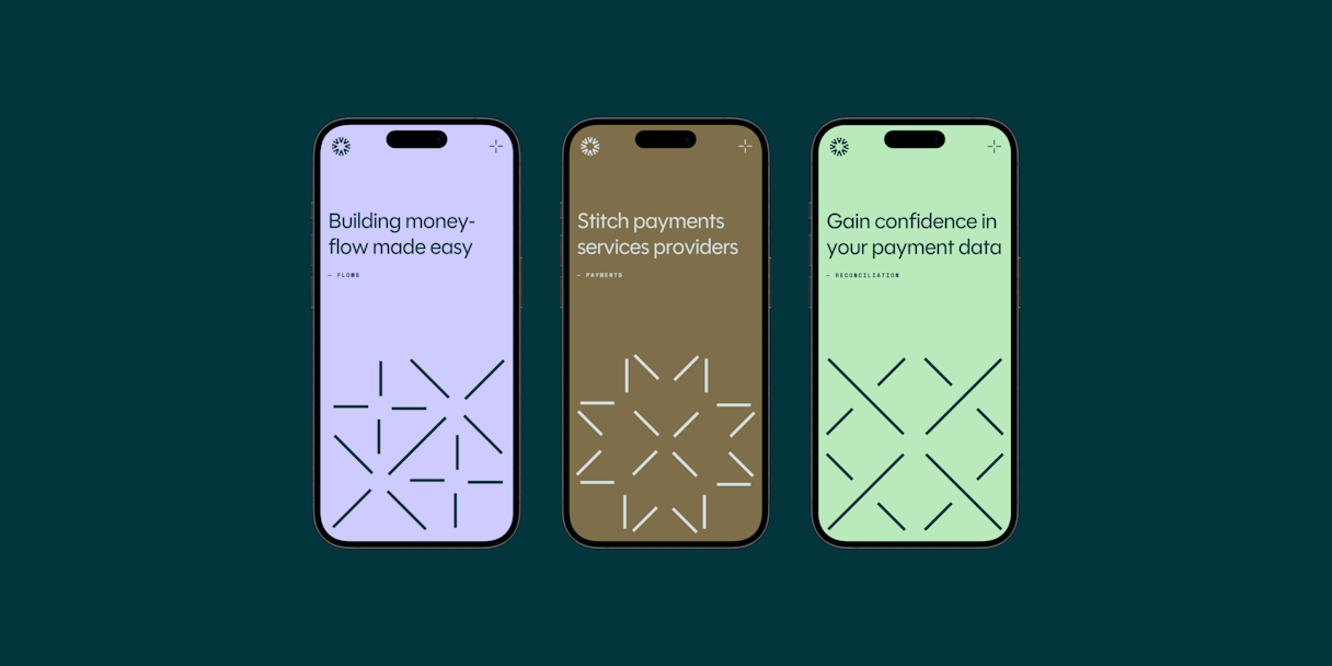
The primary color palette embodies simplicity, modernity, and a touch of luxury. Emerald and Slate form the bedrock of the identity, capable of taking the lead when the spotlight calls. Gold, Lilac, Cobalt, and Mint round out the secondary palette, adding depth and balance.
Shades seamlessly blend all colors into a cohesive whole. From establishing type hierarchy to supporting UI elements and backgrounds, these versatile neutrals play a pivotal role in maintaining visual balance and clarity.